7 Contact Form UX Mistakes That Cost You Enquiries (And How to Fix Them)
Is your contact form losing you leads? Discover the top UX mistakes that stop users from enquiring — and how to fix them.
Table of contents
Contact form UX mistakes are design and usability issues that create friction, reduce trust, and prevent users from submitting enquiries. The most common mistakes include asking for too much information upfront, making phone numbers mandatory, unclear post-submission expectations, robotic form copy, poor error handling, poor mobile experience, and weak call-to-action buttons. Fixing these issues doesn't require a full redesign. Small, targeted UX improvements — reducing fields, humanising copy, adding trust signals — often produce disproportionate gains in enquiry rates.
Your website might be attracting solid traffic. Your services might be genuinely excellent. But if your contact form isn't converting, all of that effort quietly drains away.
Contact forms rarely fail because they're broken. They fail because they create friction — at the exact moment a visitor is deciding whether to trust you enough to reach out.
For web designers, this often surfaces as unexpectedly low submission rates on otherwise well-designed pages. For SME owners in Singapore and beyond, it simply feels like people are visiting but nobody is enquiring.
This guide identifies the seven most common contact form UX mistakes that silently cost businesses enquiries — and explains precisely how to fix each one.
Why Contact Forms Fail More Easily Than Other Forms
Contact forms occupy a unique and fragile position in the user journey. Unlike checkout forms or sign-up forms, contact forms are entirely optional. There is no purchase in progress. There is no account being created. The user is choosing to begin a conversation — and that choice is easily abandoned.
At this stage, users are still mentally asking:
- Is this company trustworthy?
- Will a real person actually respond to me?
- Am I about to get spammed or hard-sold?
This makes the contact form UX far more fragile than most designers account for. Every field, every word of copy, every missing trust signal is a potential reason to close the tab.
Understanding this context is the foundation for fixing the mistakes below. Each one targets a different dimension of user hesitation.
The 7 Most Common Contact Form UX Mistakes
1. Asking for Too Much Information Upfront

Asking for too much information upfront is perhaps the most damaging contact form UX mistake. When users see a form with six or more fields before trust has been established, the perceived effort increases immediately — and the perceived benefit does not.
Long contact forms signal one of two things to a user: either the company is bureaucratic and slow, or it is harvesting data. Neither inspires confidence.
Why this hurts conversions: Users abandon the form before even beginning because the effort feels disproportionate to starting a conversation.
How to fix it: Reduce required fields to the bare minimum — typically name, email, and a brief message. Additional context can be gathered in the follow-up conversation, once trust has been established. If you need to qualify leads, use a single optional dropdown (e.g. 'What best describes your enquiry?') rather than multiple mandatory fields.
For a broader look at form design principles, see our guide on Form UX Best Practices.
2. Making Phone Number Mandatory Before Trust is Established
Phone numbers feel personal. When a user is still evaluating your business, being required to hand over their phone number triggers immediate anxiety — concerns about unsolicited calls, aggressive follow-ups, or spam.
This is particularly relevant for Singapore businesses, where consumers are increasingly protective of personal contact details following the rise of scam calls and stricter PDPA awareness.
Why this hurts conversions: Users leave without submitting. Silently. You never know they were there.
How to fix it: Make phone number optional. If a phone number is genuinely necessary for your workflow, add a brief reassurance note beside the field — for example, 'We'll only call if you prefer to discuss over the phone.' This small addition has a measurable effect on completion rates.
3. Not Explaining What Happens After Submission

One of the most overlooked contact form UX mistakes is the absence of post-submission clarity. Users want to know: who will reply, how soon, and through which channel?
Without this information, users hesitate at the final step. The submit button feels like a leap into the unknown rather than the start of a conversation.
Why this hurts conversions: Uncertainty causes last-minute abandonment, right at the point of maximum intent.
How to fix it: Add a short line above or below the submit button that sets expectations. Something like: 'We typically respond within one business day via email.' This single line removes ambiguity and increases submission confidence significantly.
After submission, display a clear success message that confirms receipt and reiterates the response timeline. This also reduces duplicate submissions from users who weren't sure the form went through.
4. Using Robotic, Non-Human Form Copy
Contact forms are the beginning of a conversation, not a database entry point. Yet many forms still use cold, generic copy: 'Submit Enquiry', 'Enter your message here', 'Your name*'.
This impersonal language creates emotional distance. It makes users feel they're dealing with a system, not a team. And when users feel like they're about to send a message into a void, they often don't send it.
Why this hurts conversions: Users disengage emotionally at the point they most need to feel confident.
How to fix it: Rewrite your form copy to sound like a real person. Replace 'Enter your message' with 'Tell us a bit about your project'. Replace 'Submit' with 'Send My Enquiry' or 'Let's Talk'. Use field labels and placeholder text to guide users conversationally.
This principle extends beyond forms — for a broader view, see our article on UX Writing: Elevating User Experience Through Words.
5. Poor Error Handling That Wastes User Effort
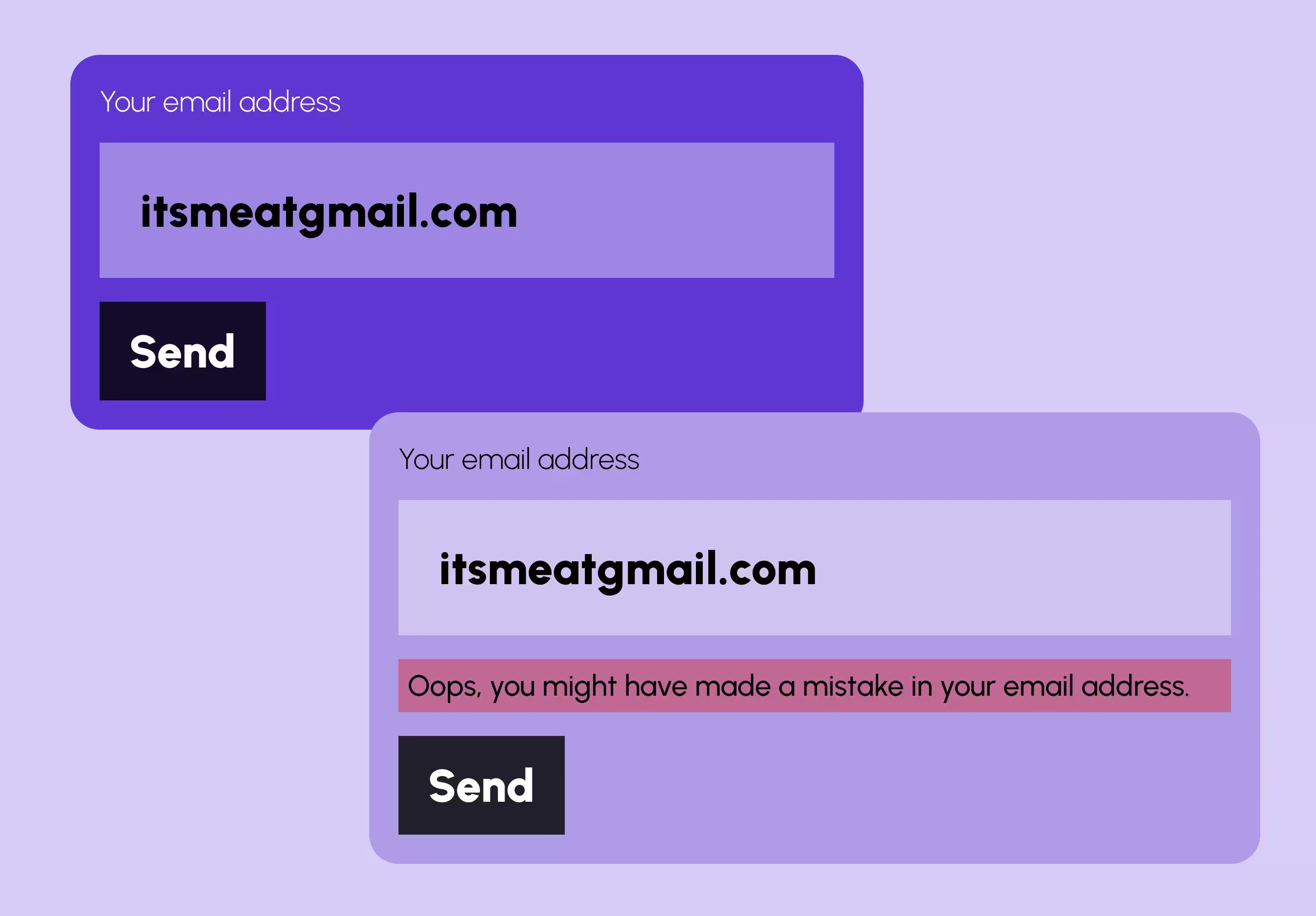
Poor error handling is a contact form UX mistake that often goes unnoticed until you analyse your form drop-off data. Users fill in a form, hit submit, and are then confronted with a vague red message — 'Something went wrong' — with no indication of which field needs fixing or why.
This wastes the effort the user has already invested, and effort investment is a psychological trigger that makes abandonment more frustrating — and more likely.
Why this hurts conversions: Users who encounter unclear errors at the submit stage give up rather than fix what they cannot identify.
How to fix it: Use inline validation that shows errors in real time, at field level, as users complete each input. Error messages should be specific: not 'Invalid email' but 'Please enter a valid email address, e.g. name@example.com'. Avoid surfacing all errors only after a full submission attempt.
6. Forms That Break or Feel Painful on Mobile
Mobile users now represent a significant portion of web traffic across Singapore and globally. A contact form that works perfectly on desktop but is difficult to complete on a phone is, functionally, a broken contact form for a large share of your audience.
Common mobile form issues include: input fields too small to tap accurately, no autocomplete support, the wrong keyboard type triggered (e.g. a numeric keyboard appearing for a name field), and zoom behaviour that disorients users.
Why this hurts conversions: Mobile users abandon before completing the form, and mobile traffic often represents your highest-intent visitors — people searching on the go, right when they've decided to act.
How to fix it: Test every form on at least two real mobile devices, not just browser responsive simulators. Use correct input types (email, tel, text) so the right keyboard triggers. Ensure tap targets are at least 44px. Avoid relying on hover states for validation.
For more on mobile-first considerations, see our article on Responsive Web Design and Mobile-First UX and Mobile Landing Page Optimisation for Singapore Businesses.
7. Weak or Generic Submit CTAs
The submit button is the final micro-moment of commitment. It is the last point at which a user decides whether to follow through or step back. A generic button that says 'Submit' or 'Send' does none of the work that a good CTA should do at this stage.
Why this hurts conversions: Momentum dies right at the final click. The button offers no reassurance, no value framing, and no emotional nudge.
How to fix it: Replace generic labels with action-oriented, benefit-led copy. 'Send My Enquiry', 'Start the Conversation', or 'Book My Free Consultation' all perform better than 'Submit'. Pair the button with a single trust signal: a privacy note, a response time expectation, or a no-commitment statement.
Contact Form UX for Singapore Businesses: What's Different
Many of the mistakes above are universal, but there are nuances worth noting for businesses operating in Singapore.
Singapore users are generally technology-literate and have high expectations of digital experiences. A poorly designed contact form is more likely to be interpreted as a sign of an unprofessional or low-quality operation — not simply an oversight.
Additionally, under the Personal Data Protection Act (PDPA), collecting more personal data than necessary can create compliance concerns. Limiting your contact form to essential fields is both a UX best practice and an alignment with Singapore's data protection obligations.
For Singapore SMEs specifically, trust signals carry extra weight. Adding a note such as 'Your information is kept private and never shared' reassures users who are increasingly cautious about data privacy in the local context.
Our UX/UI Design services include contact form audits and redesigns as part of broader website improvement projects. If your form isn't converting, get in touch to explore what a UX audit could uncover.
How to Identify Contact Form Friction on Your Website
You don't need a full UX audit to start diagnosing contact form problems. Look for these warning signals:
- High page traffic to your contact page but very few form submissions
- Strong desktop conversion rates but noticeably weaker performance on mobile
- Repeat questions or enquiries coming through other channels (email, social DMs) from users who couldn't complete the form
- Unusually high spam leads — a sign that your form lacks sufficient friction for bots but too much for real users
- No post-submission confirmation email set up — a sign that the end-to-end experience hasn't been fully tested
These signals consistently point to UX friction rather than a lack of genuine interest from visitors. For a more structured approach, consider a Common UX Mistakes audit across your full website — not just the contact form.
Quick Wins: Contact Form UX Improvements You Can Make Today
Not every improvement requires a development sprint. Here are changes that most teams can implement quickly:
- Remove any field that is not genuinely required to start the conversation
- Change 'Submit' to a specific action label such as 'Send My Enquiry'
- Add one sentence above the button explaining your response time
- Make the phone number field optional and add a brief reassurance note
- Verify the success confirmation message displays correctly after submission
- Test the form on a real iPhone and Android device — not just a browser simulator
- Add a privacy reassurance line below the form (e.g. 'We respect your privacy. No spam, ever.')
For teams building on Webflow, most of these changes can be made directly in the Designer without touching custom code. For broader structural issues, our web design services and UX/UI Design services can help.
You may also find value in reviewing single-step vs multi-step form design if you're considering a more significant structural change to how your form flows, and form accessibility best practices to ensure your form is inclusive for all users.
Frequently Asked Questions
What are the most common contact form UX mistakes?
The most common contact form UX mistakes include asking for too much information upfront, making phone numbers mandatory, not explaining what happens after submission, using generic or robotic copy, poor mobile optimisation, weak error handling, and submit buttons that lack clear call-to-action language. Each of these creates friction that reduces enquiry rates.
Why is my contact form getting traffic but no submissions?
If your contact page receives traffic but generates very few submissions, the most likely cause is UX friction — not a lack of interest from visitors. Common culprits include too many required fields, a lack of trust signals, unclear next steps, or a mobile experience that is difficult to complete. Auditing the form against the mistakes above is a good starting point.
How many fields should a contact form have?
A contact form should contain the minimum number of fields needed to start a meaningful conversation — typically name, email address, and a brief message. Three to four fields is the recommended range. Every additional field you add beyond this reduces completion rates. Additional information can always be gathered during the follow-up.
Should phone number be mandatory on a contact form?
No — phone numbers should not be mandatory on a first-contact form unless your business model genuinely requires a phone-based follow-up. Making it optional, with a brief reassurance note, is the better UX approach. It reduces user anxiety and increases the likelihood of form submission without compromising lead quality.
What should happen after a user submits a contact form?
After submission, users should immediately see a clear confirmation message that their enquiry was received. This message should state who will respond, through which channel, and approximately when. A follow-up confirmation email further reinforces trust and reduces duplicate submissions from users who were uncertain the form had gone through.
How do I improve contact form conversions on mobile?
To improve mobile contact form conversions, use correct HTML input types so the appropriate keyboard triggers (e.g. 'email' type for email fields), ensure tap targets are at least 44px in height, test on real devices rather than browser simulators, avoid hover-dependent validation, and confirm that the form does not cause unexpected zoom behaviour on smaller screens.
What trust signals should I add near my contact form?
Effective trust signals near a contact form include a short privacy reassurance note, a stated response time expectation, a 'no obligation' statement, and — where relevant — brief client credentials such as a recognisable logo or a one-line testimonial. The goal is to answer the user's unspoken question: 'Is it safe to reach out to this company?'
Conclusion
Contact forms fail quietly, and the cost is real. Every user who reaches your contact page and leaves without submitting is a lead that could have become a client.
The good news is that the fixes are rarely complex. Removing unnecessary fields, humanising your copy, setting clear post-submission expectations, and testing on mobile can each make a measurable difference — often without a full redesign.
If you're consistently generating traffic but struggling to convert visitors into enquiries, the issue is almost certainly a UX one. The seven mistakes above are the most common places to look first.
For further reading, explore our guides on Form UX Best Practices, How UX/UI Design Improves Website Conversions, and Web Design Best Practices.
{{build-better-experience="/directory"}}
First Published On
January 27, 2026
Categories
Written By

Resources
Related Articles
Deep dive into our latest news and insights.

.webp)