Redesigning BigFundr: From Clunky to Conversion-Ready.
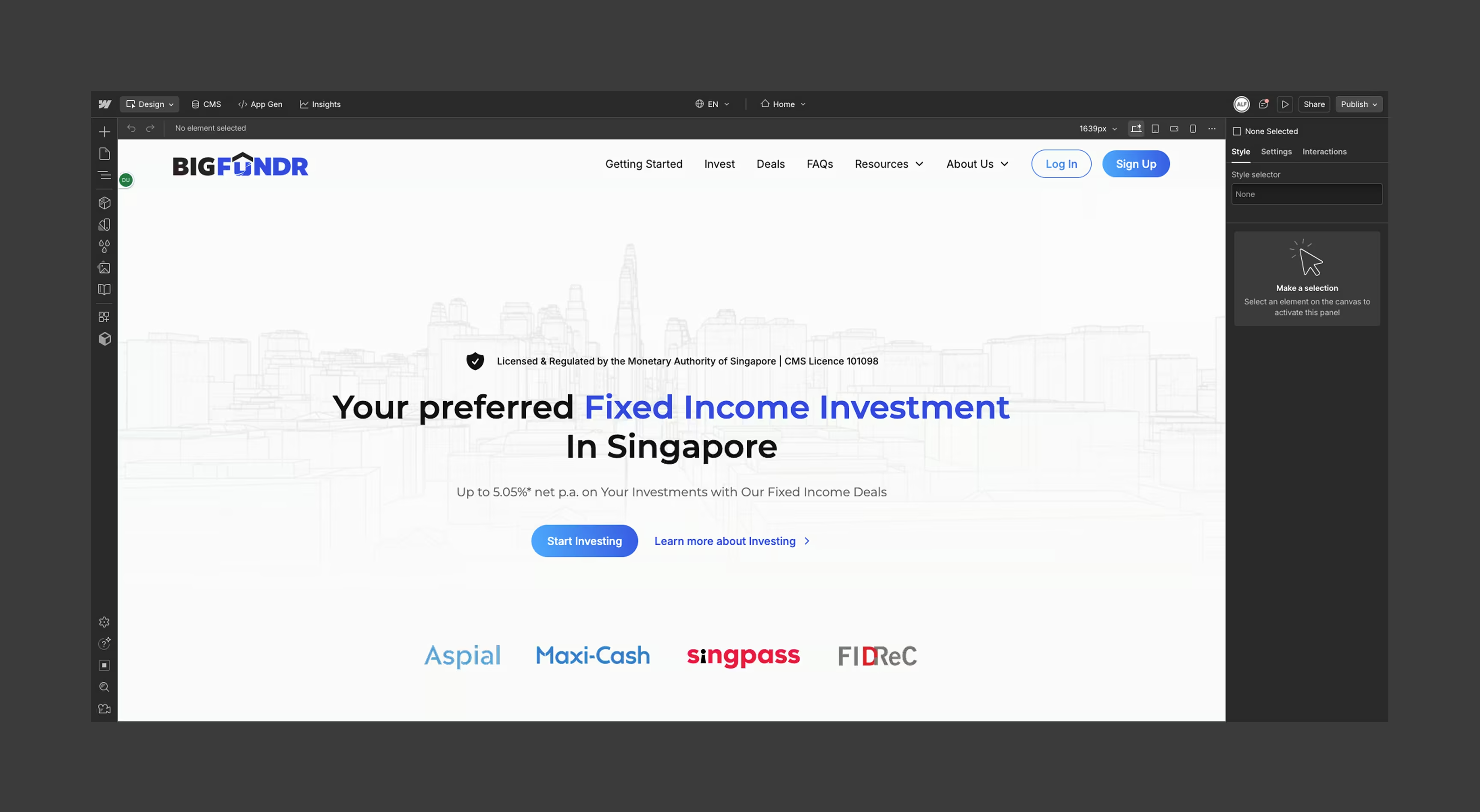

BigFundr’s previous website was built on Odoo, a system designed for ERP, not marketing flexibility.
Every small content change required developer involvement — slowing down campaigns, limiting SEO agility, and frustrating the marketing team.
The user experience was rigid and didn’t reflect the trust and clarity needed for a fintech platform.
We began with stakeholder workshops to understand user needs, brand positioning, and platform limitations.
From there, we redesigned the site architecture and created responsive, user-friendly layouts in Figma.
Collaborating closely with BigFundr’s brand agency, we translated those designs into a Webflow build using the Client-First framework — empowering their team to easily update content, launch new pages, and maintain visual consistency.
Post-launch, BigFundr saw a 51% increase in organic traffic, a 75% boost in engagement rate.
Their marketing team now has full autonomy to manage the site — resulting in faster campaigns, better investor communication, and a fintech presence built for scale.
UX Research & Analysis
UX Strategy Workshop.
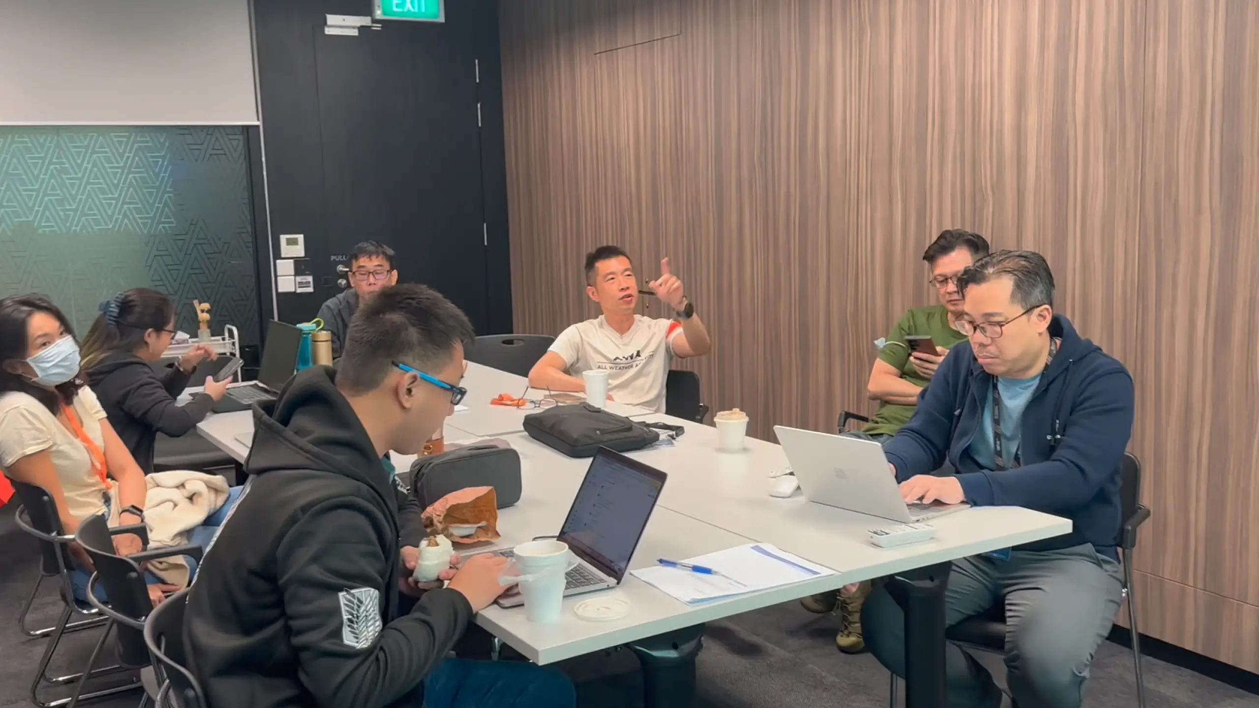
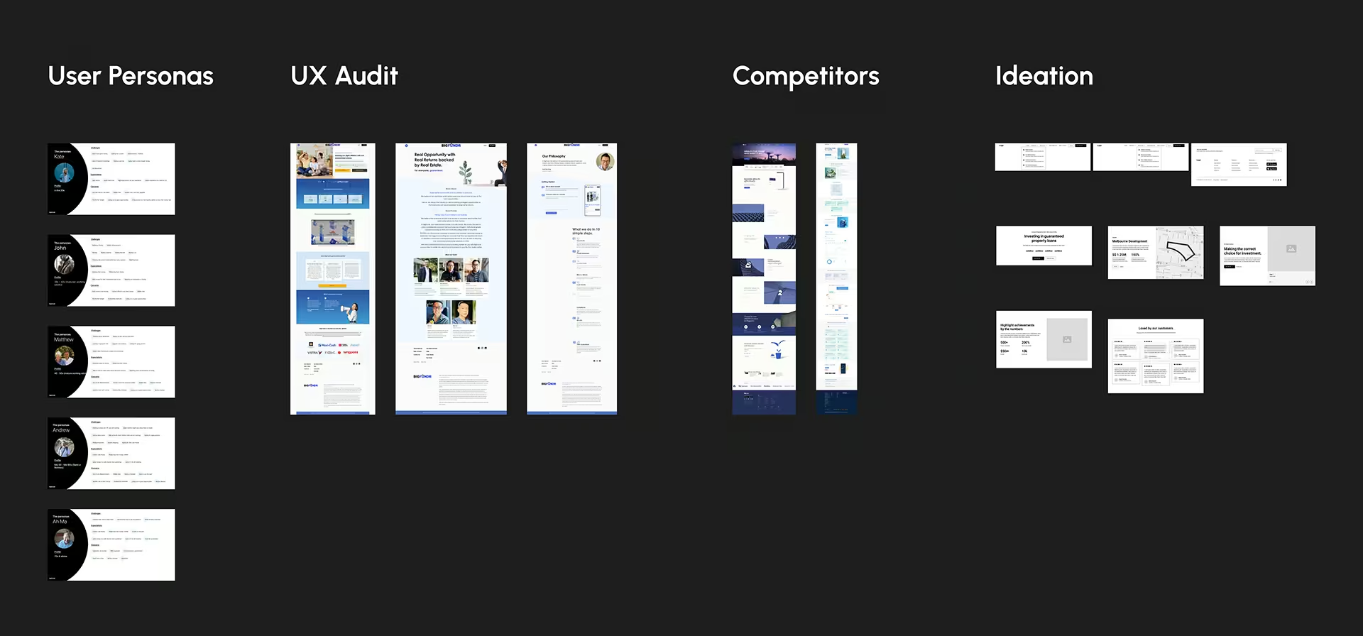
We kicked off the project with a collaborative UX strategy workshop involving BigFundr’s key stakeholders. Together, we identified their target audience personas, mapped out user pain points, and explored behavioural patterns, needs, and preferences.
Following that, we conducted a comprehensive website audit of their existing Odoo site to evaluate what was working and what wasn’t. This allowed us to highlight gaps in usability, content structure, and navigation.
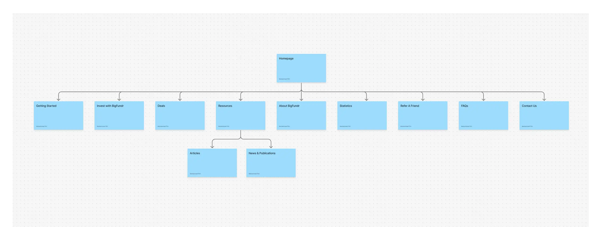
The workshop concluded with the development of a clear and purposeful information architecture. This foundation ensured our redesign would align with both business goals and user expectations setting the stage for a user-centric, results-driven website.
UX/UI Design
UI Design in Figma.
With the UX strategy in place, we moved into the UI design phase — starting with low-fidelity wireframes in Figma to outline layout, flow, and hierarchy. These early mockups served as a collaborative tool to validate structure before moving into detailed visuals.
We held weekly design reviews with BigFundr’s team, both online and on-site to ensure consistent feedback and alignment. Their brand agency was also involved in these sessions to ensure our copywriting and visual direction matched the brand’s tone and voice.
By creating an open feedback loop early in the design process, we ensured every iteration reflected BigFundr’s business goals, investor needs, and brand identity.

Branding + UX Design
Collaboration with Brand Partners.
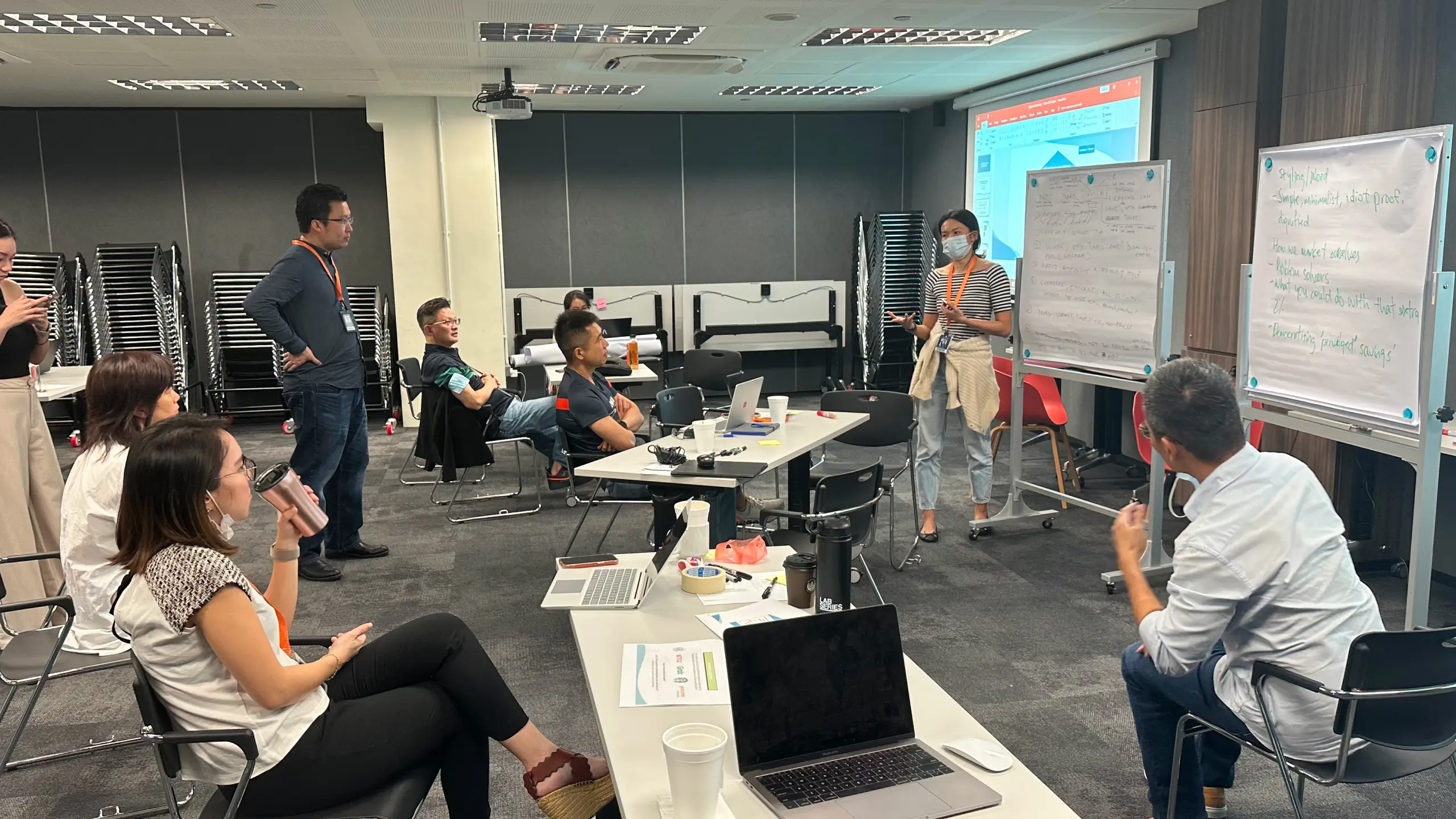
To ensure full alignment, our team participated in BigFundr’s brand workshop conducted by their appointed agency. This allowed us to deeply understand their brand positioning, messaging, and tone of voice.
From there, our designers applied the brand guidelines thoughtfully to the UI mockups — enhancing visual consistency while adding creative touches that elevate the overall user experience.
We’re comfortable collaborating with our clients’ partners, whether it's a brand agency or marketing team, to deliver cohesive, high-quality results across every touchpoint.

Webflow Development
From Figma to Functional in Half the Time.
With final mockups approved, we transitioned to Webflow to bring the designs to life — precisely, efficiently, and without writing a single line of code.
Using the Client-First design system, we ensured a structured, scalable build that matched every pixel of the Figma designs. This approach allowed us to cut development time by more than half while maintaining design integrity and responsiveness across all devices.
Throughout the process, BigFundr’s marketing team remained involved — collaborating on content, reviewing live previews, and providing real-time feedback. This seamless workflow empowered both teams to move fast, stay aligned, and launch with confidence.

Your business growth starts here.
Let us review your website, identify what’s holding it back, and guide you with honest, data-driven solutions — so you can focus on growing your business while we handle your digital presence.