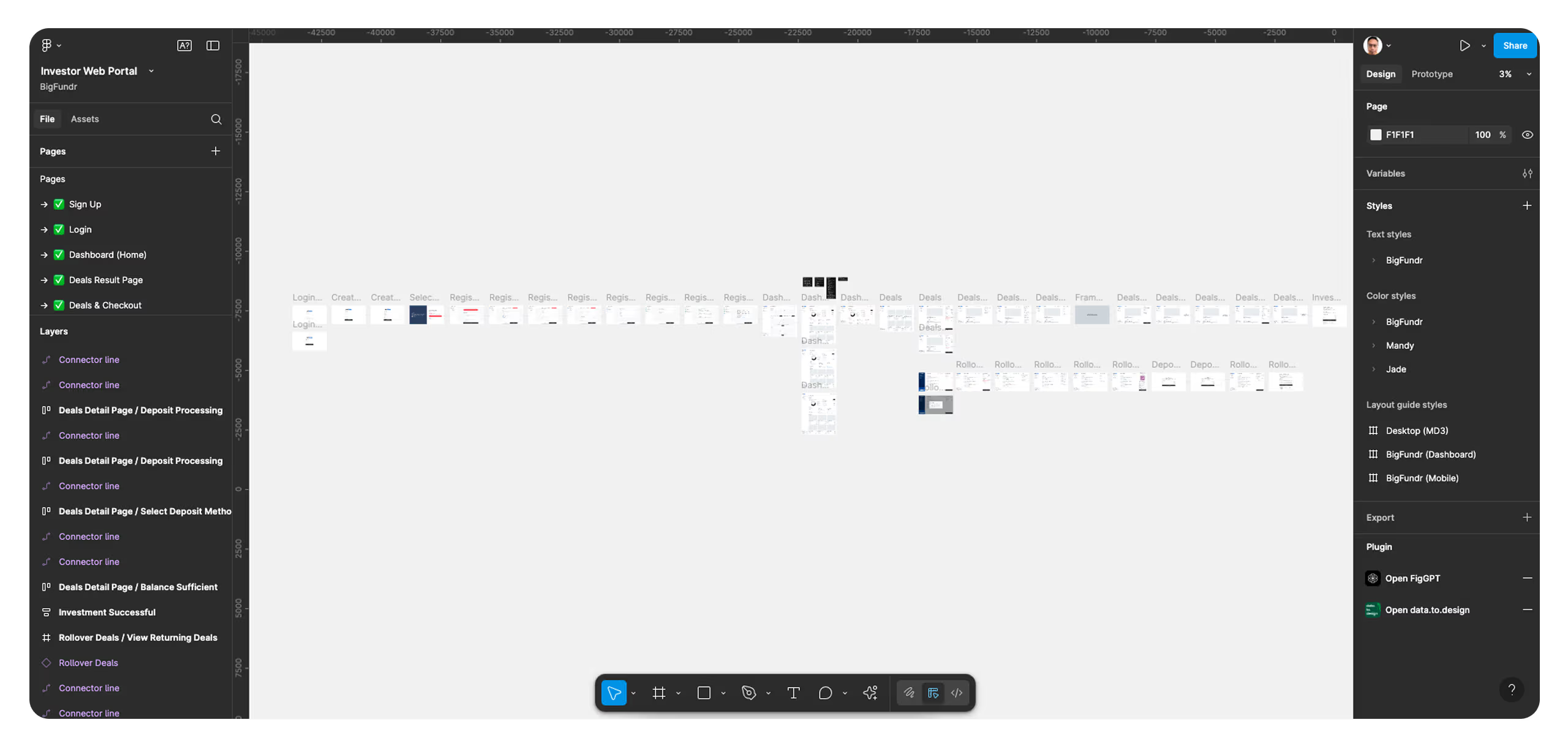
Redesigning BigFundr’s Investment Portal for Better UX and Growth


BigFundr approached us to redesign their existing investment platform after uncovering critical issues through analytics and user feedback.
Their data showed a high drop-off rate during the signup process, while customer interviews revealed frustrations around the platform’s usability. These usability pain points led to a decline in overall customer satisfaction and impacted user trust in the product.
To address these issues, we took a ground-up approach — re-evaluating the entire user journey and starting fresh. We conducted in-depth user research to identify friction points and aligned our UX strategy with both stakeholder goals and business needs.
Collaborating closely with BigFundr’s tech team, we also accounted for backend constraints to ensure design feasibility and development clarity.
The redesign significantly improved the platform’s performance. By streamlining the signup flow and addressing key usability issues, we saw a marked increase in completed signups post-launch.
With a more intuitive and user-friendly investment portal, BigFundr also reported a boost in investor engagement and a stronger conversion rate across campaigns.

UX Research
Why UX Matters in Product Design.
UX strategy workshops play a crucial role in shaping the foundation of a successful product.
They help uncover key user pain points, clarify user needs and expectations, and align all stakeholders on business goals.
Most importantly, these sessions allow us to prioritise which features or modules should be rolled out first.
With this clarity in place, we can better scope the project, allocate resources efficiently, and dive into detailed design work with a clear direction.

Sign Up UX
Less Friction = Conversions.
User surveys revealed a common frustration — the signup process was too lengthy, and most users didn’t have their information readily available.
Through further research, we discovered that 90% of BigFundr’s investors had experience with other investment platforms and were familiar with using Singpass for secure logins.
To address this, we simplified the signup flow by integrating Singpass, allowing users to autofill their details with a single click. This reduced friction and significantly improved the onboarding experience.

Dashboard UX
Designing a User-Friendly Dashboard.
During our UX workshops and user research, we learned that a large portion of BigFundr’s investors are aged between 40 and 50.
While many of them are familiar with other local investment platforms, they still expressed the need for some guidance—especially when navigating a new system.
To support this, we designed a clear, step-by-step dashboard experience that walks users through key actions, ensuring confidence and ease of use at every stage of their investment journey.

Payment Gateway UX
Secure, Seamless Payments.
Investors should be able to fund their accounts with confidence and ease.
To deliver on this, BigFundr integrates directly with DBS Bank via a secure API, allowing users to deposit funds into their investment wallet without relying on third-party gateways.
This not only streamlines the payment process but also reduces security risks — ensuring every transaction is safe, regulated, and trusted.
By offering flexible payment options backed by a major local bank, BigFundr reinforces user trust while providing a smooth, frictionless funding experience.


Your business growth starts here.
Let us review your website, identify what’s holding it back, and guide you with honest, data-driven solutions — so you can focus on growing your business while we handle your digital presence.