Sign-Up Form Design Best Practices: How to Build Forms Users Actually Complete
Discover proven UX principles behind high-converting sign-up forms — from field labels to trust signals and mobile design.
Table of contents
Sign-up forms are one of the most conversion-critical touchpoints on any website. Yet they are among the most under-designed. This guide covers the essential best practices for sign-up form design — from writing benefit-led titles and positioning field labels correctly, to building trust with microcopy, designing for mobile, and crafting a post-submission state that keeps users engaged. Whether you are building a newsletter subscription, an account creation flow, or a free trial registration on Webflow, these principles will help you reduce abandonment and convert more visitors into subscribers and users.
What Is a Sign-Up Form — and Why Does Its Design Matter?
A sign-up form is any form that asks a user to register, subscribe, or opt in — whether that is for a newsletter, a product account, a free trial, an event, or a membership. It is one of the first genuine exchanges between a business and a potential customer: the user offers their information, and the business offers something in return.
That exchange sounds simple. In practice, it is the moment where most businesses quietly lose people.
Unlike a checkout form — where the user has already committed to a purchase — or a contact form where the user has a specific problem they want to solve, a sign-up form sits at a moment of low commitment and high scepticism. The user has not yet decided. They are still weighing whether handing over their email address, their name, or their phone number is worth whatever you are offering.
That psychological dynamic shapes everything about how a sign-up form should be designed. Every field, every label, every button, every word of microcopy either tips the user towards completing the form or gives them a quiet reason to close the tab.
At ALF Design Group, we work on sign-up and onboarding forms regularly as part of our UX/UI design engagements, and the same patterns appear every time. The forms that convert are rarely the most visually sophisticated. They are the ones that make the user feel confident, comfortable, and clear about what they are getting into.
This guide breaks down the best practices we apply — and the mistakes we see most often.
How Sign-Up Forms Fit Into Your Broader Form UX Strategy
Before diving into the specifics of sign-up form design, it is worth understanding where this fits in the larger picture.
Sign-up forms are one of several form types your website likely uses — alongside contact forms, checkout forms, enquiry forms, and application forms. Each type operates at a different moment in the user journey and carries different psychological weight.
Our broader Form UX Best Practices guide covers the universal principles that apply across all form types: field reduction, label placement, validation behaviour, mobile input, and button copy. If you have not read that yet, it is a useful foundation.
This article focuses specifically on what makes sign-up forms different — the psychology of low-commitment opt-ins, the role of trust signals, and the design patterns that are unique to registration and subscription flows.
The Psychology of a Sign-Up Moment
Understanding why users abandon sign-up forms is more useful than any checklist. Most abandonment does not happen because the form is broken. It happens because of friction — real or perceived — at a moment when the user was never fully committed to begin with.
There are three questions running in a user's mind when they encounter a sign-up form:
Is this worth it? They are assessing whether the value of signing up — the newsletter, the free trial, the account — justifies the effort and the data they are being asked to provide. If that value is not clear from the form itself, doubt sets in immediately.
Is this safe? They are evaluating whether they trust you with their information. Will they receive spam? Will their email be shared? Will they be bombarded with sales calls? These concerns are often unspoken, but they are always present — particularly for users who have been burned before.
How much effort is this? They are making a fast, often subconscious calculation about how much work the form requires. Every additional field adds to the perceived cost. So does a confusing label, a broken mobile layout, or an unclear CTA.
Great sign-up form design addresses all three questions before the user has to ask them.
Sign-Up Form Design Best Practices
1. Write a Form Title That Leads With Value, Not Action
The title of your sign-up form sets the entire frame for the exchange that follows. Most businesses default to generic, action-led titles that describe what the user is doing rather than what they are getting.
Compare these:
- "Sign Up for Our Newsletter" ← describes the action
- "Get Weekly Web Design Insights — Free" ← describes the benefit
The second version answers the user's first implicit question — Is this worth it? — before they have even looked at the fields. That single change can meaningfully improve completion rates without touching anything else on the form.
A strong sign-up form title has three qualities. It is specific about what the user will receive. It is honest about frequency, format, or commitment level. And it eliminates ambiguity — the user should never have to wonder what they are signing up for.
Examples that work well:
- "Get our weekly UX tips — straight to your inbox"
- "Start your free trial — no credit card required"
- "Join 3,000+ designers who read our monthly playbook"
- "Subscribe for exclusive Singapore web design insights"
Notice that the last example works in a local reference naturally, without forcing it into the title. That is the right balance for a business like ALF Design Group — locally anchored when relevant, but never at the expense of clarity.
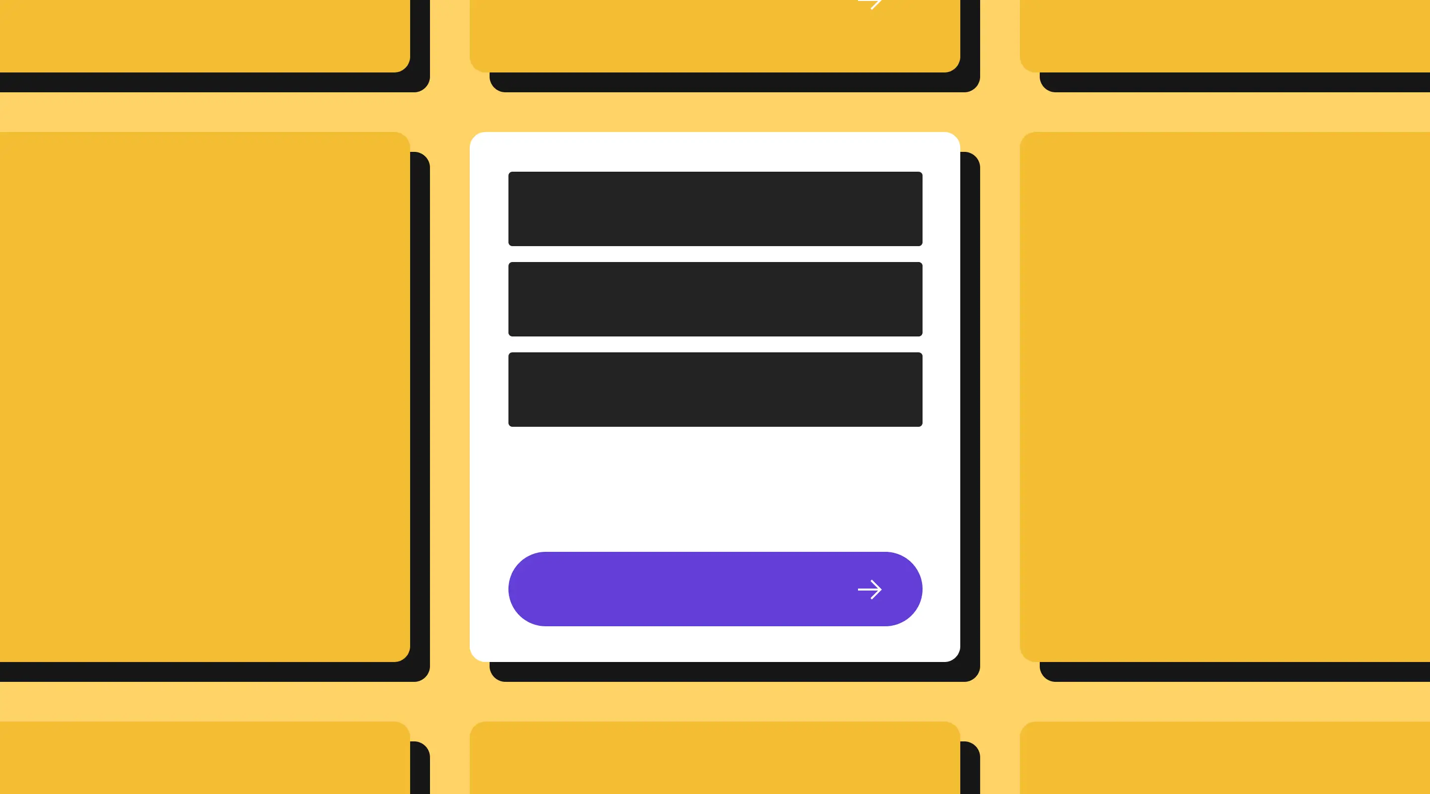
2. Position Field Labels Above Every Input — Never Rely on Placeholders Alone
This is one of the most well-documented issues in form UX, and it remains one of the most common mistakes on live websites.
Placeholder text — the grey hint text that sits inside an empty field — disappears the moment a user begins typing. On a form with more than two fields, this creates a genuine usability problem: users who pause mid-form to check their work have no reference for what a field was asking. They are forced to delete their input, read the placeholder, and retype. On mobile, where cognitive load is already higher, this friction is even more pronounced.
There is also an accessibility dimension. Placeholder text typically renders at lower contrast than standard input text, which means it fails WCAG 2.1 AA contrast requirements for a significant portion of users with visual impairments.
The correct approach is straightforward: place a persistent, clearly worded label above every input field. Placeholders can still be used for format hints — for example, showing name@company.com in an email field to indicate the expected format — but they should never be the primary label.
For sign-up forms specifically, label wording matters too. "Email Address" is clearer than "Email". "First Name" is clearer than "Name". Small distinctions, but they reduce hesitation.
3. Ask Only for What You Genuinely Need Right Now
Every additional field on a sign-up form increases the perceived effort of completing it. Research consistently shows that reducing form fields improves completion rates — and for sign-up forms operating at a low-commitment moment, this effect is amplified.
The question to ask about every field is not "would this information be useful?" — it almost certainly would. The question is: "Do I need this right now, in order to deliver what I have promised?"
For a newsletter sign-up, you need an email address. You might optionally want a first name for personalisation. You almost certainly do not need a phone number, a company name, a job title, or a country of residence at this stage.
For an account creation flow, you need the minimum required to create the account and authenticate the user. Additional profile information can be collected during onboarding, once the user has experienced some value and is more willing to engage.
This principle is called progressive profiling — collecting information gradually over multiple interactions rather than front-loading everything into a single form. It is particularly effective for SaaS products, subscription services, and membership platforms, where the relationship with the user develops over time.
For Singapore-based businesses with a regional audience, progressive profiling also makes localisation easier: you can ask for location-specific preferences — language, market, currency — after sign-up, when context makes the question feel more natural.
4. Use Single-Column Layouts, Especially on Mobile
Multi-column form layouts are a persistent design temptation. They appear to save vertical space, and on a large desktop screen, two columns of fields can look balanced and compact. In practice, they create more problems than they solve.
Multi-column forms disrupt the natural reading flow. Users scan forms top-to-bottom, not left-to-right, and a two-column layout forces the eye to make lateral jumps that slow down completion. Fields positioned side-by-side also imply an equivalence that is often misleading — a first name field and a last name field are genuinely parallel, but most other pairings are not.
On mobile, multi-column layouts become actively harmful. Fields become narrow and difficult to tap accurately. Labels truncate. The keyboard obscures more of the form. Errors are harder to read. All of this creates friction at the exact moment when mobile users — who are often filling in forms one-handed, in transit, with divided attention — need the least possible friction.
Single-column forms are almost always the right choice for sign-up flows. They are easier to scan, easier to complete on any device, and easier to validate correctly. The only genuine exception is tightly paired inputs — such as day and month fields in a date picker, or area code and phone number — where the relationship between fields is so clear that adjacency actually helps.
When designing for mobile specifically, also ensure that touch targets are large enough (a minimum of 44px height per field is the standard), that spacing between fields is generous enough to prevent accidental taps, and that the keyboard dismissal behaviour is handled cleanly.
5. Trigger the Right Keyboard for Each Field
This is a small but highly practical best practice that makes a meaningful difference on mobile devices — and it requires nothing more than using the correct HTML input type for each field.
When a user taps an email field, they should see a keyboard that includes the @ symbol and .com shortcut. When they tap a phone number field, they should see a numeric keypad. When they tap a password field, characters should be masked by default.
These behaviours are controlled entirely by the type attribute on each input element:
- Email fields:
input type="email" - Phone fields:
input type="tel" - Password fields:
input type="password" - Numeric inputs:
input type="number"
On Webflow, these input types can be set directly in the form field settings without any custom code. There is no reason not to implement this on every sign-up form — it reduces friction for mobile users and signals that the form has been thoughtfully designed.
It is also worth enabling browser autofill where appropriate. For sign-up forms, allowing the browser to autofill name and email fields removes a significant portion of the typing burden for returning users. The autocomplete attribute controls this behaviour and is supported across all major browsers.
6. Add Trust Signals at the Point of Doubt
The moment just before a user clicks the submit button is the most psychologically loaded moment of the entire sign-up process. This is when doubt peaks. The user is about to hand over their information and they have one last opportunity to reconsider.
Most businesses address this concern through a footer privacy policy that nobody reads. Effective sign-up form design addresses it at the exact point where doubt occurs — directly beneath the email field, adjacent to the submit button, or woven into the microcopy of the form itself.
Trust signals for sign-up forms fall into three categories:
Privacy reassurance — short, specific statements that address the user's concern about spam or data sharing. "No spam. Unsubscribe anytime." is more credible than "We respect your privacy" because it is specific and actionable. "We send one email per week" is even better because it sets a concrete expectation.
Social proof — references to the size or quality of your existing audience that demonstrate others have already made this decision. "Join 3,000+ designers" or "Read by web teams across Singapore and Southeast Asia" both function as low-key endorsements without feeling manipulative.
Commitment framing — language that reduces the perceived cost of signing up. "Cancel anytime", "No credit card required", and "Free forever" all work by removing an anticipated obstacle before the user has to confront it.
Place these signals close to the submit button — not in a footer, not in a separate section, but physically adjacent to the action the user is about to take. Proximity matters because the reassurance needs to be present at the exact moment the decision is made.
7. Design Constructive, Human Error Feedback
Error messages on sign-up forms are a surprisingly high-leverage area. Users who encounter an error mid-form are already invested — they have started the process, they have entered information, they have a reason to complete it. A poorly designed error message can break that momentum entirely.
The most common mistake is vague, accusatory error copy. "Invalid input" tells the user nothing. "You have not entered your email" is technically accurate but reads as blame. Both create frustration without helping the user move forward.
Constructive error feedback does three things: it acknowledges what went wrong, it explains why if that is not obvious, and it tells the user clearly how to fix it.
Compare:
- ❌ "Invalid email address"
- ✅ "Please enter a valid email address — for example, name@company.com"
Or for a password field:
- ❌ "Password does not meet requirements"
- ✅ "Your password needs at least 8 characters and one number"
Tone matters too. Sign-up forms are often a user's first interaction with your brand. Error messages that are human, friendly, and helpful set a positive tone for the relationship — even when something has gone wrong.
On Webflow, custom error messages can be configured per field. There is no reason to leave the default browser validation messages in place.
Colour-coding also helps: green for validated inputs, red (or amber) for errors. Pair colour with an icon — a tick or a warning symbol — so the feedback is accessible to users who cannot distinguish colours reliably.
8. Consider Social Sign-Up — But Offer It as a Choice, Not a Default
Sign-up via Google, LinkedIn, or Apple removes almost all of the typing friction from the registration process. For mobile users especially, being able to authenticate with a single tap rather than typing an email address and creating a password is a significant usability improvement.
For B2B audiences, LinkedIn sign-up has an additional benefit: users are less likely to enter disposable email addresses, which improves the quality of your subscriber or user base. For consumer products, Google sign-up is typically the most widely adopted option.
However, social sign-up is not universally appropriate. In contexts where users may prefer privacy — financial services, health platforms, or sensitive professional tools — the implicit data-sharing association of social login can reduce trust rather than build it. Some users are simply uncomfortable with the idea that signing up with Google gives that platform visibility into their activity.
The right approach is to offer social sign-up as an option alongside a traditional email path, with both options clearly labelled and neither visually dominant over the other. A clean presentation might show Google and LinkedIn buttons above a divider labelled "or continue with email", with the email form below.
Never remove the email option entirely. There will always be users who prefer it, and removing it creates an unnecessary barrier.
9. Design the Post-Submission State as Carefully as the Form Itself
The moment after a user submits a sign-up form is consistently one of the most neglected in web design. Most forms default to a generic "Thank you" message — or worse, a blank page refresh — and miss an opportunity to reinforce the user's decision and set the tone for the relationship.
A well-designed post-submission state does three things.
First, it confirms success clearly. The user needs to know their submission was received. This sounds obvious, but silent form submissions — where nothing visibly changes — are more common than they should be and reliably cause confusion and duplicate submissions.
Second, it sets expectations for what comes next. "Check your inbox — your first edition lands every Tuesday" tells the user exactly what to expect and when. "We will be in touch within 24 hours" does the same for a trial sign-up. Concrete expectations reduce post-submission anxiety and increase the likelihood that the user will actually open your first email.
Third, it offers an immediate next step. The user has just indicated genuine interest in what you offer. That is the highest engagement moment in the entire journey. A relevant article, a free resource, a short onboarding prompt, or a link to your most popular content all capitalise on that moment. Leaving the user on a static confirmation screen is a missed opportunity.
On Webflow, custom success states can be designed directly within the form component, giving you full control over what the user sees after submission.
How We Design Sign-Up Forms at ALF Design Group
At ALF Design Group, sign-up and registration forms are almost always part of a broader UX/UI design engagement rather than a standalone deliverable. We approach them as conversion touchpoints within a wider user journey — designed to work with the surrounding page context, the CRM integrations downstream, and the onboarding experience that follows.
We build all of our client forms in Webflow, which gives us significant advantages in this area. Webflow's native form builder supports custom input types, real-time validation styling, custom success states, and direct integration with tools like HubSpot, Mailchimp, and Zapier. For more complex sign-up flows — multi-step onboarding, conditional logic, or personalised follow-up sequences — we integrate via Zapier or custom embed.
If you are working on a sign-up form and are not getting the conversion rates you expect, the issue is almost always in one of three areas: the value proposition in the title, the number of fields being asked for, or the trust signals adjacent to the submit button. Start there before touching anything else.
You can also read our related guides on Form UX Best Practices, Contact Form UX Mistakes That Cost You Enquiries, and Checkout UX Best Practices for a complete picture of form design across different contexts.
FAQs: Sign-Up Form Design
How many fields should a sign-up form have?
For most sign-up forms, two fields — email address and optionally first name — are sufficient. Every additional field increases abandonment risk. Collect further information progressively after sign-up, once the user has experienced some value from your product or service.
Should I use placeholder text or field labels?
Always use persistent labels above your fields. Placeholder text disappears when the user starts typing and fails accessibility contrast requirements. Use placeholders only for format hints, never as a replacement for labels.
What is the best way to reduce sign-up form abandonment?
The three highest-impact changes are: reducing the number of fields to the minimum viable ask, adding trust microcopy adjacent to the submit button (such as "No spam. Unsubscribe anytime."), and ensuring the form works smoothly on mobile. These three changes alone address the most common causes of abandonment.
Should I offer social sign-up options like Google or LinkedIn?
Social sign-up reduces friction significantly, particularly on mobile, and is worth offering for most products. However, always provide a traditional email option alongside it. In privacy-sensitive contexts — finance, health, or professional tools — make the email path equally prominent.
What should happen after a user submits a sign-up form?
The post-submission state should confirm success clearly, set expectations for what comes next (including timing), and ideally offer an immediate next step such as a relevant resource or onboarding prompt. Never leave users on a blank or generic confirmation screen.
Does sign-up form design differ for Singapore businesses?
The core UX principles are universal, but localisation matters in a few specific areas. Trust signals may need to reflect local data privacy expectations. Language preference options (English, Mandarin, Malay) can be relevant for broader audience reach. And for B2B sign-ups, referencing Singapore or Southeast Asia in the form title or microcopy can increase relevance and click-through for a local audience.
What is the difference between a sign-up form and a lead generation form?
Sign-up forms are typically for self-service opt-ins — newsletters, accounts, free trials — where the user immediately receives access to what they signed up for. Lead generation forms are usually for higher-commitment actions — booking a consultation, requesting a quote, downloading a resource — where a human follow-up is expected. The design principles overlap significantly, but lead gen forms carry more trust weight and often benefit from more explicit reassurance about what happens after submission.
Conclusion
A well-designed sign-up form is not just a lead capture mechanism — it is the first experience a user has of how your brand treats them.
Forms that convert are not necessarily the most visually impressive. They are the ones that make the user feel that signing up is easy, safe, and worth their time. They communicate value before asking for anything. They ask only for what is genuinely needed. They reassure the user at the moment of doubt. And they treat the post-submission state as the beginning of a relationship, not the end of a transaction.
At ALF Design Group, we design sign-up and onboarding forms as part of our broader UX/UI design and web design services — built in Webflow, integrated with your CRM, and tested against real user behaviour. If your sign-up form is underperforming, we are happy to take a look.
{{build-better-experience="/directory"}}
First Published On
November 17, 2023
Categories
Written By
.webp)
Resources
Related Articles
Deep dive into our latest news and insights.