Landing Page Optimisation: The Complete Guide to Higher Conversions
Actionable landing page optimisation strategies to reduce bounce rates, boost conversions, and improve ROI for your business.
Table of contents
Landing page optimisation is the discipline of improving a single-purpose page's design, copy, and structure so a higher share of visitors complete one specific action, whether that is submitting a form, booking a call, or making a purchase. The highest-leverage levers, roughly in order of impact, are message match between your ad and headline, a benefit-led above-the-fold section, one clear call-to-action, credible social proof, fast load times, and a mobile-first layout. None of this is a one-time build. The pages that convert well are the ones tested and revised on a regular cycle, not published once and left alone.
What Is Landing Page Optimisation?
Landing page optimisation means treating a single-purpose page, one goal, one audience, zero distractions, as a system you keep improving rather than a design you finish once. Unlike a homepage or a blog post, a landing page has no menu to browse and no unrelated content competing for attention. Every element on it exists to move the visitor toward one action.
Done well, landing page optimisation:
- Increases conversion rate without increasing traffic spend
- Improves Quality Score in paid campaigns, which lowers your cost per click
- Builds credibility through visible trust signals
- Creates a coherent path from ad click to conversion
- Generates data that improves every future page you build
I think of a landing page less as a finished piece of design and more as a conversion mechanism you are allowed to keep tuning. The version you publish on day one should never be the version still live a year later.
Why Landing Page Optimisation Matters
The Real Cost of an Unoptimised Page
Every visitor who leaves without converting is money spent for nothing. If your paid landing page converts at 2% when a stronger version could hit 6%, you are discarding two-thirds of that budget on traffic that never had a real chance to convert.
According to Unbounce's Conversion Benchmark Report, the median landing page conversion rate across industries sits at 6.6%, with the top 10% of pages converting above 11%. That gap between median and top performers is almost entirely down to optimisation, not traffic quality.
Businesses that invest in improving pages they already have consistently see a better return than businesses that simply buy more clicks. Fixing what is broken is cheaper than outrunning it with spend.
Singapore's Market Makes This Non-Negotiable
Singapore has one of the highest smartphone penetration rates in Southeast Asia, and mobile traffic dominates most campaigns I look at. A landing page that is not fast, thumb-friendly, and visually clean loses the majority of its audience before the headline is even read.
Singaporean buyers are also comparison-driven. They respond to specific, verifiable credibility signals, real local testimonials, recognisable logos, outcomes stated in numbers, rather than generic claims. The UX/UI design work my team and I do is aimed squarely at that problem: turning design decisions into measurable conversion gains, not just a page that looks clean.
Before You Optimise: Define Your Goal and Your Audience
Every decision downstream, headline, layout, CTA, form length, depends on answering two questions first: what is the one action you want this visitor to take, and who exactly is arriving on this page?
Skipping this step is the single most common reason optimisation efforts stall. Businesses try to capture a lead, drive a sale, and grow an email list on the same page, and the result converts nothing particularly well. Pick one goal, a form submission, a call booking, a demo request, a purchase, and build every other decision in service of it.
Your audience answer shapes tone and depth. A visitor arriving from a retargeting ad already knows your brand and needs a shorter page. Someone clicking a cold search ad for the first time needs more context and more trust-building before they will convert. For Singapore audiences specifically, local references and local client examples do more work than generic global copy, regardless of which stage of awareness the visitor is at.
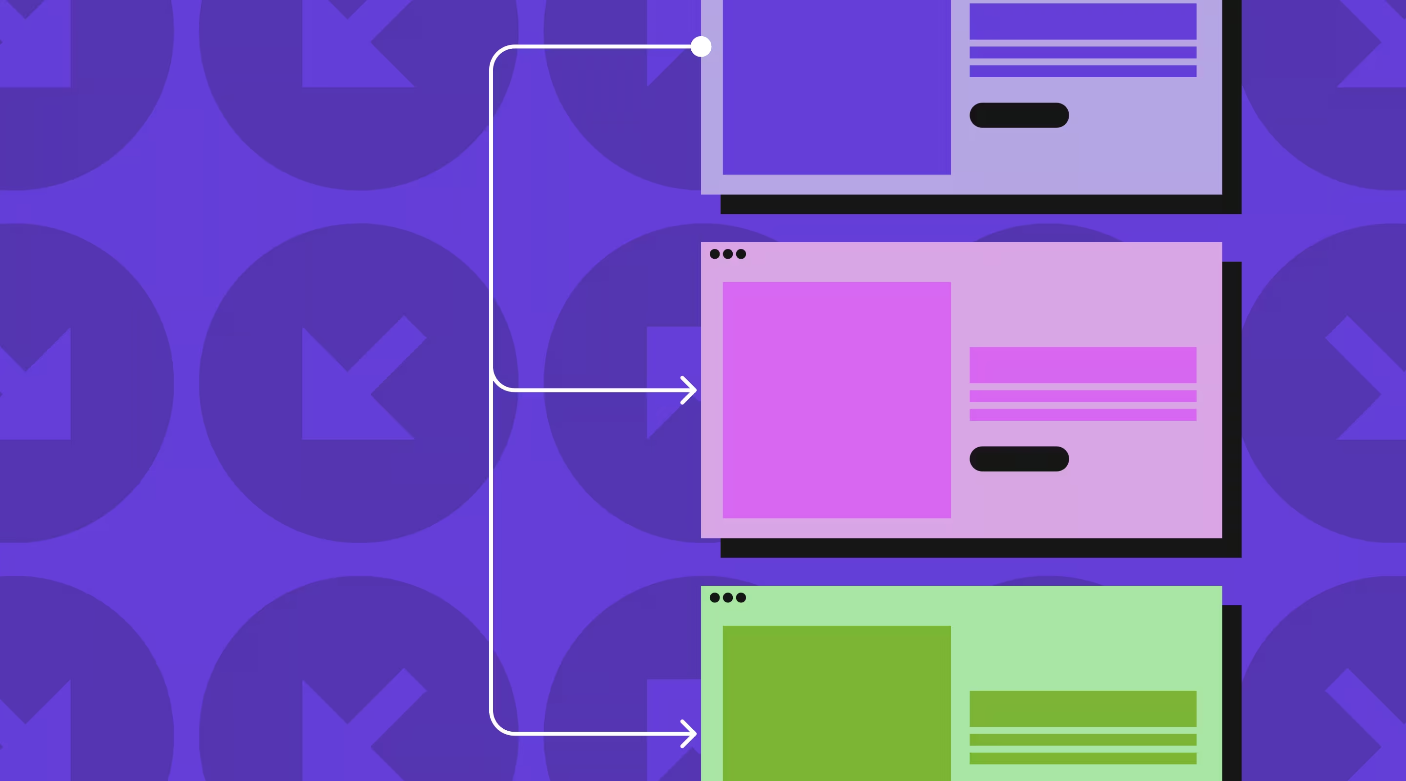
Structuring Your Page Layout
Most high-converting landing pages follow a version of this order, though not every page needs every section:
A simple lead-magnet page might only need the hero, one benefit statement, and a form. A considered, high-ticket service page usually needs the full sequence. Match the structure to how much convincing the decision actually requires, not to a template.
Landing Page Optimisation Best Practices
1. Align Your Message With Your Ad (Message Match)
The single biggest driver of high bounce rates is a mismatch between what an ad promised and what the page delivers. If an ad reads "Free Website Audit for Singapore SMEs" and the page opens on a generic homepage, the visitor leaves within seconds.
Your headline needs to mirror the promise that brought the visitor there:
- Paid traffic: match your headline to your ad copy, close to word for word
- SEO traffic: align your H1 with the search query you are targeting
- Email traffic: reflect the specific hook from the subject line
A useful headline formula: primary benefit, plus specific outcome, plus a differentiator or context. "Get More Qualified Leads Without Increasing Ad Spend" does more work than "Grow Your Business Today" because it is specific enough to be falsifiable.
2. Get the Above-the-Fold Section Right
Visitors decide whether to stay within three seconds, before scrolling. Everything needed to make that decision has to be visible immediately: a headline stating the core benefit, a subheadline adding specificity, a CTA that is visually unmissable, and one trust signal. I go deeper on this specifically in best practices for designing a hero section for SaaS websites.
3. Write Copy That Sells Outcomes, Not Features
The most common copy mistake is describing what a product does instead of what it changes for the customer. "Includes automated email sequences" is a feature. "Save five hours a week while automated emails nurture your leads" is an outcome, and outcomes are what get read.
Keep copy scannable: short paragraphs, bullet points, subheadings. Most visitors skim rather than read, so structure for skimming, not for a complete read-through. Landing page copywriting tips that convert has the full framework if you want to go deeper on this specifically.
4. Design a CTA That Earns the Click
Your CTA is the point the entire page is built to reach, yet it is frequently the weakest element on it. A CTA that works:
- Uses action language tied to outcome: "Get My Free Quote", not "Submit"
- Stands out with genuine colour contrast against its background
- Appears above the fold and repeats further down the page
- Is tested rather than assumed: small wording changes move conversion meaningfully
Motion or animation on a CTA can help draw the eye, but only if it is doing that job specifically. I would rather see a static button with the right copy and contrast than an animated one that is decorative and slows the page down.
5. Build Trust With Specific Social Proof
Trust, more than design polish, is what moves a Singapore buyer from considering to converting. Vague praise does not do this. "Great service" converts far less than a testimonial naming the result: "ALF Design Group rebuilt our Webflow site in three weeks and our lead volume doubled the following month."
Client counts, project counts, and specific named case studies all outperform generic trust badges when the specifics are real and checkable.
6. Reduce Friction in Every Form
Every additional form field is a reason not to finish. Ask only for what the next step in your funnel actually requires, name and email is often enough at first contact, and defer company size or budget to a later conversation.
Label fields above the input rather than inside it as placeholder text, validate inline rather than after submission, and use a single column on mobile. Form UX best practices and single-step vs multi-step forms cover the detail.
7. Treat Page Speed as a Conversion Requirement
According to Google's mobile bounce rate research, the probability of a mobile bounce is 32% higher once load time moves from one second to three, and 90% higher at five seconds. Speed is not a technical afterthought, it is a direct lever on conversion rate.
Compress images, serve them in modern formats like WebP, strip unused JavaScript and CSS, and use a CDN. Webflow includes a global CDN by default, which removes one variable from this list before you have written a line of code. How to optimise your website's speed has the full technical checklist.
8. Design Mobile-First
With mobile traffic dominant in Singapore, a landing page has to work flawlessly on a small screen before it is considered finished on desktop. Build for mobile first and expand outward, rather than shrinking a desktop design down. Minimum tap targets of 44px, body text no smaller than 16px, no hover-dependent interactions, and forms that are genuinely comfortable to complete on a touchscreen keyboard. Mobile landing page optimisation for Singapore SMEs has the localised checklist.
9. Remove Navigation and Other Exit Points
A standard navigation bar on a landing page hands visitors five to ten ways to leave before they have converted. If the goal is one action, every additional link works against it.
For paid campaign pages specifically: remove the main navigation, remove footer links, remove anything that is not the CTA. This is sometimes called the attention ratio, the number of links on a page relative to the number of conversion goals, and for a landing page that ratio should sit close to 1:1.
10. Use Visual Cues Deliberately
Design can direct a visitor's eye toward your CTA without them noticing it is happening: size contrast, colour contrast, generous whitespace, a person's gaze in a photo pointed at the headline or button.
This is one area where I would push back on adding more rather than less. A cleaner page with two or three deliberate visual cues consistently outperforms a busier one with five competing decorative elements. If a design choice is not earning its place by directing attention somewhere useful, it is working against the page, not for it.
11. Test, Learn, and Iterate
No landing page converts optimally on the first attempt. A/B testing splits traffic between two versions of a page to determine which performs better, and it is the only reliable way to know rather than guess. Headlines, CTA copy, hero visuals, form length, and social proof placement are all worth testing, roughly in that order of impact. Our complete guide to landing page A/B testing covers methodology, tools, and how to read results without fooling yourself.
Common Mistakes That Undermine Optimisation Efforts
The mistakes I see most often are not complicated: targeting more than one goal on a single page, burying the CTA below the fold, skipping the post-click thank-you page, and going months without testing anything. Each one is straightforward to fix once identified, which is exactly why leaving them unfixed is such an avoidable cost. Landing page optimisation mistakes to avoid breaks down all ten in detail, with how to audit for each one.
Choosing the Right Tools
The right stack makes optimisation faster and more reliable, but it does not need to be complicated. For building the page itself, I recommend Webflow for the control it gives you over design and SEO without needing a developer for every change, though dedicated builders like Unbounce or Instapage suit teams that need to launch fast and test natively. For measuring what is actually happening, GA4 covers conversions and traffic sources, and a heatmapping tool like Hotjar shows you where attention drops off.
Set Up Tracking Before You Launch
A page with no tracking is a page you cannot improve, only guess about. Before publishing, confirm four things are live: a GA4 conversion event for your primary goal, UTM parameters tagging every traffic source, a heatmapping tool capturing sessions from day one, and your ad platform's conversion pixel firing correctly if you are running paid campaigns.
Whatever you collect in the first few weeks becomes the baseline your first round of tests measures against. Skip this step and your first optimisation cycle is working blind.
How to Prioritise Your Optimisation Efforts
If you are starting from limited time or resources, prioritise by impact relative to effort:
Landing Page Pre-Launch Checklist
Before any landing page goes live, run it against this list:
Landing Page Optimisation for Singapore Businesses
The core principles above apply everywhere, but a few factors are specific to Singapore:
- Tone: direct, benefit-focused copy in standard English performs better than overly casual language, particularly in B2B contexts
- Local payment signals: mentioning PayNow, PayLah, or local bank transfer options reduces hesitation at the point of commitment
- MAS compliance: financial services pages need clearly visible disclaimers, which functions as both a legal requirement and a trust signal
- Mobile by default: this is not an enhancement here, it is the baseline given how the market browses
- Local proof: testimonials and case studies from recognisable Singapore clients carry more weight than international examples alone
Frequently Asked Questions
How do I measure my landing page's conversion rate?
Conversion rate is the number of conversions divided by total visitors, multiplied by 100. If 1,000 people visit and 40 complete your form, that is a 4% conversion rate. GA4 or your landing page platform's built-in analytics will track this automatically once your conversion event is set up correctly.
What is a realistic conversion rate benchmark for a Singapore B2B landing page?
Benchmark data shows considered-purchase categories like financial services performing well above the general median, so a Singapore B2B lead generation page converting at 5 to 8% with proper optimisation is a realistic target, not an underperforming one, even though some marketing content quotes 10%+ figures that actually reflect high-intent event or free-trial pages. Context and industry matter more than a single benchmark number.
How long does it take to see results from landing page optimisation?
Simple fixes, message match, a clearer CTA, added social proof, can show measurable movement within days if you have reasonable traffic volume. Statistically valid A/B test results typically need two to four weeks of data collection, depending on how much traffic the page receives. Treat early wins as a starting point, not a finish line.
Do you design and optimise landing pages for businesses in Singapore?
Yes. At ALF Design Group, I lead UX-driven landing page work for businesses across Singapore and the wider region, combining research, conversion-focused design, and ongoing testing rather than a one-off build. If you would like a second opinion on a page that is not converting, get in touch and we will take a look.
Conclusion
If you are looking at your own landing page right now, start with an honest answer to one question: does it have a single, unmistakable goal, or is it quietly asking visitors to do three things at once? That answer alone usually points to your biggest opportunity.
From there, pick two or three fixes from this guide rather than attempting all of them simultaneously. Message match and CTA clarity tend to move the needle fastest and cost the least to implement. Set up tracking before you touch anything else, so you can actually measure whether a change worked rather than assuming it did.
If you would rather have someone audit the page and build the testing roadmap with you, that is the kind of work I do.
{{build-better-experience="/directory"}}
Categories
Written By

Resources
Related Articles
Deep dive into our latest news and insights.

.webp)