
Improve Your Sidebar Design for Web Apps
This post explores how good UX (user experience) principles can elevate your sidebar design from an afterthought to a powerful navigation tool.
Sidebar navigations has been a loyal companion on websites, especially on SaaS (Software-as-a-Service) websites. They offer a constant presence to guide your users on their journey.
Sidebars are a fundamental part of web design, serving as a primary navigation tool that can significantly impact the user experience. A well-designed sidebar not only enhances usability but also contributes to the overall aesthetic of your website. In this article, we'll explore essential aspects of sidebar navigation design and how we redesigned this sidebar navigation below.
Understanding Your Sidebar Navigation
Before diving into the specifics, it’s crucial to understand the role of your sidebar. A sidebar typically contains navigation links, but it can also host additional elements such as search bars, social media links, call-to-action buttons, and more. When designing a sidebar, consider your site's purpose and the needs of your users. Is your website content-heavy, requiring a detailed navigation structure? Or is it more straightforward, necessitating only a few key links?
Understanding the context will guide the design process and help you make informed decisions.
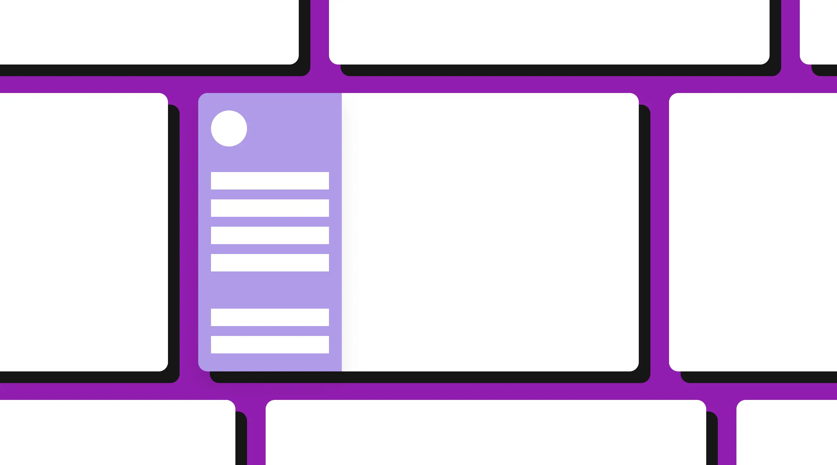
Listed below is an example of a sidebar that might need some redesign.
The common factors that we discovered here is the
- Lack of visual hierarchy
- Underwhelming/linear design
We will go through a step by step process on how to improve this sidebar navigation.

1. Visual Alignment
Visual alignment in a sidebar is about ensuring that all elements are consistently placed and aligned.
This not only improves the aesthetic appeal but also enhances readability and navigation. Use grids and guides to align text, icons, and other elements.
Consistent spacing between items, proper padding, and margins can make the sidebar look neat and organized. Pay attention to alignment from both a horizontal and vertical perspective to maintain balance and order.

2. Sizing
The size of your sidebar should be proportional to the rest of your website’s layout. It shouldn't dominate the page, nor should it be so small that it becomes difficult to use.
The width of the sidebar should be sufficient to accommodate its content comfortably, without causing text or icons to be cramped. Consider responsive design principles, ensuring that the sidebar adjusts appropriately across different devices and screen sizes. A flexible design can provide a seamless experience whether users are on a desktop, tablet, or smartphone.
Not everything has to be huge.
- Changing the font size to a default size (16px, 1em/rem)

3. Visual Enhancement
Establishing a clear visual hierarchy is crucial for effective sidebar navigation.
This involves organizing content in a way that guides users' attention to the most important elements first. Use typography, color, and spacing to create distinctions between primary and secondary items. For example, main navigation links could be bold and larger, while sub-links are smaller and lighter. Icons can also help differentiate sections and add a visual cue to the navigation flow.
The goal is to make it intuitive for users to find what they're looking for without having to think too much.

4. Adding Details
Detailing refers to the finer aspects of your sidebar design that can enhance usability and aesthetics.
This includes the use of hover effects, active states, and subtle animations that provide feedback to users. For instance, changing the background colour of a link when hovered over or clicked can indicate interaction.
Adding tooltips or brief descriptions to icons can improve accessibility and clarity. Additionally, incorporating elements like dividers between sections, shadows, and gradients can add depth and dimension to the sidebar, making it more visually engaging.

Conclusion
Improving your sidebar navigation design requires a thoughtful approach to each of these elements.
By understanding the purpose of your sidebar, aligning elements visually, sizing appropriately, establishing a clear visual hierarchy, and paying attention to details, you can create a sidebar that is both functional and aesthetically pleasing. Remember, a well-designed sidebar not only enhances the user experience but also reflects the overall quality and professionalism of your website.
{{build-better-experience="/directory"}}
.webp)
Related Articles
How to Maintain Your Webflow Website Like a Pro
Keep your Webflow site sharp with this pro guide; covering DIY tasks, SEO, and expert help.

SEO and UX: How to Build a Website That Ranks and Converts
Find out why UX and SEO should work together. This guide explains how user experience impacts rankings and what it means for websites in Singapore.

How to Conduct a Usability Audit: A Step-by-Step Guide for Better User Experiences
Step-by-step usability audit guide for UX improvements and better Webflow experiences.
Launch Your Next Website.
Schedule a call with us if you think that we can help you. The least we can do is to give you good advice.