Best Practices for Website Search Design: A UX Guide
Discover how to improve UX with best practices for website search design, tailored for Webflow and UX teams in Singapore.


Table of contents
According to Semrush, approximately, there are about 5.9 million Google searches per minute. That is a whopping number.
Site search is one of the most overlooked yet powerful tools in a website’s UX strategy. Whether you're running a content-rich blog, an e-commerce store, or a corporate platform, your website search design can dramatically improve engagement, retention, and conversions.
As a leading Web Design Agency in Singapore, we’ve helped countless clients elevate their user experience through smart UX/UI and Webflow integrations. In this article, we’ll dive into the best practices for website search design, complete with local insights for Singapore brands and businesses.
Why Website Search Design Matters
Did you know that users who perform a search on your website are 2–3 times more likely to convert than those who don’t? According to Baymard Institute, nearly 70% of site search experiences fail to meet users' expectations due to poor relevance, lack of filters, or confusing UI. That means a well-designed search experience is no longer optional.
Real Use Cases Where Search Design Matters:
- E-Commerce (e.g. Shopee, Lazada): Fast, predictive search is key to reducing drop-offs
- Content-heavy platforms (e.g. government websites, legal sites): Search help users find deep content without navigating multiple menus
- Educational or SaaS platforms: Enables users to find help documents, product features, or tutorials quickly.
Best Practices for Effective Website Search Design
1. Make Search Visible and Easy to Find
Search bars should be placed where users intuitively expect them:
- Top right corner on desktop layouts
- Front and centre on content-heavy or e-commerce homepages
- Use a magnifying glass icon universally recognised across cultures
On mobile, ensure the search icon is thumb-accessible, usually near the bottom navigation
2. Use Expandable and Smart Search Fields
Instead of static input boxes, consider using expandable search fields that grow when clicked. This keeps your layout clean while prioritising usability.
Best Practice:
- Set the default search input to 30-40 characters
- Use subtle animations to indicate interactivity
3. Enable Auto-Suggestions and Typo Tolerance
Nothing frustrates users more than getting no results because of a typo.
Solutions:
- Use fuzzy matching (e.g. "web desing" > "web design")
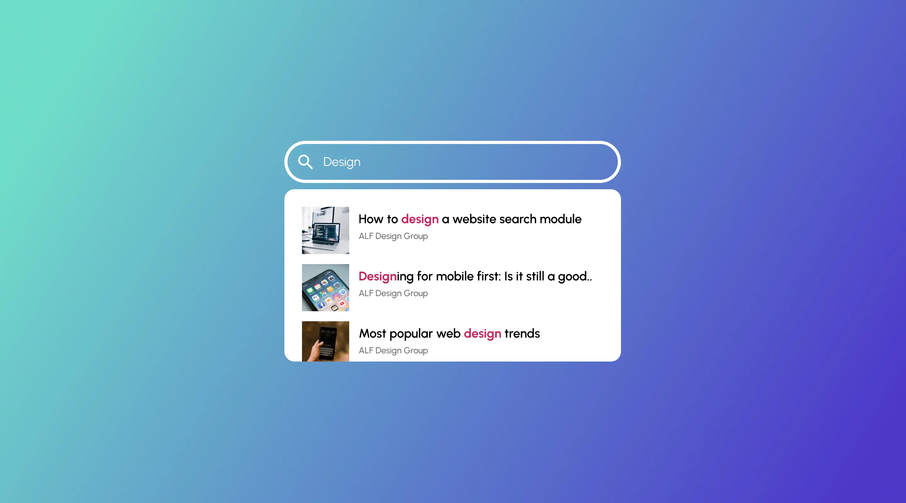
- Offer auto-suggestions from your product titles, blog posts, or popular queries
Platforms like Algolia and Jetboost are excellent for Webflow-based autocomplete setups
4. Design Thoughtful Empty States
When no results are found, don’t let your user hit a dead end.
Instead, show:
- Suggested results or related categories
- A friendly message (e.g. "No results for 'x' — but check these out!”)
- A CTA to browse categories or contact support
5. Incorporate Filters and Categories
Especially in content-heavy or ecommerce websites, filters drastically enhance search accuracy.
Example: A user searching for "portfolio" on a Webflow agency site should be able to filter by project type, industry or year
Best UI element for filters:
- Checkboxes for categories
- Toggle buttons for status (available, out of stock, etc)
- Price sliders or dropdowns for advanced research
6. Index the Right Content
Make sure your CMS and search indexing include:
- Blog posts
- Product pages
- Help documents
- Page meta titles and descriptions
In Webflow, use Search Settings
7. Design for Mobile First
Singapore's mobile-first population expects intuitive search experiences.
Key Tips:
- Make the search bar collapsible
- Enable swipe gestures to dismiss search
- Optimise load times for search results
8. Track and Optimise Search Analytics
Use tools like:
- Google Analytics Site Search reports
- Jetboost Search insights (for Webflow)
Monitor:
- Top searched queries
- Zero-result queries
- Click-through rates from results
Use this data to create better content, improve product names, or update keywords.
Real World Inspiration: IKEA and Shopee
IKEA Singapore
Their prominent, centre-aligned search bar is expandable and instantly filters through categories like “Furniture”, “Storage”, or “Lighting”.

Shopee
Mobile-optimised with keyword tags, trending suggestions, and even emojis that improve recall.

Takeaway: Learn from leaders but adapt based on your audience and content structure.
Common Mistakes in Website Search UX
- Hiding the search bar in a hamburger menu
- Not handling empty queries
- Showing too many irrelevant suggestions
- Inconsistent styling between results and the rest of the website
FAQs About Website Search Design
How do I implement site search in Webflow?
Use the native Webflow Site Search component, enhanced with Jetboost or Finsweet for filters and live search features.
What’s the best search bar position for e-commerce?
Top-centre for homepages, top-right for inner pages—always visible.
How do I track what users are searching for?
Enable site search tracking in Google Analytics. For Webflow users, combine it with Jetboost insights or Plausible Analytics.
Should I show results as users type?
Yes. Live results or autocomplete improve UX significantly, especially on mobile.
What is the best UI for empty search results?
A friendly message, a search tips list, and links to popular pages or categories.
Conclusion: Don’t Let Search Be an Afterthought
Search is more than a utility — it’s a strategic experience. If you’re building or redesigning your site with Webflow, remember: search UX can make or break your site’s performance.
At ALF Design Group, we specialise in Webflow development, UX/UI design, and building seamless search experiences for brands across Singapore and Southeast Asia.
Need help improving your search design? Let’s schedule a discovery call.
{{build-better-experience="/directory"}}
Resources
Related Articles
Deep dive into our latest news and insights.

.webp)

