Case Study: Designing BigFundr's Website in Webflow
How ALF redesigned BigFundr's fintech website — from UX research to Webflow — with measurable results.
Table of contents
When BigFundr — a Singapore-regulated property-backed investment platform — approached ALF Design Group in early 2024, the brief was clear: they had a strong product but a digital experience that did not reflect it. As a MAS-licensed fintech, trust, clarity, and usability were not optional design considerations — they were commercial prerequisites. Users were arriving, not understanding what BigFundr offered, not seeing the compliance signals that would make them comfortable to invest, and leaving without converting. This case study documents the full redesign engagement: the user research that identified the trust gap, the UX strategy that resolved it, the Figma-to-Webflow build process, and the measured outcomes at six weeks post-launch. The results — a 42% increase in conversions, 31% growth in mobile engagement, and a 22% reduction in bounce rate — reflect what happens when UX strategy and Webflow execution work together on a product that genuinely serves its audience.
A UX, Webflow, and Fintech Transformation Story
When BigFundr — a fast-growing Singapore investment platform offering property-backed notes — reached out in early 2024, the brief was straightforward but the challenge was not. They had a genuinely strong product: a MAS-regulated investment platform offering asset-backed notes with transparent returns. What they did not have was a website that communicated that strength clearly enough to convert new investors.
As a regulated fintech under the Monetary Authority of Singapore, trust, clarity, and usability are not design niceties — they are survival requirements. An investor who does not immediately understand what BigFundr offers, does not see the compliance signals that make them feel safe, and cannot intuitively find the path to getting started will leave. And in Singapore's competitive investment platform market, that departure is rarely reversible.
This is how ALF Design Group redesigned their entire digital presence — from UX strategy through wireframes and visual design to a full Webflow build and measurable business impact. For the companion story of how we redesigned the BigFundr investment app, see our BigFundr app case study. For the broader strategic case for UX investment in Singapore's fintech sector, see our guide on why UX design matters for Singapore's finance and investment companies.
1. Understanding the User: The Foundation of Fintech UX
Good fintech UX starts long before screens are designed. It starts with people — specifically with an honest, research-grounded understanding of who is visiting the site, what they know when they arrive, what they need to feel confident, and what currently prevents them from taking action. BigFundr's redesign began here: with user research and persona development grounded in real investor behaviour data.
User Personas That Shaped the Direction
We worked with BigFundr's directors and internal teams to develop and refine two investor personas based on actual platform analytics, user interview insights, and behaviour data from the existing site. These personas became the north star for every design decision that followed — from content hierarchy to CTA copy to the level of financial explanation offered at each stage of the journey.
Persona 1: Young Investors (21–30)
This segment represented BigFundr's largest growth opportunity — digitally native, mobile-first, interested in growing wealth but starting with smaller capital amounts. Their defining characteristic as an audience was a lower financial literacy baseline combined with a higher trust threshold: they needed more education before they would commit, and they were quick to abandon if something felt opaque or complex.

Persona 2: Mature Investors (40–50)
This segment was more financially experienced but less digitally agile. They were seeking stability and predictable returns rather than growth at any cost. Their friction points were different from the younger segment: not low financial literacy, but complex onboarding flows and product information that required too much cross-referencing to evaluate confidently.

These two personas had different entry points, different knowledge levels, and different conversion barriers — but a shared underlying need: they both needed to trust BigFundr before they would invest. Every design decision we made addressed that shared need, expressed differently for each segment.
2. Mapping the UX Challenges — The Trust Gap
Before designing any solutions, we spent time rigorously diagnosing the problem. Using Google Analytics data, Hotjar session recordings, heatmap analysis, and funnel drop-off mapping, we identified precisely where users were getting stuck and why. What we found was a consistent pattern that we described internally as the "trust gap" — a set of four specific questions that first-time visitors needed answered but the existing site did not answer clearly.
1. "What is BigFundr, exactly?"
Users arriving on the homepage could not immediately understand what the platform offered. The hero section communicated financial confidence but not product clarity — a common failure mode in fintech design, where marketing instincts toward aspiration conflict with users' need for literal, immediate comprehension. An investor who does not understand the product in the first ten seconds will not invest in the next ten minutes.
2. "Can I trust this platform?"
Fintech onboarding anxiety is real and justified — users are being asked to commit real money to a digital platform they have just discovered. The existing site had trust signals but they were not prominent enough, not specific enough, and not sequenced correctly in the user journey. Users encountered them too late, after their scepticism had already formed rather than before it could take hold.
3. "Is this MAS-licensed?"
For Singapore investors, MAS licensing is the single most important compliance signal — the equivalent of a financial institution's equivalent of a safety rating. The existing site mentioned MAS licensing but not in a way that was immediately visible or prominently reassuring. Users who specifically looked for this information found it; users who did not know to look for it did not find it. For a regulated fintech, this is a material credibility gap.
4. "How do I actually get started?"
Even users who understood the product, trusted the platform, and saw the compliance signals could not confidently identify the first step. The user journey was not guiding first-time visitors with the progressively committed series of micro-decisions that builds investment confidence — it was presenting the full product simultaneously, requiring users to self-navigate rather than feeling guided.
These four gaps shaped every strategic and design decision that followed. For the broader framework of how UX signals affect user trust in digital products, see our guide on top UX signals that influence AI search rankings.
3. UX Strategy: Designing for Trust, Simplicity and Clarity
With the trust gap clearly mapped, our UX strategy had four corresponding objectives: make the value proposition immediately legible, surface trust signals before anxiety can form, make MAS compliance unmissable, and guide users through a progressively committed journey rather than presenting everything at once.
A. Trust-Building at First Click
We redesigned the homepage hero to answer three questions in the first visible screen, without scrolling: what BigFundr does, why it is safe, and how to get started. The redesigned hero included a clear, jargon-free value proposition in plain English; MAS licensing badges placed prominently alongside asset-backed security indicators; media features from recognisable Singapore financial publications; and a "How It Works" CTA that provided a low-commitment onramp for users not yet ready to register.

The principle: users should not have to search for trust signals. Trust should be the first thing they encounter, not something they discover after their scepticism has already set in.
B. Designing for Clarity and Control
Finance overwhelms users quickly — particularly users at the lower end of the financial literacy spectrum. Our content strategy deliberately avoided financial jargon wherever plain language could communicate the same information. Modular content blocks broke investment concepts into digestible steps rather than presenting the full product architecture simultaneously. Accordions and tooltips gave users control over how much detail they engaged with — offering deeper explanation on demand without cluttering the primary information hierarchy.
The goal was to make investing feel simple, transparent, and approachable — without misrepresenting the complexity of the product. Clarity is not simplification; it is structure.
C. Mobile-First UX for a Mobile-First Audience
Analytics showed that over 60% of BigFundr's users browsed via mobile — a figure that aligned with Singapore's broader mobile-first digital behaviour. Yet the existing site had been designed desktop-first, with mobile treated as a secondary viewport rather than the primary experience. We inverted this: the mobile layout was designed first, with navigation structured specifically for thumb reach, CTAs sized and spaced for reliable touch interaction, and component weight reduced to ensure fast load times on mobile networks.
D. Micro-Interactions That Inspire Confidence
In fintech, the details that make a platform feel premium are often the smallest ones. Micro-interactions — hover states that confirm interactive elements, smooth loading transitions that signal performance, modal explanations that keep users in context rather than redirecting them, subtle animations aligned with BigFundr's brand tone — all contributed to an experience that felt responsive, intentional, and trustworthy. These are not cosmetic additions; they are the signals that communicate to users, at an instinctive level, that the platform behind the website is well-built and professionally operated.
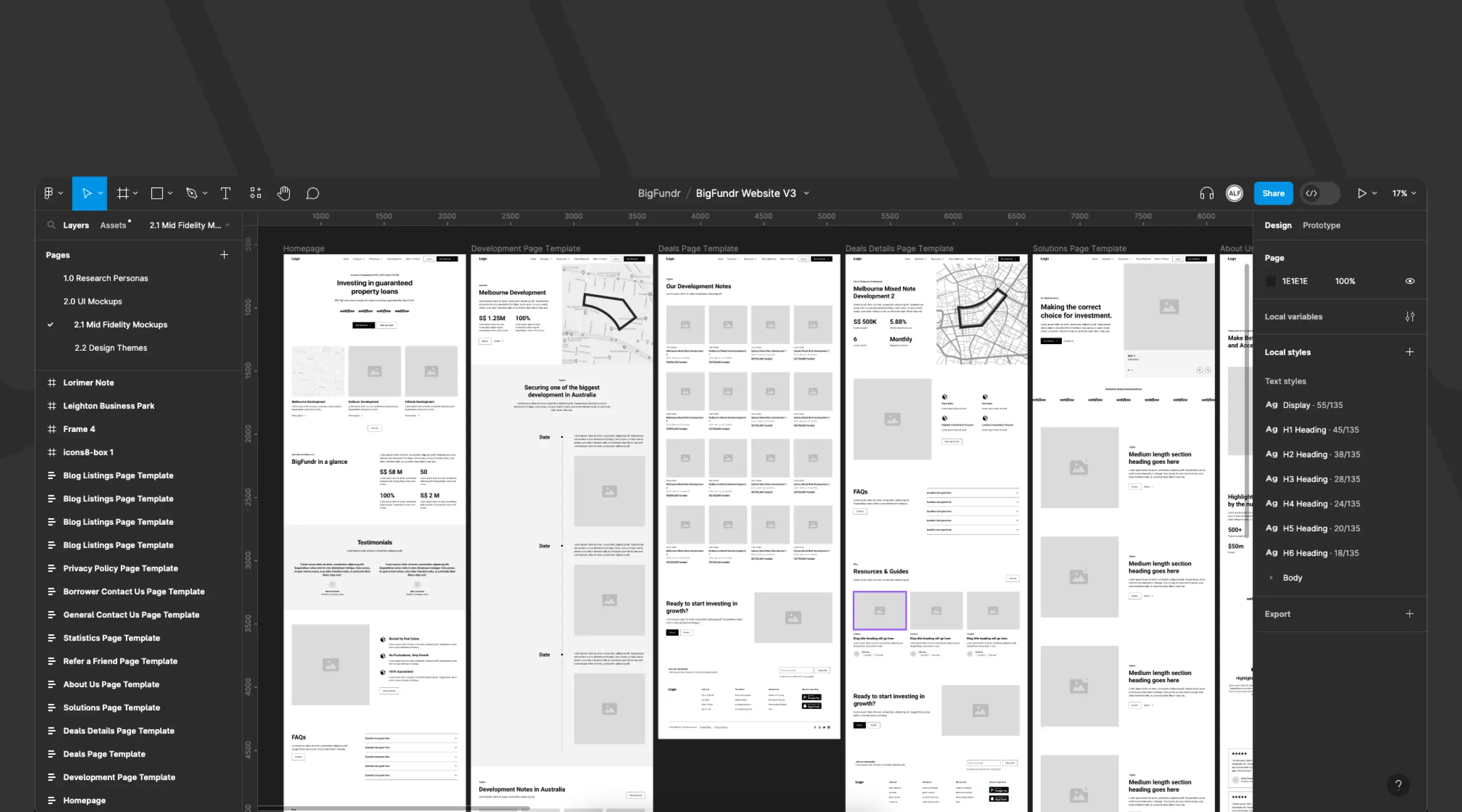
4. Wireframes to Webflow: Bringing the Website to Life
A. Wireframing the Experience in Figma
With the UX strategy defined, we moved into wireframing — building the structural blueprint of the new site in Figma before committing to any visual design decisions. Wireframes served three purposes on this project: they aligned BigFundr's directors and marketing team on the proposed information architecture before visual design investment was made; they allowed us to test the content hierarchy against the four trust gap questions and validate that the proposed structure resolved each one; and they provided a concrete artefact for stakeholder feedback that separated structural decisions from aesthetic ones, preventing the two from conflating in review discussions.
The wireframes focused on homepage clarity as the primary concern, followed by simplified investment listing pages, educator-style content blocks that built product understanding progressively, strong CTA placement at each stage of the investor journey, and trust-building elements positioned above the fold on every key page.
B. Exploring Three Visual Directions
Rather than presenting a single visual direction, we developed three distinct design themes for BigFundr to evaluate — a practice that prevents the design process from becoming a negotiation over a single option and instead creates a structured conversation about brand direction.
- Institutional and premium — dark backgrounds, gold accents, serif typography signalling traditional financial authority
- Approachable and educational — lighter palette, friendly typography, illustration-forward to reduce the intimidation factor of investment
- Modern fintech minimalism — clean whites, a strong brand colour accent, contemporary sans-serif — the direction that balanced credibility with accessibility
BigFundr selected the third direction — modern fintech minimalism — which aligned with their positioning as a technology-forward, accessible investment platform rather than a traditional financial institution.
C. Why Webflow Was the Right Platform
BigFundr's previous website had been built on Odoo — a powerful enterprise platform, but one that created a significant operational problem: every marketing update required developer involvement. In a fast-moving fintech environment where compliance requirements change, campaign landing pages need to be deployed rapidly, and FAQ content requires frequent updates, this dependency was a material constraint on the business.
We recommended a hybrid architecture: Webflow for the marketing website and Outsystems for the investment portal. Webflow gave BigFundr's marketing team direct control over their digital presence — the ability to update pages, publish blogs, modify FAQs, and adjust compliance language without any developer involvement. Outsystems provided the secure, scalable low-code environment that the investment portal's regulatory and data requirements demanded.
The practical benefits for BigFundr: lightning-fast content iterations, a robust CMS for investment listings and educational content, a strong SEO foundation through Webflow's clean HTML output and automatic sitemap generation, precise control over compliance messaging, and significantly faster iteration cycles compared to the previous Odoo setup.
5. Measurable Impact: What Changed After Launch
The redesign went live six weeks after the engagement began. The results, measured over the following eight weeks against pre-launch baseline data from the same period in the prior year, were measurable and commercially significant.
- +42% increase in conversions — investor registration completions vs pre-launch baseline
- +31% growth in mobile engagement — session duration from mobile devices
- −22% reduction in overall bounce rate — users exploring more pages per session
The conversion improvement was the direct result of three design changes working together: clearer messaging that reduced the time users needed to understand the product, improved CTA placement that eliminated the navigational uncertainty about where to go next, and trust signals prominent enough to be encountered before scepticism could form rather than after. These were not separate optimisations — they addressed the same underlying conversion barrier (the trust gap) from three angles simultaneously.
The mobile engagement growth reflected the shift to a genuinely mobile-first design. The 60%+ of BigFundr users who browsed on mobile were previously experiencing a site designed for desktop and adapted for mobile — which is a fundamentally different experience from one designed for mobile from the outset. Longer mobile sessions mean users were exploring more, reading more, and building more confidence before making a decision about registration.
The bounce rate reduction reflected improved content hierarchy across the site. Users were landing on the homepage, understanding the proposition quickly, and navigating to supporting pages — investment listings, how-it-works explanations, risk disclosures — rather than leaving immediately. This is the clearest possible signal that the information architecture was serving user intent: people were finding what they needed, so they stayed to explore it.
Beyond the traffic metrics, the operational improvement was equally significant. BigFundr's marketing team could now update compliance language, publish new investment listings, add FAQ entries, and deploy campaign landing pages without raising a developer ticket. In a regulated environment where timely communication is not optional, this autonomy was a material business capability improvement. For a deeper look at how these UX outcomes connect to the broader fintech design story, see our guide on why UX design matters for Singapore's finance companies.
6. Tools That Supported the Build
The BigFundr website was built using a focused, purpose-selected tool stack — each tool chosen for a specific function rather than for comprehensive feature coverage:
- Webflow CMS — the primary build and content management platform; enabled fast iteration, responsive design control, and marketing team autonomy post-launch
- Finsweet Attributes — extended Webflow's CMS with filtering, sorting, and complex CMS logic for investment listing display without custom code
- Figma — the full UX and UI design workflow from wireframes through high-fidelity design to prototype review with stakeholders
- Unsplash — high-quality imagery for content pages that required contextual photography without custom photography budget
- Icons8 — consistent iconography across UI elements, maintaining visual coherence across the full site
The build philosophy: use the right tool for each function, keep the stack lean, and ensure that the tools used in the build do not create ongoing technical dependencies that constrain the client's ability to operate the site independently post-launch.
Frequently Asked Questions
What makes fintech web design different from standard web design?
Fintech UX operates under three constraints that most other categories do not share simultaneously: regulatory compliance requirements that affect what can and cannot be communicated and how, a trust threshold that is significantly higher than consumer retail or professional services (users are committing real money based on digital signals alone), and an audience that spans a wide financial literacy range — from first-time investors to experienced portfolio managers — who need different levels of explanation and reassurance. The design has to communicate credibility at the expert level while remaining accessible to the novice. For the full framework, see our guide on why UX design matters for Singapore's finance and investment companies.
Why was Webflow chosen over other platforms for BigFundr?
BigFundr's previous Odoo setup required developer involvement for every marketing content update — a significant operational constraint for a fast-moving regulated fintech. Webflow resolved this by giving the marketing team direct, non-technical control over the website while maintaining the clean code output and SEO performance that the site needed. The hybrid Webflow-plus-Outsystems architecture gave BigFundr the best of both: marketing agility on the public-facing website and the regulatory-grade security of a specialised low-code platform for the investment portal. For the full comparison of why businesses choose Webflow, see why businesses prefer Webflow for website design.
How long did the BigFundr website redesign take?
The end-to-end engagement — from initial discovery and user research through persona development, UX strategy, wireframing, visual design exploration, Webflow build, QA, and launch — was completed in six weeks. This timeline reflected a focused brief, clear decision-making from BigFundr's leadership team, and a structured Figma-to-Webflow process that minimised the handoff friction between design and development phases. Projects with more complex CMS requirements, multi-locale considerations, or broader stakeholder review cycles typically require eight to fourteen weeks.
What results did the BigFundr website redesign produce?
At eight weeks post-launch, measured against the same period in the prior year: conversions (investor registration completions) increased 42%; mobile engagement (session duration from mobile devices) grew 31%; and the overall bounce rate fell 22%. The operational improvement — marketing team autonomy over content without developer dependency — was a concurrent benefit that is harder to quantify but commercially significant for a regulated business that needs to update compliance language and publish new content quickly. The investment listing management workflow that previously required developer tickets could be managed directly through Webflow's CMS.
Can ALF Design Group help other fintech or investment companies?
Yes — we have supported multiple fintech, wealth management, and financial services companies with UX strategy, Webflow development, and digital product design. The combination of UX research capability, Figma-based design process, and Webflow development expertise makes us well-positioned for regulated financial services clients who need both brand credibility and operational agility from their digital presence. If you are a Singapore fintech, investment platform, or professional services firm with a similar brief, get in touch to discuss your project.
How does the BigFundr website case study relate to the app redesign?
The website redesign and the app redesign were complementary engagements addressing different surfaces of the same investor journey. The website handled the pre-registration experience — discovery, education, trust-building, and the decision to register. The app handled the post-registration experience — the actual investment flow, dashboard navigation, and ongoing portfolio management. They shared the same design system, the same brand direction, and the same UX principles, but addressed fundamentally different user contexts. For the app side of the story, see our BigFundr investment app case study.
What should fintech companies look for in a UX and web design partner?
Three capabilities matter most for fintech specifically. First, genuine experience with regulated financial services — understanding what compliance requirements mean for content presentation, what MAS licensing signals need to communicate, and what trust signals resonate with Singapore's investment audience. Second, the ability to work at the right level of fidelity — fintech projects require research-grounded UX decisions, not assumption-driven ones. Third, technical capability that supports the operational requirements post-launch: a platform choice (like Webflow) that gives the marketing team autonomy, and a build quality that does not create ongoing technical debt. Our web design service is built around all three.
Conclusion
The BigFundr website redesign is a precise illustration of what happens when UX strategy, research-grounded design, and platform choice work together on a product that genuinely deserves a better digital presence. The trust gap we identified at the start of the engagement was not a difficult problem to solve — it was a common fintech design failure that had a clear, structured solution. The difficulty was in diagnosing it accurately enough to address the right things in the right order.
The 42% conversion improvement, the 31% mobile engagement growth, and the 22% bounce rate reduction were not the result of cosmetic design changes. They were the result of a redesign that answered the four questions first-time investors needed answered before they would commit — clearly, quickly, and with enough confidence-building specificity to turn a sceptical visitor into a registered investor.
If you are a Singapore fintech, investment platform, or financial services business with a website that is not converting the trust and product quality your business genuinely offers, speak to our team. The trust gap is almost always diagnosable — and almost always fixable.
{{build-better-experience="/directory"}}
First Published On
August 24, 2023
Categories
Written By
.webp)
Resources
Related Articles
Deep dive into our latest news and insights.