Best Practices to Design UI Cards For Your Website
A practical guide to UI card design, covering UX principles, accessibility, performance, and when card-based layouts work best.
Table of contents
A UI card is one of the most familiar — and misunderstood — patterns in modern interface design. From Shopee’s product grids to Netflix’s content carousels, cards quietly shape how users browse, compare, and decide.
In UX design, a UI card is a modular container that groups related information into a visually distinct, scannable unit. Its job is simple: help users understand content quickly and act confidently — especially in interfaces where choice overload is real.
But cards aren’t just about aesthetics. When designed poorly, they increase cognitive load, confuse hierarchy, and frustrate users. When designed well, they improve scannability, responsiveness, accessibility, and conversion.
In this guide, we’ll break down:
- What makes a UI card effective in modern web design
- When card-based design works best (and when it doesn’t)
- UX, accessibility, and performance best practices
- Mobile-first card design principles
- Card design patterns for different use cases
- How Singapore businesses can leverage cards effectively
- Common mistakes and how to avoid them
- How teams scale cards using design systems
What Is a UI Card in UX Design?
A UI card is a self-contained visual block that presents related content as a single unit — typically combining text, imagery, and interaction.
Cards are designed to:
- Be easily scanned by users who skim rather than read
- Stand alone without external external context or explanation
- Support one clear user intent or action
- Adapt fluidly across devices sizes (desktop, tablet, mobile)
Unlike traditional page sections, cards are modular by nature. This makes them ideal for grids, feeds, dashboards, and responsive layouts where content needs to adapt seamlessly across devices.
Think of UI cards as the building blocks of modern web interfaces — they're not just design elements, they're functional containers that enable better user experiences.

The Evolution of Card-Based UI
Card-based interfaces gained mainstream adoption with Pinterest's masonry layout and Google's Material Design in 2014. Since then, they've become ubiquitous across:
- Social media platforms (Facebook, Instagram, LinkedIn)
- E-commerce sites (Lazada, Shopee, Amazon)
- Content platforms (Medium, YouTube, Spotify)
- SaaS dashboards and admin panels
- Mobile applications (where cards feel native)
The reason? Cards solved a fundamental problem: how to present diverse, dynamic content in a way that feels organized yet flexible.
In Singapore's mobile-first market, where over 85% of users access websites primarily via smartphones, card-based layouts have become the de facto standard for content-heavy sites.
Why Is Card-Based Design So Popular in Modern Interfaces?
Card-based design works because it aligns with how users actually consume digital content.
People don’t read interfaces — they scan, compare, and decide.
UI cards support this behaviour by:
- Reducing cognitive load through clear grouping
- Creating predictable visual patterns
- Adapting naturally to mobile-first layouts
- Making complex content easier to digest and navigate
- Supporting both browsing and focused exploration
This is why cards dominate:
- E-commerce product listings (Shopee, Lazada, Carousell)
- Social media feeds (Facebook, Instagram, X, Threads)
- SaaS dashboards (analytics, CRM, project management)
- Content-heavy platforms (new sites, blogs, portfolios)
- Mobile applications across all categories
This is why good web design always starts with understanding how users actually consume content, and cards deliver on that understanding better than almost any other UI pattern.
When Should You Use UI Cards (And When You Shouldn’t)?
UI cards are powerful — but they're not universal. Knowing when to use them (and when not to) is critical for effective UX/UI design.
Best Use Cases for UI Cards
Cards work best when users need to:
- Browse multiple items or options simultaneously
- Compare features, prices, or attributes quickly
- Discover content progressively (endless scroll, pagination)
- Process information in bite-sized chunks
- Make quick decisions based on visual cues
Common examples:
- Product listings (e-commerce, real estate, travel)
- Blog or article feeds (content platforms, news sites)
- Analytics dashboards (SaaSproducts, admin panels)
- Feature comparison pages (pricing tables, service tiers)
- Team member profiles (about pages, directories)
- Portfolio items(design agencies, photographers)
- Event listings (conferences, webinars, workshops)
When Card-Based Design Falls Short
Cards are not ideal when:
- The page has a single, focused message
- Long-form storytelling is the priority
- You need a strong linear narrative or sequential flow
- Content depth is more important than scannability
- The experience requires deep focus (documentation, legal content)
In these cases, traditional layouts often perform better. For example, landing pages with a single conversion goal typically benefit from simpler, more focused designs rather than card grids that invite exploration.
Singapore-specific consideration: Local users expect fast, efficient interfaces. If your card layout slows down load times or creates decision paralysis, you're better off with a simpler approach.
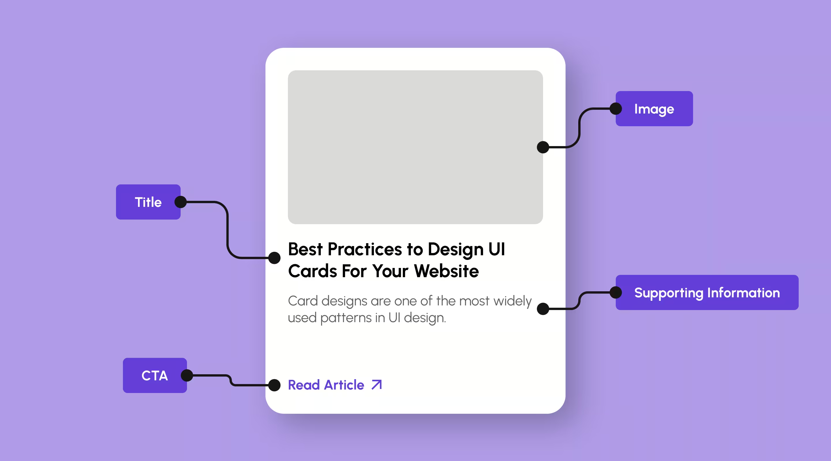
Anatomy of a UI Card (Core Elements Explained)
An effective UI card only includes what's necessary to support one action or decision. Understanding card anatomy helps you design with intention rather than decoration.
Common Elements Found in UI Cards
Visual components:
- Image or visual anchor (product photo, thumbnails, icons)
- Background colour or texture
- Border or shadow for card elevetion
- Status indicators (badges, tags, labels)
Content elements:
- Title or heading (primary information)
- Supporting text or description (context, details)
- Metadata (date, author, category, price)
- Optional tags, prices, or status indicators
Interactive elements:
- Primary CTA button or link
- Secondary actions (favourites, share, more options)
- Hover states and micro-interactions
- Selection or checkbox (for multi-seclect scenarios)
The “One Card, One Purpose” Rule
Every card should answer one question: *What should the user do next?*
Multiple competing CTAs inside a single card create friction, especially on mobile. Clarity always beats density.
Good example: Product card with single "Add to Cart" button
Bad example: Product card with "Add to Cart", "Add to Wishlist", "Compare", "Quick View" all competing for attention
When in doubt, simplify. Singapore users value efficiency — don't make them work harder than necessary to understand what action to take.
Card Hierarchy Best Practices
The visual weight of elements within your card should match their importance:
Primary (Highest weight):
- Product image or main visual
- Title/heading
Secondary (Medium weight):
- Price or key metric
- Primary CTA button
Tertiary (Lowest weight):
- Supporting description
- Metadata (dates, tags, categories)
- Secondary actions
This hierarchy should be evident through size, color, position, and contrast — not requiring users to decode your design decisions.
What Makes a UI Card Effective? (UX Principles)
Great UI cards are driven by UX fundamentals, not decoration. Let's break down the principles that separate effective cards from mediocre ones.
Visual Hierarchy & Scan Behaviour
Users typically scan cards in this order:
- Image or visual cue (processed in milliseconds)
- Title or heading (immediate context)
- Supporting information (price, metadata, description)
- CTA or interaction (decision point)
Your hierarchy should reinforce this flow, not fight it.
Implementation tips:
- Make images the largest visual element (they draw the eye first)
- Use size, weight, and color to establish clear hierarchy
- Position CTAs consistently across all cards in a set
- Avoid burying important information in dense text blocks
F-Pattern and Z-Pattern Reading
Research shows users scan content in predictable patterns:
F-Pattern (for text-heavy cards):
- Horizontal scan across the top (title)
- Shorter horizontal scan (subtitle or price)
- Vertical scan down the left side
Z-Pattern (for visual cards):
- Top-left to top-right (image + title)
- Diagonal to bottom-left (scanning)
- Bottom-left to bottom-right (CTA)
Design your card layout to work with these natural reading patterns, not against them.
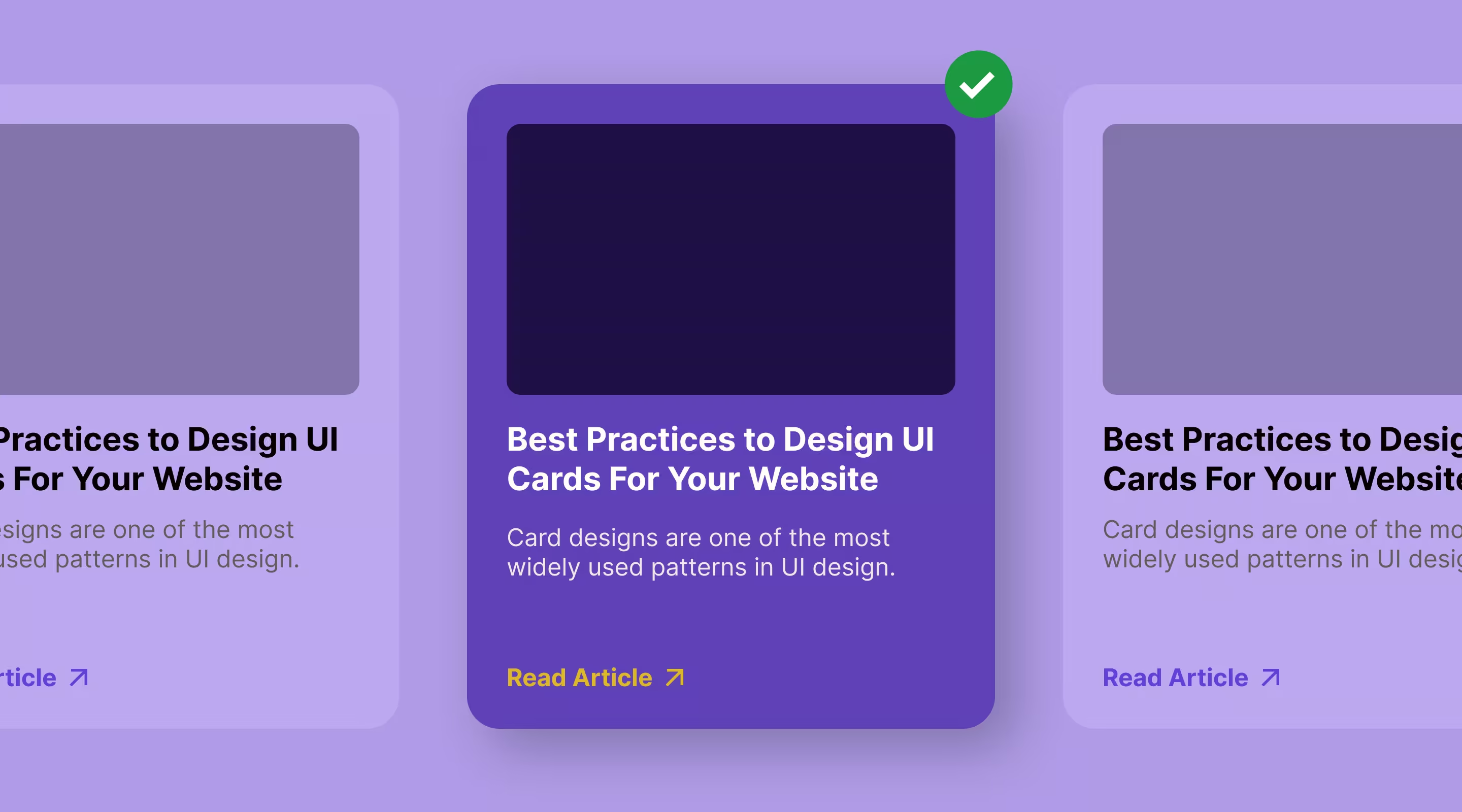
Contrast Between Card and Background
Cards need visual separation — but not excess styling.
Effective approaches include:
- Subtle elevation or shadows (2-8px blur radius)
- Soft borders or outlines (1px, subtle colour)
- Background contrast (card slightly lighter/darker than page)
- Spacing between cards (minimum 1rem (16px) - 1.5rem (24px) gap)
The goal is clarity, not decoration. Overly heavy shadows or borders create visual noise and reduce scannability.
Singapore design trend: Local websites increasingly favour clean, minimalist card designs with subtle shadows over heavily bordered "card" aesthetics. This aligns with global best practices and creates more modern, professional interfaces.
UI Card Design Best Practices (Practical Guidelines)
Let's move from theory to practice with actionable guidelines you can implement immediately.
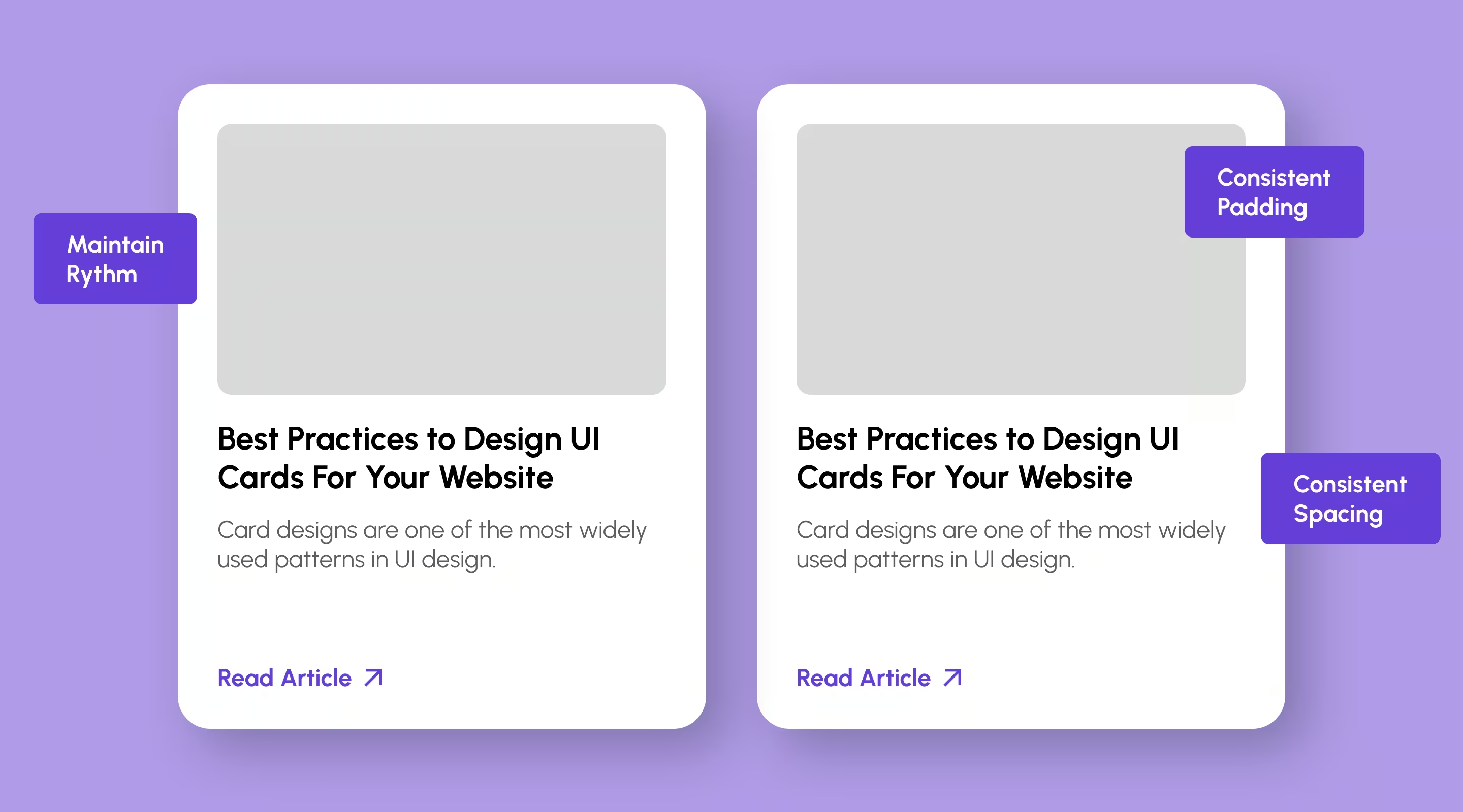
Spacing & Layout Consistency
Consistent spacing improves readability and usability.
Best practices:
- Use a 4pt or 8pt spacing system throughout your design
- Keep internal padding consistent across all cards
- Maintain consistent gaps between cards in grid layouts
- Align content to a consistent grid (left-aligned text, centered images, etc)
This also simplifies developer handoff and scaling.
Why this matters: Inconsistent spacing creates visual chaos and makes cards harder to scan. It also complicates developer handoff and scaling.
Implementation in Webflow: Use Webflow spacing presets and classes to maintain consistency across your card components.
Color & Contrast Guidelines
Card backgrounds:
- Use neutral, subtle backgrounds (white, off-white, light grays)
- Avoid vibrant background colors that compete with content
- Maintain consistent background across all cards in a set
Text contrast:
- Primary text: 4.5:1 contrast minimum (WCAG AA)
- Secondary text: 4.5:1 contrast minimum
- Disabled/inactive text: 3:1 contrast minimum
Interactive elements:
- CTAs should stand out with sufficient color contrast
- Hover states should be obvious but not jarring
- Focus states must be visible for keyboard navigation
Image Optimisation for Card Layouts
Images are typically the largest visual element in cards, making optimisation critical for performance.
Best practices:
- Use consistent aspect ratios across all cards in a grid (1:1, 4:3, 16:9)
- Implement lazy loading for cards below the fold
- Serve responsive images using
srcsetfor different screen sizes - Compress images appropriately (aim for under 150KB per card image)
- Use WebP or AVIF formats with JPG/PNG fallbacks
- Define explicit width/height to prevent layout shift (CLS)
Singapore-specific: Despite fast 5G networks, users still expect instant loading. Don't compromise performance for high-resolution imagery.
Read our guide on how to optimise website speed for more performance tips.
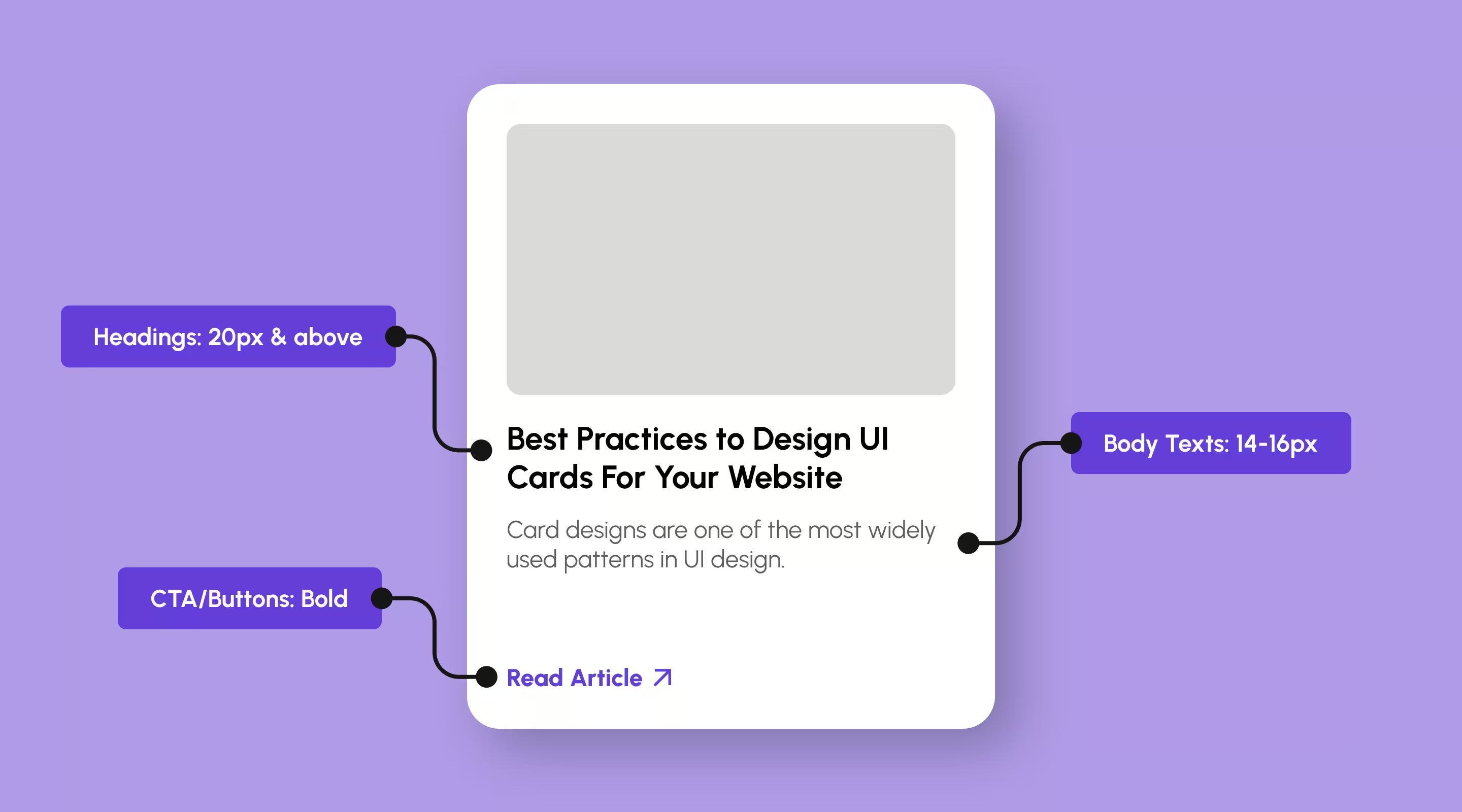
Typography for Readable UI Cards
Typography hierarchy is critical for card readability, especially on mobile devices.
Recommended guidelines:
- Headings: 18-24px (mobile), 20-28px (desktop)
- Subheadings: 16–18px
- Body text: 14–16px (never below 14px for readability)
- Buttons: 16px, bold
Key principles:
- Avoid shrinking text to fit more content — truncation is better UX
- Use consistent line heights (1.4-1.6 for body text)
- Limit to 2-3 font weights maximum across all cards
- Ensure sufficient contrast (WCAG AA minimum: 4.5:1)
Mobile consideration: Singapore users browse primarily on mobile. Test your card typography on actual devices — not just desktop browsers.
Dense Card Grid Design: How Many Cards Per Row (and How Tight Can You Go)
"Dense" card grids — the kind used in product listings, dashboards, and content feeds — trade breathing room for information density. Getting this right means balancing scannability against the number of items a user needs to compare in one view.
Column counts by breakpoint:
- Desktop (1280px+): 3–4 cards per row for decision-heavy content (pricing, comparisons); 4–6 for browsing-heavy content (product grids, image feeds)
- Tablet (768–1279px): 2–3 cards per row
- Mobile (<768px): 1 column, occasionally 2 for small square cards (thumbnails, tags)
How tight is too tight: Once gutter spacing drops below 12px, cards start to visually merge and users misread where one card ends and the next begins. Keep a minimum 12–16px gap even in high-density grids, and use background contrast (not just spacing) to keep boundaries clear as density increases.
When to increase density: Users are browsing/scanning many similar items and comparing at a glance (e-commerce, image galleries, dashboards).
When to reduce density: Each card requires a real decision (pricing tiers, service comparisons) — give these more room, not less. A dense grid works against you when the cost of picking wrong is high.
Designing Accessible UI Cards (Often Overlooked)
Accessible UI cards ensure everyone can use your interface — not just ideal users. In Singapore, where accessibility compliance is increasingly important, this isn't optional.
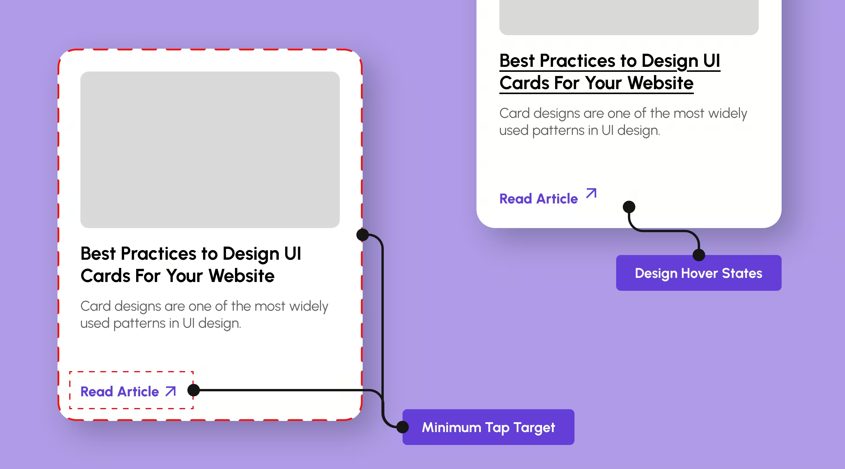
Touch Target Sizes for Mobile
Minimum touch target requirements:
- Buttons and interactive elements: 44x44px minimum (Apple iOS guideline)
- Recommended: 48x48px (Google Material Design)
- Ideal for primary actions: 56-60px
- Spacing between tap targets: minimum 8px
Why this matters: Small touch targets lead to mis-taps, frustration, and abandoned conversions. This is especially critical for Singapore's mobile-first users.
Keyboard Navigation & Focus States
Cards must be fully navigable via keyboard:
- Entire card should be focusable and clickable (don't require precise CTA clicking)
- Clear, visible focus indicators (2-3px outline, high contrast color)
- Logical tab order (left-to-right, top-to-bottom)
- Skip-to-content links for long card grids
Implementation tip: Test your card layout using only keyboard navigation. If it's frustrating, it needs work.
Screen Reader Considerations
- Use semantic HTML (article, heading, button elements)
- Add descriptive alt text for all images
- Use ARIA labels for icon-only buttons
- Ensure card links have descriptive text (not just "Read more")
- Announce dynamic content changes (filtering, sorting)
Example of good practice
```html
<article aria-label="Product: iPhone 15 Pro, $1,599">

	<img src="iphone.jpg" alt="iPhone 15 Pro in titanium blue">
    	<h3>iPhone 15 Pro</h3>
    	<p>$1,599</p>
    	<button aria-label="Add iPhone 15 Pro to cart">Add to Cart</button>

</article>```
Color Contrast & Visual Accessibility
- Never rely on colour alone to convey meaning
- Use icons + text for status indicators
- Ensure sufficient contrast for colourblind users
- Test with tools like WebAIM Contrast Checker
- Consider dark mode variants for cards
Mobile-First Card Design Principles
With over 70% of Singapore web traffic coming from mobile devices, mobile-first card design is essential.
Vertical Stacking on Mobile
Desktop grids (3-4 columns) must collapse gracefully to mobile:
- Single column for small phones (320-375px width)
- Two columns maximum for larger phones (375-428px)
- Maintain consistent card heights where possible
- Increase touch target sizes for mobile
Common mistake: Shrinking desktop card layouts to fit mobile, making everything tiny and unreadable.
Thumb-Friendly Design
Place interactive elements within thumb reach:
- Primary CTAs in the bottom third of cards (easy to reach)
- Avoid requiring taps at the very top of long cards
- Make entire card clickable, not just small CTA buttons
- Add adequate spacing between cards (minimum 12-16px)
Mobile Performance Optimisation
Mobile users are more sensitive to loading delays:
- Limit initial cards loaded (load more on scroll)
- Use placeholder/skeleton loaders
- Optimize images aggressively for mobile
- Avoid heavy animations that impact performance
- Test on mid-range Android devices, not just latest iPhones
Card Design Patterns for Different Use Cases
Different contexts require different card approaches. Here's how to adapt card design for specific scenarios.
Product Cards (E-commerce)
Essential elements:
- High-quality product image
- Product name/title
- Price (prominently displayed)
- Quick-add CTA button
- Optional: ratings, badges (sale, new, low stock)
Best practices:
- Use consistent image aspect ratios (square common)
- Show price prominently (don't make users hunt)
- Include hover states showing additional product images
- Add to wishlist/compare options (secondary actions)
Content Cards (Blogs, News, Articles)
Essential elements:
- Featured image or thumbnail
- Headline/title
- Excerpt or description (2-3 lines)
- Metadata (date, author, read time)
- "Read article" link or entire card clickable
Best practices:
- Prioritise compelling headlines over long descriptions
- Use consistent image sizes for grid uniformity
- Include category tags for browsing
- Keep descriptions scannable (40-60 words max)
Profile Cards (Team, Directory)
Essential elements:
- Profile photo or avatar
- Name and role/title
- Brief bio or description (optional)
- Contact method or "View profile" link
- Social media links (optional)
Best practices:
- Use consistent photo dimensions (circular or square)
- Keep bios brief (2-3 lines)
- Make names prominent and readable
- Consider hover states revealing more information
Dashboard Cards (Analytics, Metrics)
Essential elements:
- Primary metric or KPI (large, prominent)
- Trend indicator (up/down arrow, percentage change)
- Timeframe or context
- Optional: Sparkline or mini-chart
- Link to detailed view
Best practices:
- Make the metric the focal point
- Use colour sparingly (red/green for trends)
- Keep cards scannable at a glance
- Avoid cluttering with too much data
Feature Cards (Pricing, Services)
Essential elements:
- Feature name/title
- Icon or visual representation
- Description (brief, benefit-focused)
- CTA button ("Learn more", "Get started")
Best practices:
- Focus on benefits over features
- Use icons that are instantly recognisable
- Keep descriptions under 20 words
- Make CTAs action-oriented
Singapore-Specific Card Design Considerations
When designing cards for Singapore audiences, consider local user behaviours and expectations.
Multi-language Support
Singapore's multilingual population may require:
- Cards that accommodate varying text lengths (English vs Chinese)
- Flexible layouts that don't break with longer text
- Font choices that support multiple languages
- Consider separate card variants for different languages
Local E-commerce Patterns
Singapore users are familiar with platforms like:
- Shopee (dense product grids, sale badges prominent)
- Lazada (similar pattern to Shopee)
- Carousell (community marketplace feel)
While you don't need to copy these patterns, understanding user expectations helps. Singapore users expect:
- Clear pricing information upfront
- Delivery timeframes and costs visible
- Ratings and reviews prominently displayed
- Mobile-optimised checkout flows
Payment & Conversion Expectations
Singapore e-commerce users expect:
- Multiple payment options (cards, PayNow, GrabPay)
- Clear security indicators
- Guest checkout options
- Save-to-favourites functionality
Loading States & Performance for Card-Based UI
Loading behaviour matters just as much as visual design.
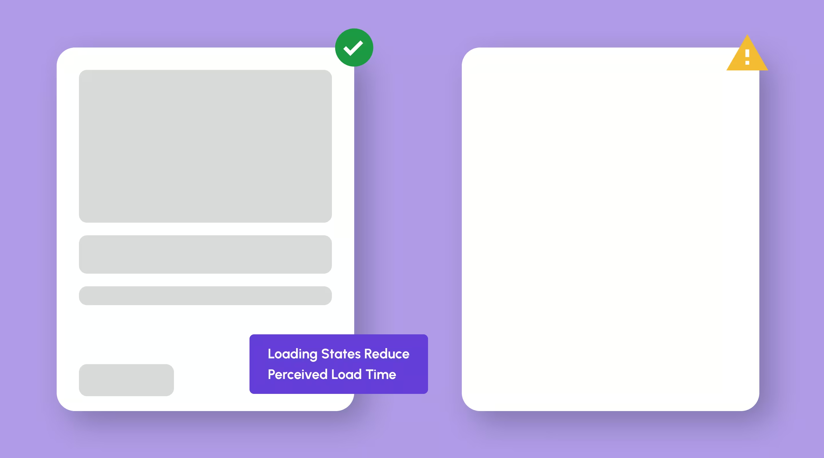
Skeleton Loaders vs Spinners
Skeleton loaders work better for cards because they:
- Reduce perceived loading time (users see structure immediately)
- Prevent layout shifts (CLS) that hurt user experience and SEO
- Set clear expectations for what's loading
- Feel more modern and polished than spinners
Implementation approach:
- Match skeleton dimensions to actual card dimensionsAnim
- Animate with subtle shimmer effect
- Load content progressively (images last)
- Replace content with real content smoothly
Performance Tips for Card Layouts
- Use consistent image aspect ratios (prevents layout shift)
- Implement nintersectionobserverforlazy loading
- Avoid overly dense grids on mobile (cognitive overload)
- Limit initial render to 12-20 cards, load more on scroll
- Use efficient image formats (WebP, AVIF)
- Minimise JavaScript for card interactions
Infinite Scroll vs Pagination
Infinite scroll works well for:
- Discovery-focused interfaces (Pinterest, Instagram)
- Mobile-first experiences
- Content where users browse casually
Pagination works better for:
- Search results (users want to return to specific results)
- Desktop-heavy audiences
- Situations where users need to bookmark specific pages
Hybrid approach: Use "Load more" button instead of true infinite scroll — gives users control while maintaining simplicity.
Common UI Card Design Mistakes to Avoid
Even experienced designers make these mistakes. Here's what to watch for.
1. Overloading Cards with Information
Problem: Trying to fit too much content into each card
Impact: Cards become difficult to scan, defeating their purpose
Solution: Embrace white space, limit to essential information only
Rule of thumb: If you need to shrink text below 14px to fit content, your card has too much information.
2. Inconsistent Card Heights
Problem: Cards in the same row with dramatically different heights
Impact: Creates visual chaos, looks unprofessional
Solution: Use consistent heights or implement masonry layout properly
Options:
- Fixed height with content truncation
- Minimum height with flexible expansion
- Masonry layout (Pinterest-style)
3. Weak Visual Hierarchy
Problem: All elements given equal visual weight
Impact: Users don't know where to look first
Solution: Establish clear primary, secondary, tertiary hierarchy
4. Poor Mobile Adaptation
Problem: Desktop card layout doesn't work on mobile
Impact: Tiny text, hard-to-tap buttons, horizontal scrolling
Solution: Design mobile-first, then enhance for desktop
5. Neglecting Empty/Error States
Problem: No consideration for what cards look like when:
- Content fails to load
- Search returns zero results
- User hasn't added content yet
Solution: Design empty states, error states, and loading states
6. Making Entire Card Clickable (But Not Obviously)
Problem: Card is clickable but no visual indicator shows this
Impact: Users don't realise they can click cards
Solution: Add subtle hover states or make CTA button obvious
7. Inaccessible Colour Choices
Problem: Insufficient contrast for text on card backgrounds
Impact: Content is hard to read, fails accessibility standards
Solution: Test all text against backgrounds (4.5:1 minimum ratio)
Using Design Systems to Scale UI Card Design
As products grow, consistency becomes a UX challenge. Design systems solve this by creating reusable, scalable card components.
Benefits of Design System Card Components
- Ensures consistency across all product surfaces
- Speeds up design and development time
- Reduces design debt and inconsistencies
- Makes maintenance and updates easier
- Improves collaboration between designers and developers
Popular Design System Card Examples
- Elevation system for card depth
- Consistent spacing and typography
- Motion principles for interactions
- Merchant-focused card components
- Clear documentation and usage guidelines
- Accessibility built in by default
- Multiple card variants for different contexts
- Comprehensive interaction patterns
- Focus on enterprise use cases
Building Your Own Card System
Start with:
1. Base card component - Foundation for all variants
2. Card variants - Product card, content card, profile card, etc.
3. Spacing tokens - Consistent padding, margins, gaps
4. Typography scale - Heading sizes, body text, labels
5. Color tokens - Backgrounds, borders, text colours
6. Interaction states - Default, hover, focus, active, disabled
Tools: Most design systems start in Figma with component libraries, then scale into production through prototyping and development.
At ALF Design Group, we help Singapore businesses create scalable design systems that work across web and mobile platforms.
Real-World Examples of Effective UI Card Design
You’ll find strong card systems on platforms like:
- Shopee – structured product grids optimised for browsing and comparison
- Pinterest – vertically stacked masonry layout for discovery
- Netflix – carousel-based browsing with hoverstate previews
- Awwwards – curated feature cards showcasing design work
- Airbnb - property cards balancing information desnsity with scannability
- Dribbble - Design showcae cards with clear hover interactions
What they share isn’t style — it’s clarity, rhythm, and intent.
Singapore examples:
- PropertyGuru - real estate listing cards
- Carousell - marketplace cards optimised for quick browsing
- Lazada - grocery product cards with clear pricing and promotions
Frequently Asked Questions About UI Card Design
What is a UI card in web design?
A UI card is a modular container that groups related content into a compact, visually organised block. It helps users scan and interact with content quickly by presenting information in bite-sized, easily digestible units.
Why are UI cards good for UX?
Cards reduce cognitive load, improve scannability, and support responsive layouts — especially in content-heavy interfaces. They create predictable patterns that users recognise, making navigation intuitive and reducing decision fatigue.
How many actions should a UI card have?
Ideally one primary action. Multiple CTAs can confuse users and reduce interaction clarity. If you need secondary actions, make them visually subordinate to the primary CTA.
Do UI cards work well on mobile?
Yes. Cards stack naturally, support touch interaction, and adapt well to smaller screens. This is why card-based layouts dominate mobile interfaces — they're inherently mobile-friendly.
Can card-based design hurt SEO?
Not inherently. Poor hierarchy and hidden content can hurt SEO — but well-structured cards with proper HTML semantics enhance usability without harming rankings. In fact, good UX (which cards provide) often correlates with better SEO performance.
Are UI cards suitable for conversion-focused pages?
They work best for browsing and comparison scenarios. For single-goal landing pages with one clear conversion objective, simpler linear layouts often convert better. Use cards when users need to compare or choose between options.
How do I make UI cards accessible?
Ensure sufficient colour contrast, provide keyboard navigation, use semantic HTML, add descriptive alt text for images, make touch targets at least 44x44px, and test with screen readers. Accessibility should be built in from the start, not added later.
What's the ideal number of cards to show at once?
Depends on context. For browsing (e-commerce), show 12-20 initially with lazy loading. For dashboards, show only the most important 4-8 cards. For feature comparison, 3-4 cards is optimal. Always prioritise performance over quantity.
Conclusion: Why UI Cards Remain a Core UX Pattern
UI cards aren't a trend — they're a response to how users interact with digital products today.
When designed intentionally, cards:
- Improve clarity and scannability in complex interfaces
- Scale gracefully across devices and platforms
- Support accessible, performant user experiences
- Enable flexible, modular content systems
- Reduce cognitive load through clear information grouping
But like any UX pattern, their success depends on intent, restraint, and execution.
Treat UI cards as functional building blocks — not decorative containers — and they'll continue to deliver real UX value for your Singapore web design projects.
Key takeaways for Singapore businesses:
- Design mobile-first (your users are primarily on phones)
- Prioritise performance (fast loading is non-negotiable)
- Keep cards scannable (users won't read dense blocks of text)
- Test with real users (assumptions fail, data doesn't)
- Maintain consistency (design systems save time and improve quality)
Ready to elevate your website with professional UI/UX design? Contact us to discuss how we can help create card-based interfaces that convert.
Related articles:
- Responsive Web Design Best Practicses Every Designer Should Know
- Mobile-First Web Design: Best Practices for 2026
- How to Improve Website Accessibility: Complete Guide
- Website Speed Optimisation
- Navigation UX Best Practices for Seamless Design
{{build-better-experience="/directory"}}
Written By

Resources
Related Articles
Deep dive into our latest news and insights.
.webp)