Transforming GB Helios's Online Presence.

With a wide array of financing solutions — from venture debt to embedded finance and earned wage access — GB Helios needed a clearer way to present their services online.
Their previous website buried key offerings under overly technical labels, making it hard for businesses to understand or compare options.
Our goal was to simplify the service taxonomy and guide users through intuitive, business-friendly navigation.
We conducted a UX audit and stakeholder interviews to understand how users typically navigate their service categories. From there, we reorganised their offerings into clear, intuitive groups
We created a mega menu structure and internal linking strategy that connects related services together — allowing users to discover complementary offerings easily.
Each service page was designed to provide just the right amount of detail — including case examples, service overviews, and call-to-actions to get in touch — without overwhelming readers.
This reorganisation allowed users to more easily explore and understand the differences between offerings such as venture debt, revenue-based financing, and supply chain solutions.
By simplifying the structure and aligning services with how business owners search for funding, we significantly improved clarity and usability.
After implementing the new design, we observed a 3x improvement in service discoverability based on heatmap testing. Visitors were engaging more consistently with key service categories, and navigation paths became more intuitive across both desktop and mobile devices.
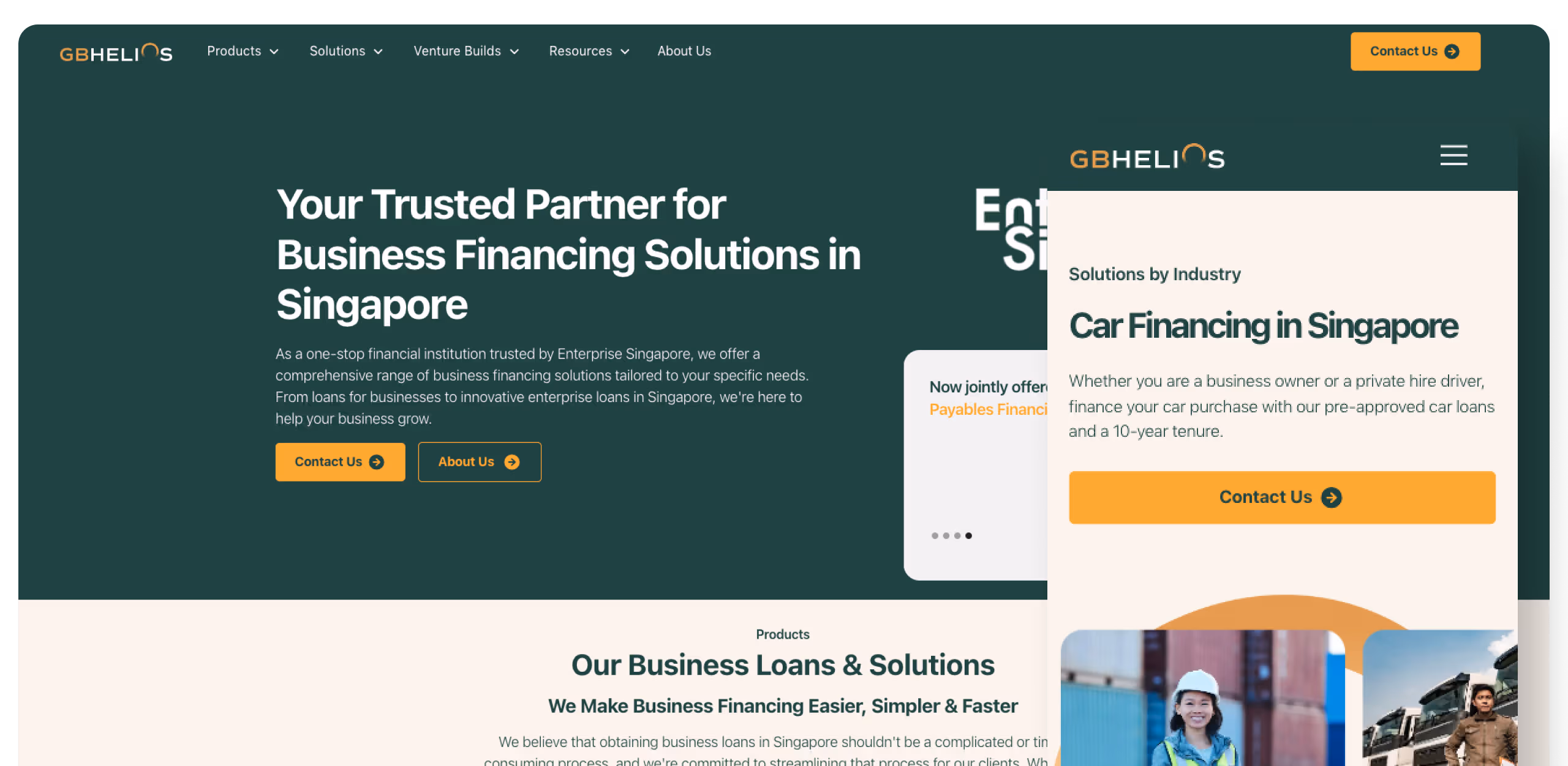
Navigation UX
Creating Intuititive Navigation.
One of the biggest challenges with the GB Helios website was helping users find what they needed without getting lost in a sea of financial terms.
With so many services on offer, we knew the navigation had to do more than just look clean — it had to guide.We focused on creating a structure that felt natural to explore.
Think of it like organising a messy toolbox — we grouped related services together, added clear labels, and made sure users could easily hop between sections without second-guessing themselves.
The end result? A site that feels less like a corporate brochure and more like a conversation — helpful, direct, and easy to follow.

Branding & Design
A Refreshed Look.
As part of their rebrand from Goldbell Financial Services to GB Helios, the company launched a bold new identity — one that reflected their values of being proactive, progressive, and pro-business.
We studied their brand guidelines in detail, drawing inspiration from their updated colour palette, typeface, and tone of voice to create a digital experience that felt fresh yet trustworthy.
From the use of deep navy and burnt orange tones to clean, modern typography, every visual element on the site was designed to reflect their new direction.
We applied their brand personality across subtle UI details — hover states, CTA buttons, iconography — ensuring the site felt consistent and aligned with their evolving image. The result is a website that doesn’t just look on-brand, but reinforces their new identity with every click.


Your business growth starts here.
Let us review your website, identify what’s holding it back, and guide you with honest, data-driven solutions — so you can focus on growing your business while we handle your digital presence.