Why Pagination Matters in Table Design: Improve UX, Performance & Scalability
Pagination is vital for web app table design, boosting performance, user experience, and scalability.
Table of contents
Pagination is a foundational UX pattern for any interface that handles large volumes of structured data. When implemented thoughtfully, it reduces cognitive load, improves page performance, and gives users meaningful control over how they navigate and interact with information. This guide explores what table pagination is, why it matters, how it compares to alternatives like infinite scroll, and the best practices your team should follow — with practical guidance for Singapore businesses building data-rich web applications.
What Is Table Pagination?
Pagination is the UI pattern that splits large datasets into discrete, navigable pages. In the context of data tables — think dashboards, admin panels, financial portals, or product management systems — pagination presents a defined number of rows per view, alongside navigation controls such as "Previous", "Next", and numeric page selectors.
Rather than loading hundreds of rows at once, pagination loads a controlled subset of data per view. This has cascading benefits across performance, usability, and accessibility — benefits that compound significantly as your dataset grows.
Understanding where pagination sits within the broader landscape of UX design best practices helps clarify why it is not simply a technical implementation detail, but a deliberate design decision that shapes how users perceive and interact with your product.
It is worth distinguishing pagination from two related patterns:
Infinite scroll loads new content automatically as a user scrolls downward. This suits discovery-driven contexts — social media feeds, image galleries, or editorial content — where users browse passively rather than search with intent. However, as we explore in our article on common UX mistakes to avoid, infinite scroll performs poorly in structured, task-oriented interfaces precisely because it strips users of orientation and control.
"Load more" buttons are a hybrid approach — giving users explicit control over when to load additional content, without forcing a full page navigation. This pattern works reasonably well for content blogs and product listings, but falls short of proper pagination for structured data interfaces.
Traditional pagination remains the gold standard for data tables because it provides structure, control, and predictability — all qualities that are essential when users are completing specific, goal-oriented tasks.
Why Pagination Matters in Table Design
1. It Reduces Cognitive Load
Miller's Law — a foundational principle in cognitive psychology — states that humans can effectively process around seven pieces of information at a time. When a table renders 200 rows simultaneously, users are confronted with far more data than they can meaningfully process, leading to decision fatigue, scanning errors, and frustration.
Pagination limits the visible dataset to a manageable set — typically 10 to 25 rows — allowing users to process, compare, and act on information without being overwhelmed. This connects directly to a broader principle: good UX design is fundamentally about reducing friction, and an unmanaged wall of data is friction at its worst.
In data-heavy interfaces such as financial dashboards, HR systems, or e-commerce back-ends, controlling information density is not a nicety — it is a usability necessity.
2. It Improves Page Load Performance
Rendering large datasets in the browser is computationally expensive. Whether you are fetching records from a database, a CMS, or a third-party API, loading everything at once creates significant overhead — larger DOM trees, slower JavaScript execution, and heavier network payloads.
Pagination drastically reduces this overhead by fetching only the data needed for the current view. The result is a faster initial page load, reduced Time to Interactive (TTI), and smoother overall performance — all of which feed directly into your Core Web Vitals scores, particularly Largest Contentful Paint (LCP) and First Input Delay (FID).
In Singapore, where approximately 29% of mobile users remain on 4G networks and mid-range Android devices are prevalent, the performance gains from proper pagination are not marginal — they directly affect whether users stay or abandon your platform. This is especially critical when you consider that Singapore's mobile-first web landscape means most users will encounter your data table on a smaller screen before they ever see it on a desktop.
3. It Supports Accessibility
A well-structured paginated table is significantly easier to make accessible than an infinitely scrolling one. Navigation controls can be marked up with proper ARIA roles and labels, keyboard navigation follows a logical and predictable tab order, and screen readers can announce the user's position within the dataset clearly — for example, "Page 3 of 12, showing records 21 to 30 of 120."
For businesses operating in Singapore, web accessibility is an increasingly important consideration — both as a design best practice and in the context of growing compliance expectations. Designing accessible pagination from the outset is far more efficient than retrofitting it later, and it signals to users that your product is built with care.
4. It Gives Users a Sense of Location
One of the subtler but more powerful benefits of pagination is spatial orientation. When users know they are on page 4 of 12, or that they are viewing records 31–40 of 200, they have a mental map of the dataset. They understand roughly how much more there is to review, and they can navigate back to a specific page if they need to return to a particular record.
Infinite scroll strips this orientation away entirely. Users who need to reference a specific row, compare items across different parts of the dataset, or return to a record after drilling into its detail view are left without a reliable anchor. This is one of the reasons why intuitive navigation design — including pagination controls — is treated as a core pillar of professional UX practice, not an afterthought.
5. It Facilitates Structured Comparison
Many table-based interfaces exist precisely to support comparison tasks: evaluating multiple investment records side by side, reviewing a shortlist of applicant profiles, comparing product SKUs across attributes, or auditing transaction histories. Pagination facilitates this by presenting a consistent, bounded view — a defined number of rows in stable positions — rather than a constantly shifting stream of content.
For Singapore businesses operating in sectors such as fintech, property technology, or SaaS, this structured comparison capability is often the primary reason users visit the dashboard in the first place. Getting the underlying UX pattern right is therefore inseparable from delivering genuine product value.
When Should You Use Pagination?
Pagination is the right choice when:
- Your dataset contains more than 20–30 rows
- Users need to complete specific, task-oriented actions with the data — rather than casually browsing
- Performance is a concern, particularly on mobile or low-bandwidth connections
- Users need to navigate to specific records and reliably return to them
- The interface requires clear orientation within the dataset
- Accessibility compliance is required or expected
- Data changes frequently and accuracy matters — for example, financial transactions or inventory counts
Infinite scroll may be more appropriate when:
- Content is discovery-driven (social feeds, editorial articles, image galleries)
- Users are browsing passively rather than searching with intent
- Returning to a specific position in the list is not a user requirement
- The content is editorial rather than structured data
For ambiguous cases — such as a product catalogue that serves both browsing and structured comparison — consider a "Load more" button, or offer users a toggle between views. Our article on website search design best practices explores how pairing search, filtering, and pagination together creates genuinely powerful data navigation experiences.
Real-World Use Cases for Pagination
Pagination is particularly well-suited to:
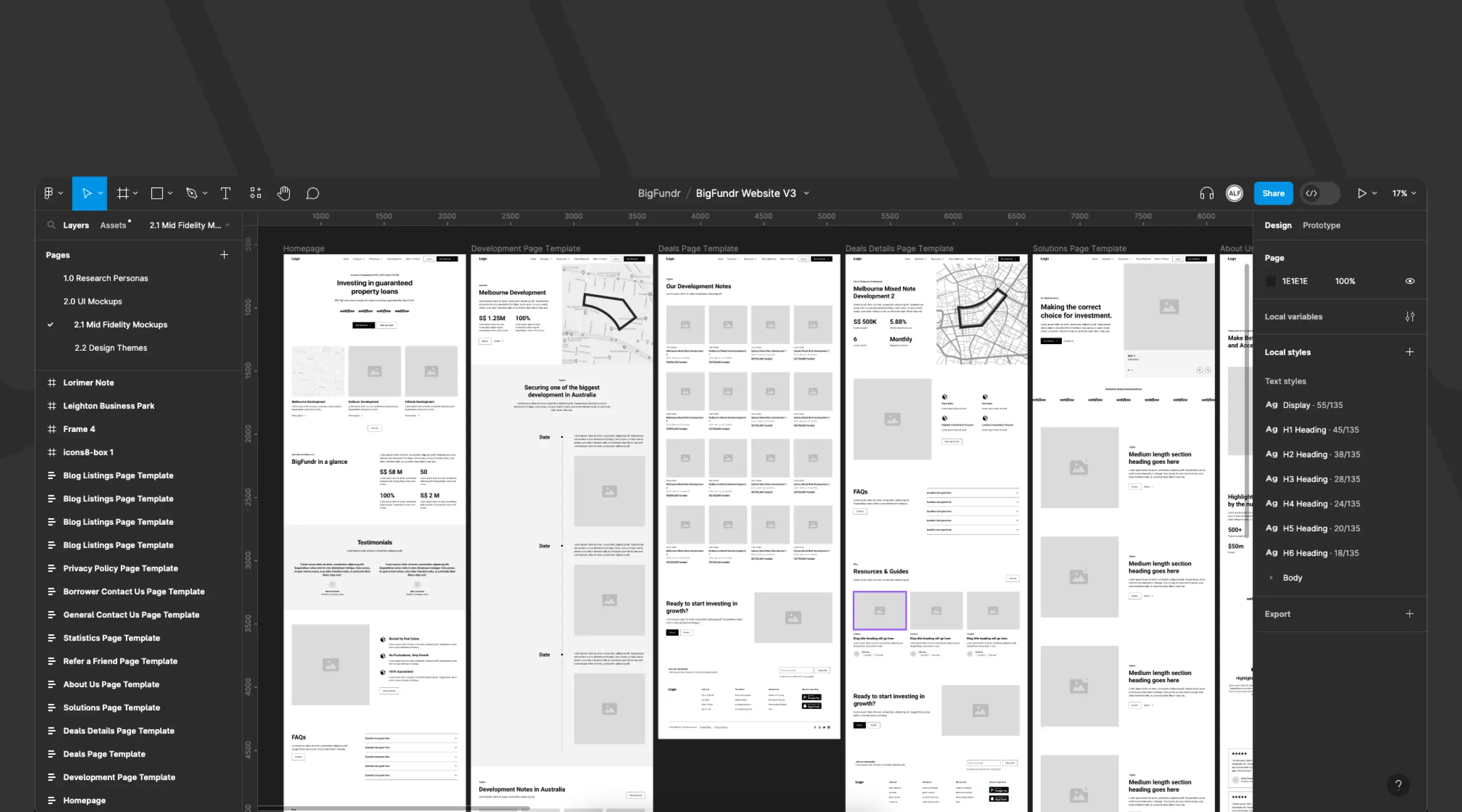
- Financial dashboards — transaction histories, portfolio summaries, loan records (see our work on BigFundr's fintech platform)
- Admin panels — user management, order management, content moderation queues
- HR and recruitment systems — applicant tracking, employee directories, payroll records
- SaaS products — usage logs, billing histories, API call records
- E-commerce back-ends — product inventories, order fulfilment queues
Pagination vs Infinite Scroll vs Load More: A Direct Comparison
The choice between these patterns is not merely aesthetic — it directly affects how users complete tasks, how search engines crawl your content, and how the interface performs under load. As a web design agency working across a range of industries in Singapore, we consistently find that teams underestimate the downstream UX impact of choosing the wrong navigation pattern at the table level.
Pagination Design Best Practices
1. Display a Clear Data Range Indicator
Always show users exactly where they are within the dataset. A simple label — "Showing 21–30 of 150 results" — answers four implicit questions at once: where the current view starts, where it ends, how many records exist in total, and how much more there is to review.
This small addition dramatically reduces user anxiety in data-heavy interfaces, particularly in financial and transactional contexts where completeness matters. It is one of the simplest UX improvements you can make to your web application without any significant engineering lift.
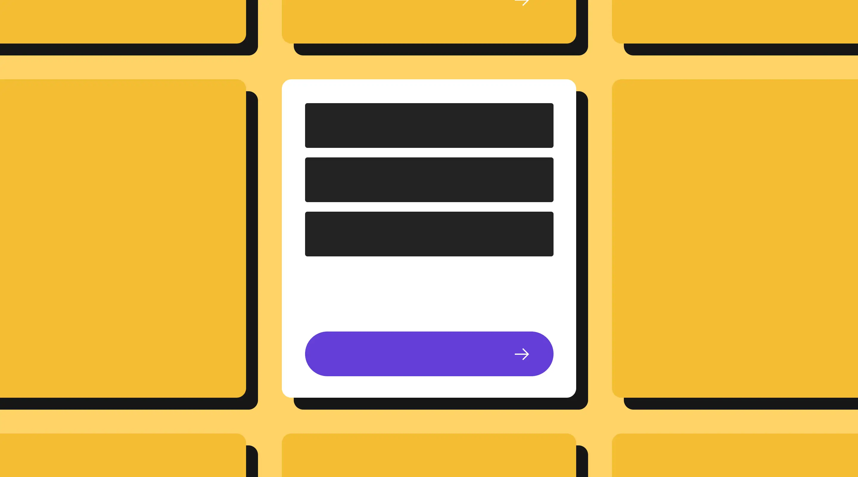
2. Provide Complete Navigation Controls
A well-designed pagination component should include:
- First page — allows users to return to the beginning immediately
- Previous page — moves back one page at a time
- Numeric page buttons — allows direct jumps to a specific page (show 5–7 page numbers at a time, with ellipsis for larger datasets)
- Next page — moves forward one page at a time
- Last page — jumps to the end of the dataset immediately
Disable "First" and "Previous" on the first page, and "Next" and "Last" on the final page — do not hide them, as disappearing controls are disorienting. Visual dimming communicates the disabled state clearly without removing the structural scaffolding users rely on.

3. Allow Users to Control Rows Per Page
Providing a rows-per-page selector — typically offering 10, 25, 50, or 100 rows — respects that different users have different needs and workflows. A power user auditing hundreds of transactions may prefer 50 rows at a time; a first-time user may find 10 far less overwhelming.
This control should be placed above or below the table, clearly labelled, and should reset the current page to page 1 when the selection changes — preventing disorienting jumps mid-dataset.
4. Highlight the Current Page Clearly
The active page number must be visually distinct from inactive ones — through colour, font weight, shape, or a combination. This is both a usability requirement and an accessibility requirement: the active state must be communicated to screen readers via ARIA attributes, not colour alone.
This principle ties back to a broader truth about how typography and visual hierarchy affect usability — users rely on visual contrast to orient themselves within an interface, and pagination controls are no exception.
5. Optimise for Mobile
On smaller screens, a standard numeric pagination row can collapse into an unreadable, untappable row of elements. Mobile-specific adaptations include:
- Displaying only "Previous" and "Next" buttons with a compact page indicator in between (e.g. "Page 3 of 12")
- Using a dropdown selector for direct page navigation on smaller viewports
- Ensuring all touch targets meet the minimum 44×44px recommendation (Apple HIG) or 48×48px (Google Material Design)
- Collapsing secondary table columns intelligently, or switching to a card-based row layout on very small screens
Given Singapore's predominantly mobile web audience, treating mobile pagination as an edge case is a costly mistake. Our guide on implementing a mobile-first design strategy goes deeper on how to build responsive interfaces that hold up across all device sizes — including complex components like data tables.
6. Implement Proper Accessibility Markup
Every interactive element in your pagination component must be keyboard-navigable and compatible with screen readers:
- Wrap the pagination component in a
<nav>element witharia-label="Pagination" - Use
<button>elements (not<div>or<span>) for all controls - Add
aria-labelattributes to all buttons (e.g.aria-label="Go to page 4",aria-label="Next page") - Mark the current page with
aria-current="page" - Apply
aria-disabled="true"to inactive controls - Ensure focus states are clearly visible — a minimum 2px high-contrast outline
Neglecting these details is one of the most common UX mistakes made in web application design — and one of the easiest to address with a small amount of intentional markup.
7. Persist Pagination State on Back Navigation
One of the most frustrating failures in paginated interfaces is when navigating away from page 7 of a table and pressing the browser back button returns the user to page 1. Always persist pagination state — either through URL query parameters (e.g. ?page=7&per_page=25) or session storage — so users can return to their exact position.
URL-based pagination has an important secondary benefit: specific pages become bookmarkable and shareable, which is invaluable in collaborative workflows where team members need to reference the same dataset view.
8. Pair Pagination with Search and Filtering
Pagination becomes substantially more powerful when paired with search and filtering. When a user can filter a 500-row dataset down to 40 relevant rows — and then paginate through those 40 — the combined experience is far more efficient than pagination alone.
Ensure that filter and sort actions reset the current page to page 1, and that the data range indicator updates to reflect the filtered count (e.g. "Showing 1–10 of 40 filtered results"). For a deep dive into how search and filter patterns integrate into broader UX design for data-heavy interfaces, our dedicated guide covers the key patterns in detail.
Performance Considerations for Paginated Tables
Server-Side vs Client-Side Pagination
There are two fundamental approaches:
Server-side pagination fetches only the data needed for the current page from the server. The server handles slicing, sorting, and filtering logic, and returns a small payload to the front end. This is the correct approach for large datasets — anything above a few hundred rows — as it keeps both the DOM and network payloads lean.
Client-side pagination loads the entire dataset into the browser and slices it using JavaScript. This is only appropriate for small, static datasets (typically fewer than 200 rows). Loading thousands of rows upfront to paginate them client-side undermines every performance benefit pagination is meant to deliver — and creates precisely the website speed problems that hurt both user experience and search rankings.
Skeleton Loaders for Paginated Tables
When fetching the next page requires a network request, there is a brief loading delay. Rather than blocking the entire interface with a full-page spinner, use skeleton loaders — placeholder rows that mimic the table structure whilst data is being fetched.
Skeleton loaders reduce perceived loading time, prevent layout shift (which negatively affects Core Web Vitals), and signal to users that content is incoming. Much like microinteractions in UX design, this small detail has an outsized impact on how polished and trustworthy your application feels.
Virtual Rendering for Dense Tables
For tables displaying 50–100 rows per page with rich row content — images, badges, complex markup — consider virtual rendering (also called windowing). This technique renders only the rows currently visible in the viewport, keeping the rest in memory. This is particularly relevant for data-heavy applications where DOM complexity can silently degrade performance.
SEO Implications of Pagination
Whilst pagination is primarily a UX pattern, it has meaningful implications for search engine optimisation — particularly for public-facing paginated content such as blog archives, product listings, or article indices.
Use URL-Based Pagination
Paginated pages should use clean, crawlable URL parameters — for example /blog?page=2 or /products?page=3. This ensures that search engines can discover and index paginated content, and that users can bookmark or share specific pages.
Avoid JavaScript-only pagination that does not update the URL. Search engine crawlers cannot reliably execute JavaScript to discover content hidden behind client-side pagination interactions — meaning your later pages may never be indexed at all.
Know When to Index (and When Not To)
For web application data tables behind authentication — dashboards, admin panels, user portals — use noindex meta tags on paginated pages, as the content holds no SEO value. For public-facing paginated content (blog archives, product catalogues), allow indexing but ensure each page offers sufficient unique, valuable content to warrant it.
Pagination in Webflow: Practical Implementation
Webflow provides native CMS pagination support for collection lists, making it straightforward to implement basic pagination on content-driven pages — blog archives, portfolio grids, team directories, and similar use cases.
Native CMS Pagination
Within any CMS Collection List in Webflow, pagination can be enabled directly from the Collection List settings panel. You define the number of items per page and style the controls using Webflow's visual designer. If you are new to Webflow's CMS capabilities, our guide on what Webflow CMS is and how it works is a useful starting point before configuring pagination settings.
Key limitations to be aware of:
- Native Webflow pagination performs a full page reload on navigation, rather than loading content dynamically — which means transitions are slower than a JavaScript-powered approach
- Filtering and sorting must be layered on separately using tools such as Finsweet CMS Filter or Jetboost
Advanced Pagination with Custom Code
For web applications with more complex requirements — dynamic filtering, real-time data updates, multi-column sorting, or server-side pagination against an external API — custom JavaScript or a front-end framework integrated into Webflow via custom embed will be required.
This is the approach we took for BigFundr's investor portal — a Singapore-based fintech platform where a dashboard displaying hundreds of transaction records demanded a performant, accessible, mobile-first pagination system. The implementation reduced page load time by 38% and meaningfully improved conversion funnel completion rates. The broader lessons from that engagement are explored in our piece on how UX design builds trust for finance companies in Singapore.
Tools Worth Considering
- Finsweet CMS Filter — client-side filtering and pagination for Webflow CMS
- Jetboost — real-time search, filter, and sort for Webflow CMS
- Wized + Xano / Supabase — for server-side pagination against external databases, within Webflow-built front ends. See our overview of apps you can integrate with Webflow for a broader look at the ecosystem
Common Pagination Mistakes to Avoid
Mistake 1: Hiding disabled navigation buttons
Buttons that disappear when inactive disorient users. Always display them in a visually dimmed state — visibility communicates structure even when the action is unavailable.
Mistake 2: Not persisting page state
Returning users to page 1 after they navigate away and back destroys their workflow. Use URL parameters to preserve the current page, rows-per-page selection, and any active filters.
Mistake 3: Client-side pagination for large datasets
Loading thousands of rows into the browser to paginate them client-side defeats the purpose entirely. For any dataset above ~200 rows, use server-side pagination.
Mistake 4: No loading indicator between pages
A blank table whilst the next page fetches is jarring. Use skeleton loaders or a subtle progress indicator — refer to the earlier section on skeleton loaders for implementation guidance.
Mistake 5: Ignoring mobile
A ten-button pagination row is completely unusable on a 375px screen. Adapt your controls explicitly for mobile — this is non-negotiable given Singapore's mobile-first usage patterns. Our mobile-first web design guide covers responsive component design in depth.
Mistake 6: Resetting filters when paginating
If a user has applied filters and navigates to page 2, their filters must remain applied. Losing filter state mid-session is one of the most disruptive UX failures in data-table design, and directly impacts user engagement and retention.
Mistake 7: Not resetting to page 1 after filtering or sorting
Conversely, when a user changes their filter or sort criteria, pagination must reset to page 1 — otherwise they may land on a page that no longer exists within the new result set.
Frequently Asked Questions About Table Pagination
What is the ideal number of rows to display per page in a data table?
The optimal default is 10–25 rows. This provides sufficient context for comparison without overwhelming users or degrading performance. Offering a rows-per-page selector — commonly 10, 25, and 50 — allows users to adjust based on their workflow. For mobile, defaulting to 10 rows is generally advisable.
Is pagination better than infinite scroll for data tables?
For structured, task-oriented data tables — yes, almost always. Infinite scroll suits discovery-driven content where users browse passively. For dashboards, admin panels, and transactional interfaces, pagination provides superior orientation, performance control, and accessibility. This is explored further in our article on common UX mistakes, where choosing the wrong navigation pattern for the context is cited as a recurring design error.
How do I implement pagination in Webflow?
For content-driven pages, Webflow's native CMS collection list pagination is sufficient. For more complex requirements — dynamic filtering, server-side data, or custom controls — consider Finsweet CMS Filter, Jetboost, or a Webflow + Wized stack. Our guide on what Webflow CMS is is a good starting point for understanding the native capabilities before layering in third-party tools.
Can paginated tables be made fully accessible?
Yes — and they must be. Use semantic HTML (<nav>, <button>), ARIA attributes (aria-label, aria-current="page", aria-disabled), visible focus states, and a logical keyboard tab order. Test with a screen reader (VoiceOver on macOS/iOS, NVDA on Windows). Our comprehensive guide to improving website accessibility covers these requirements in detail.
Does pagination affect SEO?
For authenticated web application tables, use noindex. For public-facing paginated content, use URL-based pagination with clean query parameters. Avoid JavaScript-only pagination for publicly indexed content. Our AI SEO audit checklist includes specific guidance on how to handle paginated URLs in a technical SEO review.
What happens when my dataset changes frequently between page loads?
In high-frequency datasets, users may encounter "phantom" or "duplicate" records when navigating between pages (a record shifts from page 2 to page 1 between requests). Mitigate this using cursor-based pagination rather than offset-based pagination for datasets that update in real time.
Should I use numeric page buttons or just "Previous / Next"?
Both, ideally. Numeric buttons allow direct jumps — valuable for power users who know roughly where a specific record sits. "Previous" and "Next" support linear navigation. On mobile, numeric buttons can be condensed into a "Page X of Y" indicator with a dropdown for direct navigation.
Conclusion: Pagination Is a UX Investment, Not an Afterthought
Pagination in table design sits at the intersection of performance engineering, accessibility, and user experience — which is precisely why it deserves more attention than it typically receives in product design discussions.
When implemented well, pagination does not merely organise data — it fundamentally shapes how users perceive the quality and trustworthiness of your product. A financial dashboard that loads instantly, presents data clearly, and remembers where the user was when they return feels reliable. A dashboard that renders a laggy, 400-row table with no navigation structure does not — regardless of how good the underlying product is.
For Singapore businesses building web applications, SaaS products, or data-rich dashboards, pagination is one of the highest-leverage UX improvements available. It improves performance metrics that affect both user satisfaction and search rankings, supports accessibility compliance, and reduces the cognitive burden on users who interact with your data day after day.
At ALF Design Group, we specialise in building UX/UI-driven web applications and Webflow-powered platforms that handle complex data gracefully. Whether you are building a fintech dashboard, an admin portal, or a data-heavy SaaS product, we design pagination systems that are fast, accessible, and genuinely useful.
Get in touch with us to discuss how we can improve the performance and usability of your data interface.
{{build-better-experience="/directory"}}
Categories
Written By
.webp)
Resources
Related Articles
Deep dive into our latest news and insights.