Best Practices for Designing a Hero Section for SaaS Websites
Learn what makes a hero section effective for SaaS websites and how to design one that converts — from value proposition to CTA to visual performance.
Table of contents
The hero section is the highest-leverage real estate on any SaaS website. It is the first thing a visitor sees, the place where first impressions are formed and kept or abandoned within seconds, and the section most directly responsible for whether a visitor continues down the page or leaves. Unlike a general landing page, a SaaS hero section has to do something specific: it must immediately communicate what the product does, who it is for, why it matters, and what the visitor should do next — all within a single viewport, on any device. This guide covers the eight design and content decisions that most directly determine SaaS hero section performance, with specific guidance on value proposition structure, CTA architecture, visual choice, mobile design, and social proof placement.
Most SaaS websites lose the majority of their visitors in the hero section. Not because the product is weak, the pricing is wrong, or the brand is unclear — but because the hero section fails to do its specific job in the time it has to do it.
The hero section has approximately three seconds to answer the most important question every first-time visitor has: is this relevant to me, and is it worth my time to keep reading? If the headline is vague, the CTA is unclear, or the visual does not reinforce the message, the visitor answers no — and the rest of the page, however well-designed, never gets seen.
This guide addresses the specific design decisions that separate SaaS hero sections that convert from those that do not. For the broader process of building a high-converting landing page from scratch, see our full guide on how to create a high-converting landing page. What follows is focused specifically on the hero — the section where most SaaS conversions are won or lost.
1. Map the Visitor's Intent Before Designing Anything
The most common mistake in SaaS hero design is starting with aesthetics. Before any design decision is made, the hero section needs to be grounded in a clear understanding of who the visitor is and what they are trying to accomplish when they arrive.
SaaS visitors arrive with different levels of awareness and different conversion readiness. A visitor arriving from a targeted paid ad may already understand the problem and be evaluating solutions — they need clarity on differentiation and a fast path to a trial. A visitor arriving from organic search on a broad query may be in an early research phase — they need education on the problem and a gentle entry point. A visitor arriving from a product review platform has already done comparison research and may be close to a decision — they need proof.
These different intent profiles require different hero emphases. A single hero section cannot perfectly serve all of them, but it can be calibrated to serve the primary visitor profile well. Understanding that profile — through analytics, user research, and UX workshops that map the customer journey — is the necessary starting point before any headline or CTA is written.
At a minimum, answer three questions before designing: who is the primary visitor arriving on this page, what do they already know about the problem this product solves, and what is the smallest action they can take that meaningfully advances their journey toward becoming a customer?
2. Structure Your Value Proposition With Precision
The value proposition is the core message of the hero section — the statement that answers, as specifically and concisely as possible, what the product does and why it matters to the visitor. Vague, abstract, or feature-led value propositions are the single most common reason SaaS hero sections fail.
A strong SaaS value proposition answers four questions simultaneously: who is this for, what problem does it solve, how does it solve it, and what is the outcome the user gets? These do not each need their own sentence — a well-crafted headline and subheading together can carry all four.
The value proposition formula
A reliable structure for SaaS hero copy is: [Product] helps [specific audience] [achieve specific outcome] by [core mechanism], so they can [downstream benefit]. This structure forces specificity at every stage and prevents the vagueness that comes from trying to appeal to everyone.
The difference in practice:
❌ "A powerful collaboration platform for modern teams." — Tells the visitor nothing specific about what they gain or why this product versus any other.
✅ "Collaborate across teams without email overload — your files, chats and tasks in one space." — Specific problem (email overload), specific audience (cross-functional teams), specific mechanism (unified workspace).
The second version is tangible, outcome-focused, and eliminates ambiguity. The visitor knows in one sentence whether this product is for them.
Headline and subheading structure
The headline carries the primary value proposition — ideally in five to ten words, focused on the user outcome rather than the product feature. The subheading expands on it: adding specificity, naming the audience, or explaining the mechanism. Together they should take no more than ten seconds to read and leave no ambiguity about what the product does.
Avoid internal jargon, platform-speak ('a holistic solution'), and generic superlatives ('the most powerful', 'the best'). These add words without adding meaning and signal to the visitor that the company has not thought clearly about who it is talking to.
3. Design CTAs That Create Momentum, Not Pressure
The call to action is where the hero section's design and copy converge into a single decision point for the visitor. Most SaaS hero sections make one of two errors: they are too passive (a generic "Learn More" that asks for nothing and offers nothing) or too aggressive (a hard sales push that feels premature for a first-time visitor who has been on the page for four seconds).
Primary and secondary CTA architecture
Most SaaS hero sections benefit from two CTAs: a primary CTA that represents the desired conversion action, and a secondary CTA that serves visitors who are not yet ready to convert but want to learn more. The primary CTA should be visually dominant — larger, higher contrast, positioned first — and the secondary CTA should be visually subordinate to make the hierarchy clear.
Common effective primary CTAs for SaaS products include: Start Free Trial, Get Started Free, Book a Demo, and See It in Action. The right choice depends on your product's conversion model: free trials work well for self-serve products where the user can evaluate value quickly; demos work better for complex products where a guided evaluation produces better conversion outcomes.
Common effective secondary CTAs include: Watch a 2-minute overview, See how it works, or View pricing. The secondary CTA should advance the visitor's understanding without requiring commitment — it is a bridge for visitors who need more before they are ready to act.
CTA copy specificity matters
"Submit" and "Click here" are lost opportunities. CTA copy should be specific about what happens next and reinforce the value proposition. "Start your free 14-day trial" tells the visitor what they are getting (free), how long the evaluation period is (14 days), and what the action is (starting). "Get a personalised demo" tells them the experience is tailored, not generic. Specificity reduces the cognitive friction of clicking.
On a recent project for a fintech SaaS platform, repositioning the primary CTA from mid-page to above the fold with more specific copy produced a 28% increase in demo bookings. The product did not change — the positioning of the conversion action did.
4. Choose Visuals That Show the Product, Not the Brand
The visual element of a SaaS hero section — the image, illustration, or video occupying the right half of a two-column layout or the background of a full-width one — should do one thing: help the visitor understand what using the product feels like. Everything else is a missed opportunity.
Product UI as the primary visual
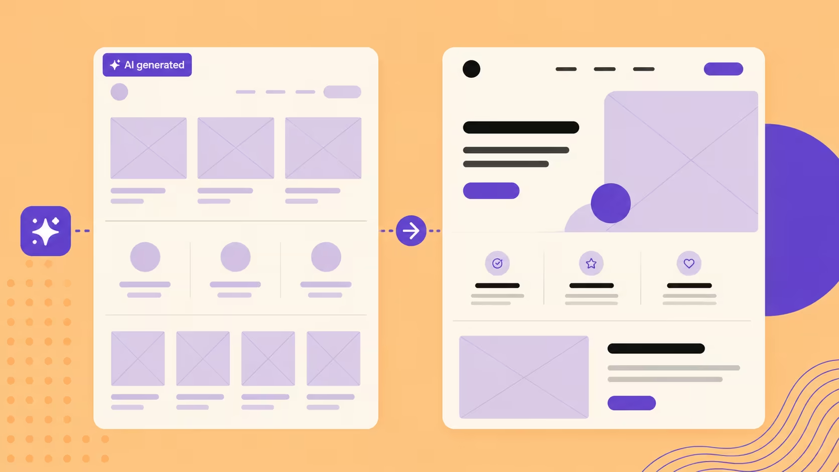
For most SaaS products, the most effective hero visual is a screenshot or a stylised representation of the product interface itself. This serves two purposes: it answers the visitor's implicit question ("what does this actually look like?") and it makes the product concrete rather than abstract. A visitor who can see the interface is making a more informed evaluation than one reading about features — and a more informed evaluation is more likely to convert to a trial.
The UI screenshot does not need to be a literal export. Stylised versions — with background removal, annotation overlays, or selective highlighting of the key feature — often perform better than raw screenshots because they direct the visitor's attention to the most compelling part of the interface.
Video and animation
A short looping video or Lottie animation can be more effective than a static image for products where motion communicates the core value — workflow tools, dashboard products, and anything where the user experience is inherently dynamic. The key constraints are performance and control: the video must be lightweight (under 2MB for a hero), autoplay muted, loop seamlessly, and not slow the page.
Avoid generic stock imagery in SaaS hero sections. A stock photo of a team in a meeting or a person on a laptop tells the visitor nothing about the product and wastes the highest-value visual real estate on the page. If the product cannot be shown directly, an abstract illustration that represents the problem being solved is significantly more effective than stock photography.
Performance is non-negotiable
A hero visual that causes the page to load slowly undermines everything else in the section. Core Web Vitals — specifically Largest Contentful Paint, which measures how long the largest visible element takes to render — are directly affected by hero image size and format. Hero images should be in WebP format, compressed below 200KB, and sized correctly for each breakpoint. For Webflow builds, this is managed directly in the designer. For a broader guide to performance optimisation, see how to optimise your website's speed.
5. Design Typography That Works at Speed
The typography of a SaaS hero section is a functional decision, not an aesthetic one. Visitors are reading fast, on a range of devices and screen sizes, often for the first time and without patience for typography that requires effort. Every typographic decision should reduce that effort, not add to it.
Headline sizing and weight
Hero headlines on desktop typically sit in the 48–72px range. The exact size depends on character count — a six-word headline can be larger than a twelve-word one without creating a layout problem. Bold or semi-bold weight is standard for hero headlines; lighter weights can work for premium or minimalist brands but require a larger size to maintain legibility.
The most common typographic error in SaaS hero sections is the headline that is too long for its size, producing awkward line breaks at different viewport widths. Write the headline with specific line breaks in mind and test it at the breakpoints where it will actually be read — not just at a standard desktop width. For a deeper look at how typographic decisions affect user experience, see why typography matters for your website.
Hierarchy between headline, subheading, and CTA
The visual hierarchy in a hero section should produce a specific reading order: headline → subheading → CTA. Size, weight, and spacing should make this sequence feel natural and require no effort from the visitor. If the CTA is competing visually with the subheading, or the subheading is so small it registers as fine print, the hierarchy is broken and the visitor's path to conversion is less clear.
6. Mobile UX Is Primary, Not Secondary
In Singapore's SaaS market — and globally — a majority of first website visits happen on mobile. This means the mobile hero section is not a responsive adaptation of the desktop version; it is the primary design context, and the desktop version should be built from it.
Mobile hero sections have specific constraints that desktop versions do not: vertical space is limited, thumb reach determines what is comfortably tappable, text that reads well at desktop sizes can be either too small or disproportionately large on a 390px screen, and the visual hierarchy of a two-column desktop layout collapses into a single-column stack that must be sequenced deliberately.
Mobile-specific design decisions
- The CTA button must be thumb-tappable — a minimum of 44px height and full-width or near-full-width on mobile to maximise the tap target
- The headline should not exceed two lines on mobile; three-line headlines on a small screen push the CTA below the fold
- The hero visual should appear below the text on mobile, not above — text above the fold on mobile is more valuable than image
- Social proof elements (logo strips, stats) should stack or collapse cleanly on mobile without creating crowding
Always test mobile hero sections on real devices rather than browser resize tools. The experience of reading and tapping on an actual phone reveals friction that browser simulation misses. Our guide on responsive web design best practices covers the full mobile design decision framework.
7. Place Social Proof Where It Reduces Hesitation
Social proof in a SaaS hero section serves a specific function: it reduces the risk perception of the visitor at the moment they are being asked to take an action. The most effective forms of social proof for a hero section are those that can be absorbed in under three seconds — a logo strip of recognisable clients, a usage statistic, or a single compelling testimonial quote.
What to show and where
A logo strip of client logos — placed directly below the CTA or as a band at the bottom of the hero section — signals that credible organisations have already made the decision the visitor is being asked to make. This is most effective when the logos are recognisable to the target audience; logos of companies the visitor has never heard of provide minimal trust benefit.
Usage statistics work well when the number is genuinely impressive: "Trusted by 50,000+ teams", "4.8/5 across 2,000 reviews", "Used in 120 countries". They should be specific and verifiable — a vague "thousands of customers" is less persuasive than a specific, sourced number.
A single testimonial quote can be powerful if it is specific and comes from a recognisable source: a named individual at a named company, describing a specific outcome. Generic testimonials without attribution add almost nothing. Place testimonials adjacent to the CTA rather than below it — social proof is most effective at the moment of decision, not after it.
8. Test Systematically and Interpret Carefully
No hero section is final at launch. The best-performing SaaS hero sections are those that have been iterated based on real visitor behaviour — what they read, where they stop, what they click, and where they abandon.
What to test first
The highest-leverage elements to test in a SaaS hero section are, in order of typical impact: headline copy, primary CTA wording, primary CTA colour and placement, and hero visual. Changes to these elements produce the largest variance in conversion outcomes because they are the elements visitors engage with most directly.
Run one test at a time. Testing multiple elements simultaneously makes it impossible to attribute performance differences to a specific change. A clean A/B test — one variable, two versions, sufficient traffic to reach statistical significance — produces actionable insight. For the methodology, see our guide on landing page A/B testing.
Behavioural data alongside conversion data
Conversion rate alone does not tell the full story of a hero section's performance. Behavioural data — scroll depth, click heatmaps, session recordings — reveals what visitors are engaging with and where they are losing interest. A hero section with a high click-through rate on the CTA but a high drop-off rate on the next page may have a messaging mismatch between the hero promise and the page it leads to, not a hero design problem. Interpreting conversion data in context produces better optimisation decisions than optimising in isolation.
SaaS Hero Section Pre-Launch Checklist
Before publishing a new or redesigned hero section, run through these checks:
Frequently Asked Questions
How long should a SaaS hero headline be?
Five to ten words is the reliable target range — long enough to be specific, short enough to be read immediately. The most important thing is that the headline is specific: it names the outcome the user gets or the problem it solves, not a generic platform description. Accompany it with a subheading that adds the mechanism or the audience qualifier.
Should a SaaS hero use a free trial CTA or a demo CTA?
It depends on the product's conversion model. Free trial CTAs ("Start free trial", "Try it free") work best for self-serve products where users can experience value quickly without hand-holding. Demo CTAs ("Book a demo", "See it in action") work better for complex products where a guided evaluation produces significantly higher close rates than self-serve exploration. Some SaaS products benefit from both — a primary demo CTA for qualified enterprise prospects and a secondary self-serve option for SMB visitors.
What visuals work best in a SaaS hero section?
Product UI — a screenshot or stylised representation of the interface — is the most consistently effective visual for SaaS hero sections. It answers the visitor's unspoken question ("what does this look like?") and makes the product concrete. Short looping video demos work well for workflow products where motion communicates the value. Abstract illustrations work for products at an early stage where the UI is not yet polished enough to show. Avoid generic stock photography — it adds nothing to visitor understanding.
How many CTAs should a SaaS hero section have?
One primary CTA and optionally one secondary CTA. More than two creates visual competition and decision paralysis. The primary CTA should be visually dominant — larger, higher contrast, positioned first — and the secondary should be clearly subordinate. If you have two CTAs of equal visual weight, you are splitting your visitor's attention and reducing the probability of either being clicked.
Where should social proof go in a hero section?
Adjacent to or immediately below the CTA — where it reduces hesitation at the moment of decision. A logo strip works well as a band at the bottom of the hero section. A testimonial quote works best positioned beside the CTA rather than below it. Usage statistics can be integrated into the subheading or placed as a compact element near the CTA. Social proof below the fold in a long hero section provides less benefit than the same elements positioned within the conversion zone.
How do I know if my hero section is performing well?
Primary metrics: CTA click-through rate (for hero engagement), scroll depth (for whether visitors progress beyond the hero), and conversion rate from hero visit to desired action. Secondary metrics: time-on-page (dwell time), bounce rate, and device-specific performance splits. Behavioural data from tools like Hotjar — click heatmaps and session recordings — reveals engagement patterns that conversion rates alone cannot explain. Benchmark your CTR against industry norms for your product category and traffic source before drawing conclusions.
Can I use animation in my SaaS hero section?
Yes, with constraints. Animation in a hero section should serve the value proposition — showing a workflow, demonstrating a key feature, or guiding the visitor's eye toward the CTA. It should not be decorative for its own sake. The technical constraints are firm: animations must not degrade Largest Contentful Paint scores, must be respectable at reduced-motion settings for accessibility, and must not prevent the static fallback from being clear and complete. Lottie animations and CSS transitions handled through Webflow's interaction tools are the most reliable approaches for performance-conscious animation in hero sections.
Conclusion
A SaaS hero section is not a design brief about aesthetics — it is a commercial decision about what happens in the first three seconds of a visitor's experience. Every element — the headline, the subheading, the CTA, the visual, the social proof placement, the mobile layout — is a variable that affects whether the visitor engages or leaves. The best hero sections are not the most visually impressive ones; they are the ones that most clearly communicate value, most effectively reduce hesitation, and most efficiently direct the visitor toward the action that benefits them and the business.
At ALF Design Group, we approach SaaS hero sections as a UX and conversion problem before a visual one. We map visitor intent, test value proposition variants, and build in Webflow so that design and performance are optimised together rather than in sequence. If your SaaS hero section is not converting at the rate your traffic deserves, our UX and UI design service is where that work starts. For a broader look at how UX design drives conversion across a full website, see how UX/UI can improve your website's conversions.
{{build-better-experience="/directory"}}
First Published On
June 4, 2025
Categories
Written By

Resources
Related Articles
Deep dive into our latest news and insights.

.webp)