
Checkout UX: Best Practices
You can clone this Figma file for your use for both personal and commercial use.
What is Checkout UX?
Checkout UX (User Experience) refers to the design and functionality of the checkout process in an e-commerce store. It encompasses everything from the layout, ease of navigation, form fields, payment options, and security features that contribute to a smooth and efficient purchase experience. A well-optimized checkout UX minimizes friction, reduces cart abandonment, and enhances customer satisfaction, ultimately leading to higher conversion rates and repeat purchases.
What Is The Use Case of A Checkout Process?
The checkout process is the final and most critical step in an e-commerce transaction, where customers review their order, provide payment details, and confirm their purchase. A seamless checkout experience is essential for ensuring customer satisfaction, reducing cart abandonment, and improving conversion rates. It serves as a bridge between customer intent and successful purchase completion.
Businesses can leverage an optimized checkout experience to build trust, offer multiple payment options, and simplify the process, making it easier for users to complete their purchases. Checkout UX plays a crucial role in encouraging repeat purchases by providing a frictionless experience that leaves customers satisfied and willing to return.
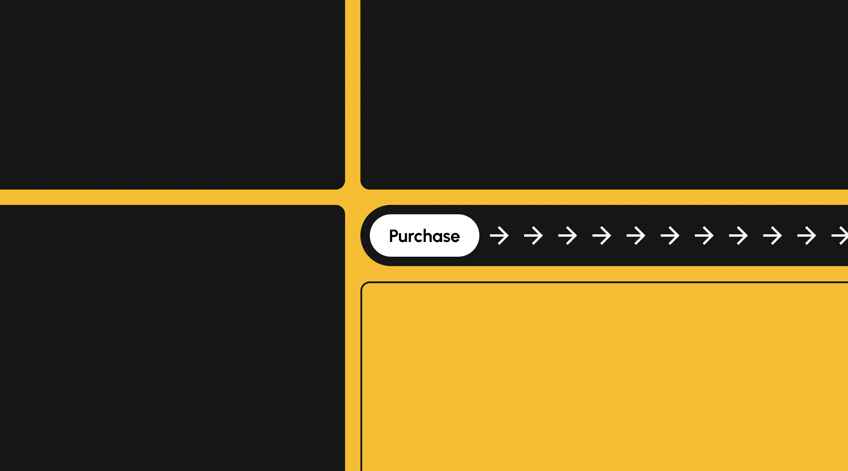
E-commerce stores, your checkout experience needs to be seamless and easy to use.
It directly impacts the user experience (UX), significantly influences conversion rates, and contributes to customer satisfaction and retention.
Why Your Checkout UX Needs to be Good?
1. Reduce Your Cart Abandonment
A complex or confusing checkout process often leads to cart abandonment.
Here are some reasons why users abandon their shopping cart:
- Extra Costs. Some users are surprised while trying to make the payment for their products. There were little to no feedback on how much the shipping costs are going to be. These can be perceived as "scam" costs by the users as they were not told beforehand that their shipping cost is going to be more than expected.
- Forced Account Creation. Nobody likes this because it involves another round of form filling. What makes it worse is that the forms can be long winded and complex.
- Lack of Payment Methods. Different countries have different mode of payments. It would be good to understand your audience and what tools they use to make online payments. In Asia, we are accustomed to be using GrabPay (which is awesome) and most credit cards.
2. Enhances Conversion Rates
Do you know that by shaving of a few seconds during your checkout process actually enhances your conversion rates?
Be mindful of how your users are using other e-commerce platforms.
An intuitive and efficient checkout flow positively impacts conversion rates. By simplifying the process, reducing steps, and providing clear calls-to-action, customers are more likely to complete their purchases. A user-friendly checkout flow encourages users to move from the consideration phase to making a successful purchase.
3. Builds Trust and Credibility
Have you ever encountered a website that shows a lack of credibility just by looking at their checkout page?
A well-designed checkout experience instills confidence in customers. Security badges, clear payment options, and transparent information about shipping costs and return policies build trust. A smooth process reassures users about the credibility of the e-commerce platform, encouraging them to complete transactions.
4. Reduces Errors and Redundancy
A good UX in the checkout flow minimizes the chance of errors and redundancy. Clear labels, pre-filled information (where appropriate), and validation messages help users input accurate data, reducing frustration caused by mistakes and ensuring a smoother transaction process.
5. Encourages Repeat Purchases
An excellent checkout experience contributes to customer loyalty. When users have a positive experience during their initial purchase, they are more likely to return to the platform for future transactions. A hassle-free checkout process can create loyal customers who value the convenience provided.
Designing a Checkout Flow with UX Best Practices
1. Allow Guest Checkout

Ensuring users can check out as a “guest” is a game-changer for reducing abandonment rates. Many shoppers simply won’t complete their purchase if they’re forced to create an account. However, offering “Guest Checkout” isn’t enough — it has to be highly visible during the account-selection step.
If users struggle to find this option, it’s as if it doesn’t exist at all. Our UX research shows that half of online stores fail to make “Guest Checkout” the most prominent choice, leading to unnecessary friction. Some users will pause and search for it, while others — moving fast — won’t find it and will abandon their cart.
The fix is simple: make “Guest Checkout” the primary, most visible option at the account-selection stage. This ensures users can quickly proceed with their purchase, keeping the experience seamless and frustration-free.
2. State the Shipping Speed

As users ourselves (we shop online, a lot), we tend to be "nervous" about when will our product arrive at our doorstep. That is normal human behaviour, right?
Most online stores fail to notice that by displaying something like "Will arrive in 2 business days" doesn't really assure the customer when exactly the product is arriving. In business terms, it is absolutely correct. From the users' POV (point of view), I have to calculate when. Not really a good thing.
So instead letting your users guess or calculate, provide a delivery date, or a date range, something like "Will arrive between 14th to 16th June" to allow users to understand when they will receive their order.
3. Using Buttons to Update Cart Quantity

Have you ever clicked on the input field and key in 3 and it becomes 31?
This is one of the most common UX mistakes that online stores are making. Editing the quantity of the items in a shopping cart should not be rocket science. And it is made worse for mobile users due to the smaller viewport and general increased in risks of input errors.
By adding buttons (plus/minus buttons), e-commerce stores can actually reduce human errors.
4. Adding a Credit Card Number

Writing a 16 digit number into an input field is extremely painful.
By validating the credit card number removes any uncertainty by your users when they are entering their credit card numbers. There are a few things that can be done here.
- Alerting the user if the number that they have entered is implausible for a credit card number
- Separate the numbers as close as to how it is being shown on the credit card itself (eg. 1234 4567 1421 4552 instead of 1234456714214552)
Conclusion
A well-designed checkout flow is fundamental to the success of an e-commerce platform. It directly impacts sales, customer satisfaction, and retention. Investing in a seamless, intuitive, and user-friendly checkout process is crucial for businesses aiming to thrive in the competitive online marketplace.
You can also download our figma file here for reference.
At ALF Design Group, we specialise in UX-driven e-commerce design and development in Singapore.
Reach out today and see how we can create an e-commerce site that enhances trust, improves engagement, and drives business growth.
.webp)
Related Articles

How to Increase User Engagement for Your Website
7 UX strategies to boost engagement on your Webflow website and drive real business results.

Top 11 Figma Plugins Every Designer Needs in 2025
Every designer needs to know these useful figma plugins to enhance their design process

How To Improve Your Website's UX
Understanding how to improve your website's user experience is key in connecting your business to your target users.
Launch Your Next Website.
Schedule a call with us if you think that we can help you. The least we can do is to give you good advice.