Case Study: Designing BigFundr's Website in Webflow
How ALF transformed BigFundr’s website through UX strategy and Webflow—driving higher trust, conversions, and mobile engagement.


Table of contents
A UX, Webflow, and Fintech Transformation Story
When BigFundr — a fast-growing Singapore investment platform offering property-backed notes reached out in early 2024, one thing was clear:
They had a strong product, but their digital experience didn’t show it.
As a regulated fintech under MAS, trust, clarity, and usability aren’t “nice to have”; they’re survival requirements. BigFundr needed a website that educated new investors, simplified decisions, and strengthened credibility from the first click.
This is how ALF Design Group redesigned their entire digital presence — from UX strategy → wireframes → visual design → Webflow → measurable business impact.
1. Understanding the User: The Foundation of Fintech UX
BigFundr’s redesign began with user personas and deep journey analysis to uncover trust, clarity, and onboarding barriers.
Good fintech UX starts long before screens are designed. It begins with people.
User Personas That Shaped the Direction
We worked with BigFundr’s directors and internal teams to refine persona profiles based on real investor behaviour.
Persona 1: Young Investors (21–30)
- Wants: Grow wealth with smaller capital
- Pain Points: Low financial knowledge, lower trust threshold

Persona 2: Mature Investors (40–50)
- Wants: Stability, predictable returns
- Pain Points: Complex onboarding, hard-to-understand product info

These personas became our north star. Every design decision — from content hierarchy to button labels — was grounded in what these users needed most.
2. Mapping the UX Challenges (The “Trust Gap”)
Users didn’t understand BigFundr quickly, didn’t see trust signals, lacked clarity on MAS compliance, and found the journey overwhelming.
Before solving anything, we analysed:
- Current website behaviour (GA + Hotjar)
- Funnel drop-offs
- Heatmaps
- User confusion points
- Brand messaging gaps
We uncovered four critical UX gaps:
1. “What/Who is BigFundr?”
Users needed immediate clarity about the platform’s purpose.
2. “Can I trust this?”
Fintech onboarding anxiety was high.
3. “Is this MAS-licensed?”
Compliance signals weren’t visible or strong.
4. “How do I start?”
The user journey wasn’t guiding first-time visitors confidently.
These insights shaped every strategic decision that followed.
3. UX Strategy: Designing for Trust, Simplicity & Clarity
We improved clarity, added compliance trust signals, simplified content, and designed a guided onboarding flow.
Fintech is complex. The design shouldn’t be.
A. Trust-Building at First Click
We redesigned the homepage hero to answer three questions instantly:
- What BigFundr does
- Why it’s safe
- How to start

This included:
- Clear, jargon-free value proposition
- MAS licensing badges
- Asset-backed investment guarantees
- Media features
- “How It Works” CTA for gentle onboarding
Users shouldn’t dig for trust—it should be obvious.
B. Designing for Clarity and Control
Finance overwhelms users quickly. We used:
- Modular blocks to break down investment steps
- Accordions + tooltips for explaining financial terms
- Clean layouts to reduce cognitive load
- Persistent help prompts
- Clear CTAs at each stage
The goal: make investing feel simple, transparent, and approachable.
C. Mobile-First UX for a Mobile-First Audience
Analytics showed 60%+ of BigFundr users browse via mobile.
So we ensured that the website is mobile-friendly:
- Structured Navigation
- Clear spacing between CTAs
- Faster loading, lighter components
The result was a frictionless mobile experience that supported real-world usage behaviour.
D. Micro-Interactions That Inspire Confidence
It’s the small details that make platforms feel “premium”:
- Hover states that confirm interaction
- Smooth loading transitions
- Modal explanations instead of redirect-heavy pages
- Subtle animations aligned with brand tone
Fintech UX wins when it feels alive — but not overwhelming.
4. Wireframes to Webflow: Bringing the Website to Life
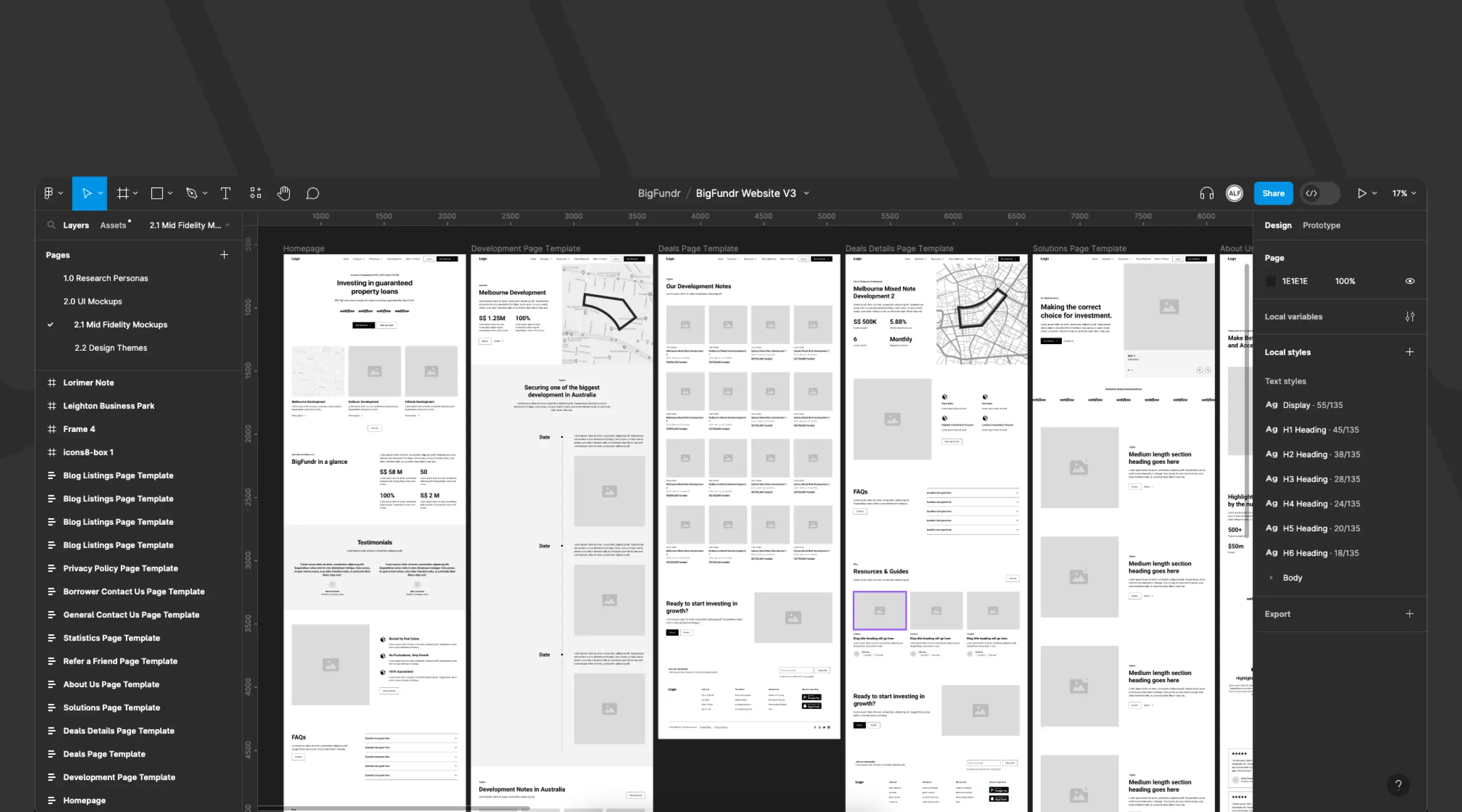
We built wireframes in Figma, explored themes, and developed the website fully in Webflow for flexibility and speed.
A. Wireframing the Experience
Using insights from our UX research, we created wireframes focused on:
- Homepage clarity
- Simplified investment listings
- Educator-style content blocks
- Strong CTA placement
- Trust-building above the fold
Wireframes aligned stakeholders and helped us test assumptions early.
B. Exploring Design Themes with BigFundr’s Branding Agency
We developed three visual themes to explore:
- Institutional & premium
- Approachable & educational
- Modern fintech minimalism
This helped BigFundr pick a clear, confident direction.
C. Why Webflow Was the Right Tool
Previously, BigFundr used Odoo — powerful but painfully slow for marketing updates.
We recommended a hybrid model:
- Webflow for the website (speed + flexibility + no developer dependencies)
- Outsystems for the investment portal (secure & scalable low-code environment)
Webflow gave BigFundr:
- Lightning-fast edits
- Robust CMS for blogs & FAQs
- Strong SEO foundation
- Precise control over compliance changes
- Faster iteration cycles
It was the perfect match for a fast-moving fintech.
5. Measurable Impact: What Improved After the Redesign
Conversions increased 42%, mobile engagement grew 31%, and bounce rates dropped 22% after the redesign.
Numbers tell the real story. After launch, BigFundr saw:
- Clearer messaging + improved CTAs = more confident actions.
- Mobile-first design paid off immediately.
- Better content hierarchy + strong trust signals kept users exploring.
Marketing now updates pages, blogs, and FAQs without developer help.
The redesign wasn’t cosmetic — it directly contributed to growth, trust and operational efficiency.
6. Tools That Supported the Build
- Webflow CMS – Fast iteration & full control
- Finsweet Attributes – Filtering, sorting, and CMS logic
- Unsplash – High-quality imagery
- Icons8 – Consistent iconography
- Figma – UX → UI → prototype workflow
These tools kept the build clean, modular, and scalable.
Frequently Asked Questions
What’s different about designing for fintech?
Fintech UX must prioritise clarity, trust, compliance signals, and transparent flows—more than typical consumer websites.
Why was Webflow chosen for BigFundr?
Webflow enabled fast updates, strong SEO, responsive design, and autonomy for the marketing team—all critical for fintech growth.
Can ALF help other fintech companies?
Yes. We’ve supported multiple fintech, AI, and financial firms with UX, Webflow and digital transformation.
Ready to Improve Trust, UX and Conversions for Your Fintech Platform?
Let’s design a website that grows your business — fast, compliant, and built for investors. Book a strategy call with ALF Design Group.
{{upgrade-website="/directory"}}
First Published On
August 24, 2023
Categories
Resources
Related Articles
Deep dive into our latest news and insights.

.webp)


